Have you ever stood in a paint aisle holding two chips that looked identical in the store and completely different on the wall? It’s what happens when you’re making decisions without a framework.
The good news is that professional designers aren’t working from some mysterious instinct; they’re applying a handful of principles that anyone can learn and use.
Light direction, undertones, color ratios, and the relationship between your walls and your floors, once you understand how these elements interact, the choices that used to feel overwhelming start making sense.
This guide walks through all of it, room by room, so you can stop guessing and start making decisions you’ll still feel good about five years from now.

Room Color Combination Ideas That Work in Any Home
How to Choose a Base Color That Feels Timeless
Color trends are fickle, but a well-chosen base color will outlast them all.
Warm whites, soft grays, and beiges have staying power because they don’t compete with your furniture or fight your artwork for attention.
North-facing rooms drink up warmer bases like cream or soft ivory, while south-facing spaces can handle cooler tones without turning cold.
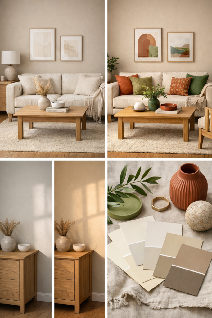
Before you commit, tape large paint swatches on multiple walls and watch how they shift from morning to evening light. A good base should feel calm without feeling sterile, and it should make you forget it’s even there.
Using Accent Colors Without Overwhelming the Space
Restraint is the skill most people haven’t developed yet, and accent colors expose it immediately. The instinct is to go bigger and bolder, but designers limit accent colors to roughly 10 to 20 percent of a room’s visual weight for good reason.
Beyond that threshold, the room starts competing with itself.
Choose one or two accent shades that genuinely complement your base, then spread them through pillows, artwork, and accessories rather than concentrating them in one corner.
Test those accents with removable pieces first; a throw blanket costs nothing to swap out, but repainting a wall costs an afternoon.
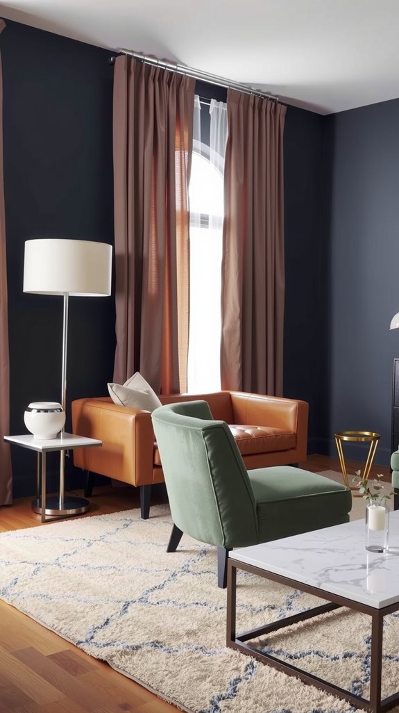
Living Room Color Combination Trends Designers Love
Warm vs Cool Living Room Color Palettes
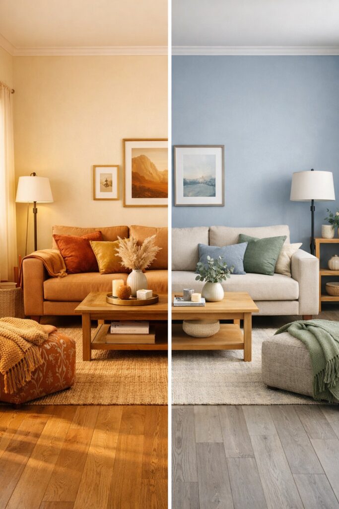
The moment someone walks into your living room, they feel the temperature of your color choices before they consciously register anything else.
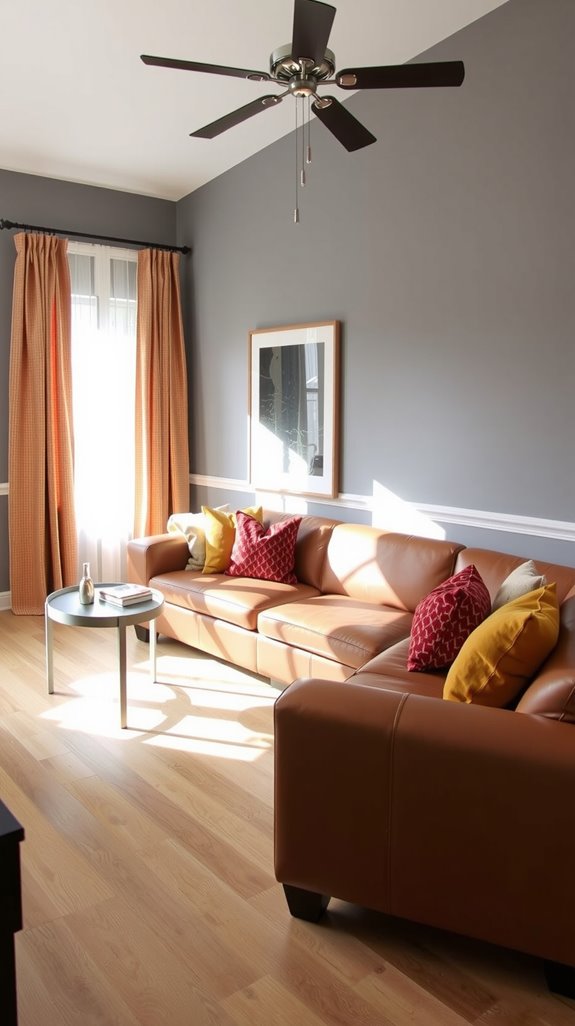
Warm palettes built on reds, oranges, and earthy browns make large rooms feel more cohesive and intimate, drawing people toward conversation.
Cool blues, greens, and purples do the opposite. They open a room up and create a sense of calm that works especially well in tight spaces.
North-facing rooms with flat, gray light almost always need warm tones to feel livable; south-facing rooms with generous sun can handle either direction comfortably.
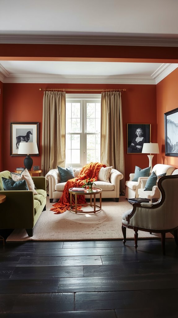
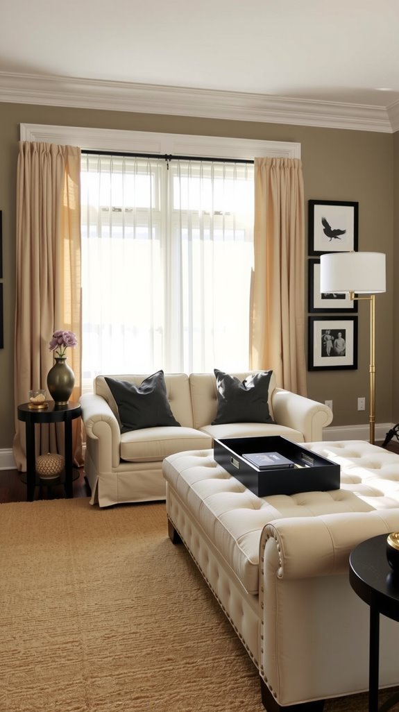
Matching Wall Colors With Furniture and Flooring
Most people start with paint and work forward, but experienced designers work backward from what’s already fixed. Your flooring is the least movable element in the room, so start there.
Honey oak floors want warm wall colors like cream or soft terracotta, while gray-toned floors pair cleanly with cool whites or slate blues.
Your sofa anchors everything else, and dark furniture needs lighter walls around it so the room doesn’t close in. Test paint samples directly alongside your furniture in the actual light of that room, not in a store under fluorescent bulbs.
Bedroom Room Color Combination for Relaxing Spaces
Soft Color Combinations That Improve Sleep Quality
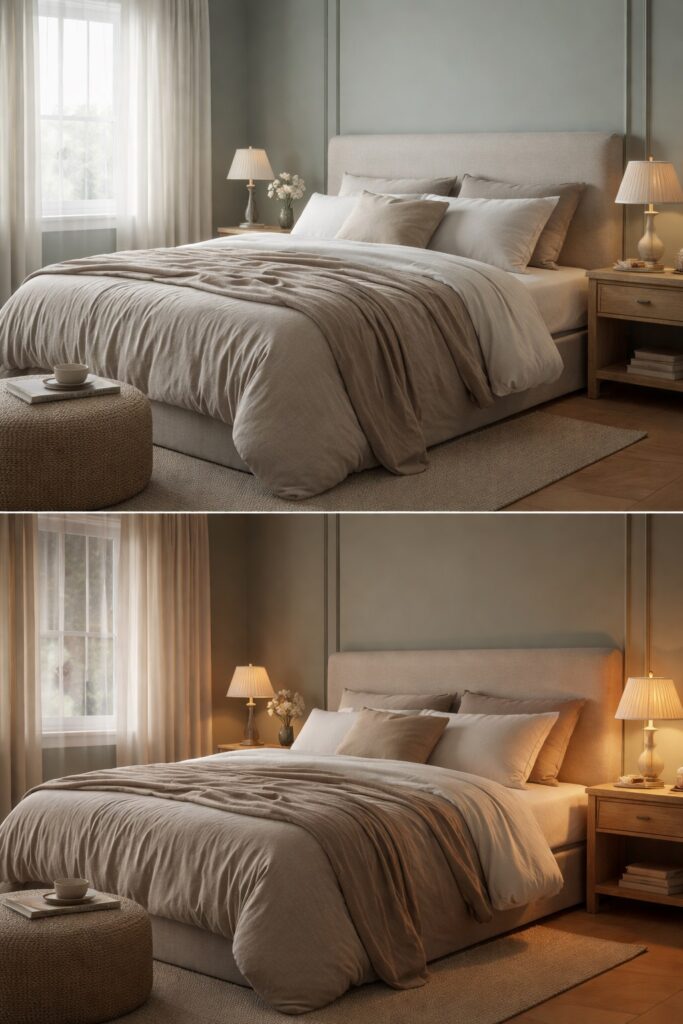
Sleep researchers have confirmed what good designers have known for years: color affects how quickly your nervous system downshifts at night.
According to this scientific research, soft blues and muted greens lower heart rate and blood pressure, while high-contrast color combinations keep the brain alert when you’re trying to wind down.
Pair those calming hues with warm neutrals like cream or soft taupe, and the room develops visual balance without any of the stimulation.
SEE THIS: 14 Bedroom Ideas for Small Rooms That Look Designer-Approved (But Are Easy to Copy)!
How Lighting Changes Bedroom Paint Colors
The color you fall in love with at the paint store will look different the moment it hits your walls, and different again by evening.
North-facing bedrooms pull blue and gray undertones forward, making warm colors look flat and muted; south-facing rooms get consistent warm light that deepens yellows and softens cooler shades.
Incandescent bulbs push everything toward yellow warmth, while LEDs shift colors depending on their color temperature rating.
Paint large samples on two or three walls and observe them during morning, midday, and evening before making any final call.
Interior Room Color Combination Principles Explained

Understanding the 60-30-10 Color Rule
Designers aren’t guessing when a room feels balanced; they’re following a ratio.
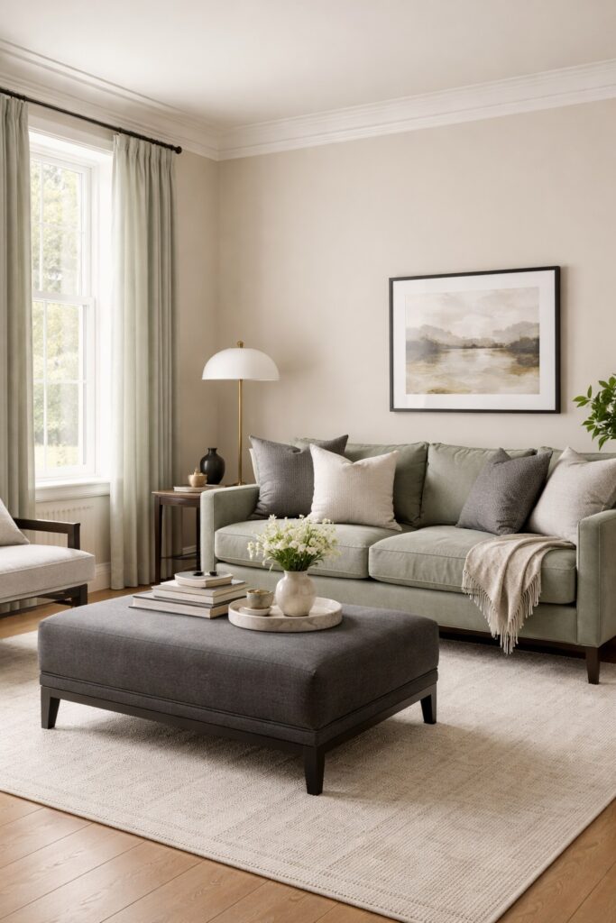
Your dominant color covers 60% of the space, typically walls and large furniture; the secondary shade fills 30% through upholstery, curtains, or an accent chair; and your third color takes the last 10% in pillows, artwork, and small accessories.
Nature and classical art both follow similar proportions, which is probably why rooms built on this framework feel instinctively right. Start by locking in your dominant shade first, then build the secondary and accent colors outward from there.
Balancing Walls, Trim, and Ceiling Colors
Walls, trim, and ceilings work best as a coordinated system. Your wall color leads, your trim either lightens for contrast or deepens slightly for a modern edge, and your ceiling ties everything together.
A ceiling painted one shade lighter than the walls adds cohesion; going slightly darker creates intimacy in tall rooms that would otherwise feel cavernous. What pulls it all together is shared undertones. When everything runs warm or cool in the same direction, the space reads as intentional.
Modern Room Color Combination Ideas for Contemporary Homes
Neutral-Heavy Palettes With Bold Contrast
Neutral rooms aren’t boring by definition; they’re boring when no one deliberately decides on contrast.
Anchoring a space in whites, grays, and beiges, then introducing one strong accent color as a strategic counterpoint, gives you the calm of neutrals with just enough personality to keep the room interesting.
Warm gray walls, deep navy throw pillows, and a piece of artwork create that tension without tipping into chaos. Keep the bold color as punctuation, roughly 10 to 20 percent of the room’s visual weight, and the sophisticated, uncluttered quality holds.
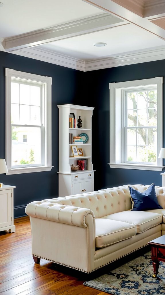
Using Black, Grey, and White the Right Way
The monochromatic palette of black, white, and gray is the cornerstone of contemporary design, but it often fails because the balance is thrown off early.
White or light gray should dominate the walls; black works as an accent in 10 to 15 percent of the room through light fixtures, window frames, or furniture legs, not as a wall color in most residential spaces.
Mid-tone grays bridge the two extremes and add depth without the eye-catching drama of true black. Layer different textures within this palette, matte blacks against glossy whites, rough concrete beside smooth fabric, or the whole thing reads flat.
| READ THIS: Modern Color Combination for Living Room (Clean, Stylish & Timeless) |
Small Room Color Combination Ideas That Make Spaces Look Bigger
Light Color Palettes That Reflect Natural Light
In a small room, your paint color is doing structural work; it’s either expanding the space visually or contracting it.
Soft whites, pale grays, and cream tones bounce light around and amplify whatever comes through the windows, making the room feel larger than its square footage suggests.
Pair warm whites with slightly cool undertones, and you avoid the sterile, hospital-corridor quality that all-white rooms often develop.
Colors with high Light Reflectance Values generally above 70 distribute light most effectively, and light blues and sage greens can hold their own in this category while adding subtle warmth.
Ceiling and Wall Color Tricks for Visual Height
Strategic color placement on ceilings and walls creates vertical illusions without touching a single structural element.
Painting your ceiling lighter than your walls draws the eye upward and expands perceived height; extending your wall color onto the ceiling by six to twelve inches blurs the boundary and adds visual inches in a different way.
For a counterintuitive approach, a ceiling painted slightly darker than the walls creates depth that paradoxically makes low ceilings feel more intentional and less oppressive.
Vertical stripes and ombré techniques that gradually lighten toward the ceiling manipulate sight lines in the same direction, all without a contractor involved.
| READ THIS: Color Combination for Small Living Room (That Makes Space Feel Bigger) |
Two-Color Room Combination Ideas That Always Work
Best Wall and Accent Color Pairings
Working with just two colors forces you to be deliberate, and that constraint usually produces stronger rooms than an open palette does.
Greige, warm white, or soft gray on the walls gives you a foundation that can absorb a bolder accent without being overwhelmed by it.
Navy and crisp white is the most durable two-color pairing in residential design; sage green and cream offer a quieter, more organic combination that works equally well in bedrooms and living rooms.
Charcoal gray walls with mustard yellow accents deliver contemporary sophistication, while blush pink and dove gray land in a more quietly elegant realm. The 60-30-10 ratio keeps either combination from tipping into excess.
When to Use Texture Instead of a Third Color
When a two-color room starts feeling flat, the instinct is to reach for a third color, but that’s usually the wrong diagnosis.
What the room is actually missing is textural depth, and adding chunky knit blankets, smooth leather furniture, and nubby wool rugs all within the existing two colors delivers that dimension without complicating the palette.
A navy-and-white room built this way develops real sophistication; the eye moves around the space, finding contrast in surface quality rather than hue. The result feels considered rather than sparse, and you keep the visual cohesion that makes minimalist spaces work.
| READ THIS: Two Color Combination for Living Room (Easy Pairings That Always Work) |
Three-Color Room Combination Ideas for Visual Interest
Choosing a Dominant, Secondary, and Accent Color
Three colors in a room work when each knows its role and stays in its place. Your dominant color, covering roughly 60% of the space on walls and large furniture, should be a neutral or subdued tone that provides a foundation for everything else to sit on.
The secondary color at 30% shows up in upholstery, curtains, or an accent chair, adding visual interest without challenging the dominant shade.
Your accent color has the greatest impact, delivering personality through artwork and accessories, and it’s also the easiest thing to change when you want to refresh the room without repainting.
Avoiding Busy or Clashing Color Schemes
Colors clash most often not because they’re opposites, but because they’re competing at the same intensity without anything to mediate between them.
Multiple bright, saturated colors at equal visual weight create tension that makes a room exhausting to spend time in because your eyes can’t find a place to settle.
Test your palette by taping paint samples together on the wall and sitting across the room; if the combination makes you squint or work too hard to focus, it’s fighting itself.
Neutral Room Color Combination Ideas for Timeless Interiors
Beige, Greige, Taupe, and Soft White Pairings
Beige, greige, taupe, and soft white have earned their place in design because they do something most colors can’t: they hold the room together while letting everything else breathe.
Greige in particular bridges cool and warm tones, which makes it invaluable in open-concept spaces where light shifts constantly from one end to the other.
Pair taupe walls with soft white trim, and you get a subtle contrast that defines the architecture without demanding attention.
These combinations enhance natural light, serve as backdrops for almost any accent color, and don’t expire the way trend-driven palettes do.
Adding Warmth With Wood and Fabric Tones
Paint gets most of the credit, but wood and fabric tones do more heavy lifting in a neutral room than most people realize. Oak and walnut introduce rich undertones that warm up beige and greige walls in ways that no second coat of paint can replicate.
Layer linen curtains, wool throws, and cotton upholstery in cream, caramel, or warm gray, and the room develops real dimension without introducing new color.
If your walls lean cool and gray, bring in honey-toned wood and terracotta textiles to keep it from drifting toward institutional.
| READ THIS: Neutral Color Combination for Living Room (Warm, Calm & Flexible) |
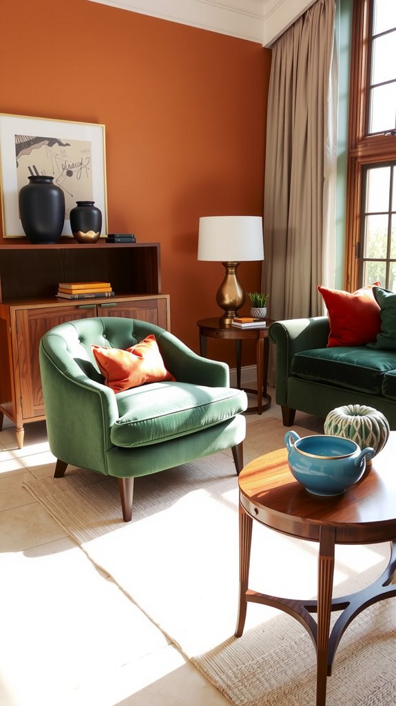
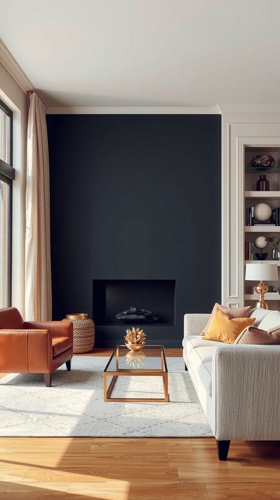
Bold Room Color Combination Ideas for Statement Spaces
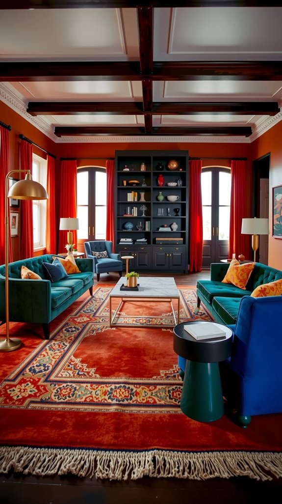
Deep Blues, Greens, and Jewel Tones Done Right
Rich, saturated hues transform a room, but they punish a heavy hand faster than any other color category. Deep navy paired with emerald green creates sophisticated depth, especially when anchored by brass or gold fixtures that warm the whole combination up.
Sapphire blue walls gain life when ruby or garnet accents come through textiles and artwork. Jewel tones tend to strengthen each other rather than compete.
These colors absorb natural light rather than bounce it, so plan your artificial lighting carefully; ambient and accent sources need to carry the room once the sun goes down.
How to Balance Bold Walls With Neutral Decor
A dramatic wall color works precisely because everything around it steps back and gives it room to operate. Sofas, chairs, and rugs in whites, beiges, and warm grays act as visual rest points that let the wall do its job without competition pulling the eye in three directions.
Think of it as an 80-20 approach 80% of your furnishings stay neutral, and the remaining 20% in accent pieces echo the wall color to create cohesion rather than chaos.
Texture in those neutral pieces, linen, wool, and raw wood, keeps them from disappearing into the background while the wall carries the weight.
Wall Color Combination Ideas for Living Rooms
Accent Walls vs Full-Room Color Saturation
Full-room color saturation is high commitment, and it works best when you stay in muted territory, sage green, warm gray, or dusty blue, applied to all four walls, creates atmosphere without pressure.
Bold, highly saturated colors on every surface in a small room create claustrophobia rather than drama.
An accent wall placed behind a fireplace or entertainment center lets you introduce that color as a deliberate statement without it consuming the space, and it’s far easier to repaint one wall if your taste shifts in three years.
Designers generally recommend keeping saturated color to 20 to 30 percent of the room’s total wall surface when using the accent approach.
SEE THIS: Color Combination for Living Room Walls (That Actually Works).
Coordinating Wall Colors With Curtains and Rugs
Curtains and rugs fail when they’re selected in isolation rather than as part of the room’s larger color story. If your walls are neutral, textiles are where you earn your color and pattern; that’s your opportunity, not an afterthought you handle at the end.
Bold wall colors need restrained textiles; competing energy from both directions creates rooms that feel exhausting to be in, rather than interesting.
Temperature matching matters more than most people expect: cool-toned walls pair with cool-toned fabrics, and warm walls want warm textiles to stay coherent across the whole room.
Bedroom Wall Color Combination Ideas for Style and Comfort
Feature Wall Color Ideas Behind the Bed
The wall behind your bed is the natural focal point of the entire room, and treating it as an afterthought is a missed opportunity.
Deep, saturated hues like navy blue, forest green, or charcoal gray add sophistication and create a cocooning effect, making the bed feel like a destination rather than just a piece of furniture.
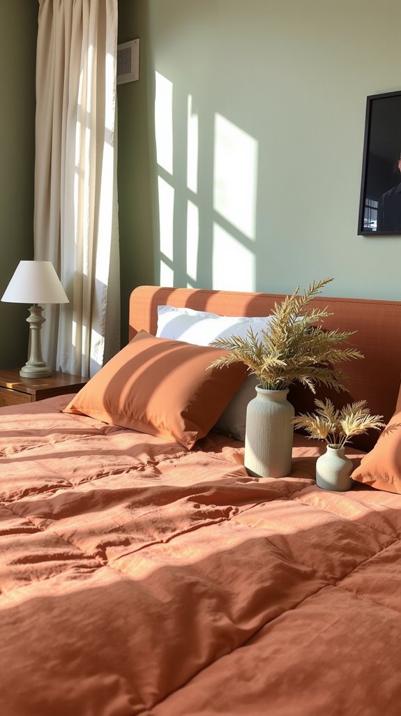
If darker tones feel like too much commitment, soft sage, dusty rose, or warm terracotta introduce color without overwhelming a room meant for rest.
For the feature wall to work, it needs to contrast with the surrounding three walls while staying in conversation with your bedding and furniture.
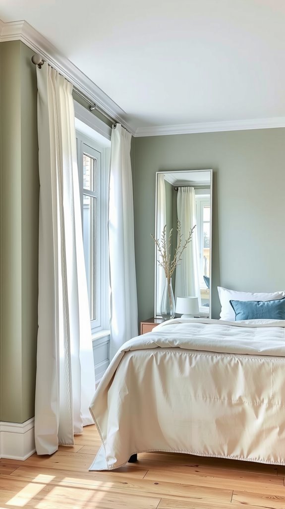
Soft Contrast vs Monochrome Bedroom Palettes
Choosing between soft contrast and monochrome is really choosing between subtle dimension and deep cohesion. Soft contrast pairs similar hues with gentle variation, sage green walls with cream bedding, and olive accents, creating visual interest that doesn’t overwhelm a space meant for sleep.
Monochrome palettes layer varying shades of one color, like charcoal, slate, and pearl gray, throughout the room, delivering sophisticated cohesion that works particularly well in smaller bedrooms where color variety might feel chaotic.
Soft contrast tends to suit traditional and eclectic styles, while monochrome tends to suit contemporary and minimalist spaces more naturally.
Interior Paint Color Combination Mistakes to Avoid
Colors That Look Good Online but Fail in Real Life
Pinterest and Instagram are lying to you about paint colors, and not subtly. Bright whites that look crisp and clean on a screen often land as stark and clinical once they’re on four walls under your specific lighting conditions.
Gray-blues that seem sophisticated in a styled photo can slide toward murky purple in rooms with limited natural light, and jewel tones that look luxurious in a shoot can make a small room feel trapped rather than dramatic.
Screen brightness and photo filters distort color temperature in ways that no monitor calibration can fully correct. Always test on actual walls before committing to a full room.
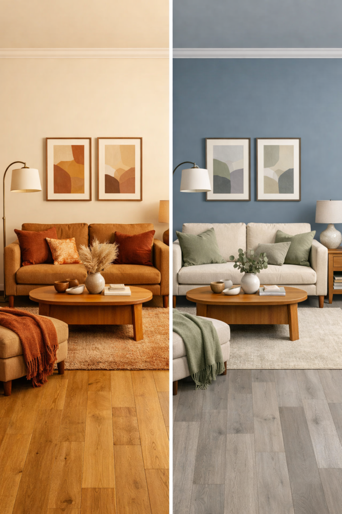
Ignoring Undertones and Natural Light Direction
Every paint color carries an undertone that stays hidden until it hits your specific walls under your specific light. North-facing rooms receive cool, indirect light all day, which intensifies blue and gray undertones and makes warm colors look muddy rather than inviting.
South-facing spaces run warm and consistent, which can oversaturate yellows and reds to the point of garishness; east and west-facing rooms shift dramatically between morning and afternoon.
Paint large samples on multiple walls, observe them at different times of day, and understand that what looks like a crisp white in morning light might reveal pink or yellow undertones by evening.
Room Color Combination Ideas Based on Natural Light
Best Colors for North-Facing and Dark Rooms
Dark rooms need warmer, more reflective choices than rooms that receive generous light throughout the day. Cream, warm beige, soft yellow, terracotta, and coral all add energy to spaces that would otherwise feel dim and cold, regardless of what furniture you put in them.
Rich warm neutrals like caramel and honey are particularly useful because they bounce available light rather than absorbing it. Pair them with reflective finishes on trim and ceilings, and even a chronically dim room starts feeling welcoming rather than apologetic.
Bright Room Color Palettes for Sun-Filled Spaces
A south-facing room with good sun exposure is the most forgiving canvas in the house, offering options that darker rooms simply can’t. Cool tones like navy, forest green, and charcoal work well here because the warmth of direct sunlight balances them, preventing them from reading as cold or somber.
Deep, saturated hues show their full richness in strong natural light, rather than going muddy the way they do in dim rooms. Even a dark accent wall, which can feel oppressive in a north-facing space, reads as dramatic and intentional when there’s real sun behind it.
If you prefer lighter palettes, crisp whites and soft neutrals create airy, expansive rooms that never feel washed out because the light is working with you rather than against you.
How to Test Room Color Combinations Before Painting
Using Sample Paints and Large Swatches Correctly
Sample pots exist for exactly this reason, and skipping them is the most expensive shortcut in home design.
Paint at least two large swatches, roughly two feet square, on different walls in your room, placing one where direct light hits and one in a shadowed area, so you can see the full range of how the color behaves.
Let the paint dry completely before evaluating it; wet paint appears darker than the finished result and can mislead you toward lighter colors than you actually want.
Testing Colors Across Different Times of Day
Natural light shifts so dramatically throughout the day that the same paint color can look like two entirely different choices depending on when you’re standing in front of it.
Morning light tends to run cooler and softer; midday sun creates harsh, direct illumination that can wash colors out; afternoon brings warmer tones; and evening light adds golden hues that change everything again.
Observe your paint samples in the morning, midday, and evening, and photograph them at each interval so you can compare the subtle variations you’d miss in real time. Test under both warm and cool artificial bulbs, too, because you’ll be living in that room long after the sun goes down.