Walk into the wrong bathroom, and you feel something’s off. The space feels smaller, colder, or just tired, and nine times out of ten, the paint is the culprit. You don’t need a gut renovation to fix it.
The right color choice can open up a cramped space, warm up a cold one, and make a builder-grade bathroom feel like something you actually chose.
Not every color delivers equally, though, and that’s where most people go wrong. The options ahead cut through the guesswork and show you exactly what works.
Contents
- 1 Bathroom Paint Colors That Make Small Spaces Look Bigger
- 2 Best Bathroom Paint Colors for Modern Homes
- 3 Neutral Bathroom Paint Colors That Never Go Out of Style
- 4 Blue Bathroom Paint Colors for a Calm, Spa-Like Feel
- 5 Gray Bathroom Paint Colors That Actually Feel Warm
- 6 Bathroom Paint Colors for Low Natural Light Spaces
- 7 White Bathroom Paint Colors That Don’t Feel Sterile
- 8 Green Bathroom Paint Colors Inspired by Nature
- 9 Bathroom Paint Colors for a Luxury Look
- 10 Bathroom Paint Colors for Small Powder Rooms
- 11 Warm Bathroom Paint Colors That Feel Cozy
- 12 Bathroom Paint Colors That Pair Well with Tile
- 13 Trendy Bathroom Paint Colors Homeowners Love
- 14 Bathroom Paint Colors for Rental-Friendly Updates
- 15 Bathroom Paint Color Mistakes to Avoid
Bathroom Paint Colors That Make Small Spaces Look Bigger
Light and Reflective Paint Colors That Expand Visual Space
Pale surfaces bounce light around a room in a way that genuinely changes how your brain reads the space.
Soft whites, creamy ivories, and light grays all work well here, especially when paired with a satin or semi-gloss finish that amplifies reflectivity.
The finish matters as much as the color itself in a small bathroom. Matte might be having a moment, but it absorbs light and traps moisture, which is a bad combination in a high-humidity room.
How Lighting Affects Paint Color in Small Bathrooms
The same paint chip can look completely different in your bathroom than it did at the store, because the light source changes everything. Natural morning light shows you the truest version of a shade, while warm incandescent bulbs push everything yellow, and cool LEDs pull colors blue.
Test large swatches on multiple walls and live with them for a full day before buying a gallon. If you’re installing new fixtures, LEDs rated between 2700 and 3000K work well with warm and neutral tones, while 3500 to 4100K bulbs suit cooler grays and blues.
Best Bathroom Paint Colors for Modern Homes
Popular Modern Bathroom Color Palettes
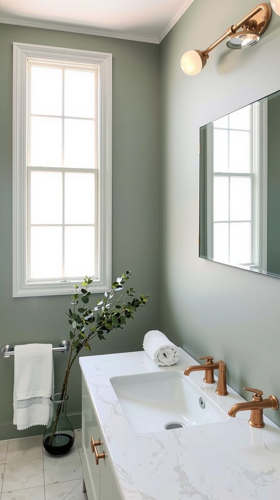
Today’s modern bathroom palettes have moved past the stark white box, and the combinations people are reaching for now have real warmth to them. Soft gray with warm taupe, sage green alongside cream, navy blue anchored by brass fixtures: these pairings create depth without sacrificing the clean lines that define a contemporary space.
What they share is a balance between restraint and personality, neither sterile nor overdone. Get that balance right and the room feels both current and timeless.
Choosing Paint Finishes for a Clean, Contemporary Look
Color sets the mood, but finish determines how that color actually holds up over time. Satin and semi-gloss are the workhorses of bathroom paint: they resist mildew, clean easily, and reflect enough light to keep the space feeling fresh.
Matte finishes look beautiful on a mood board and cause real problems in a steamy bathroom. Moisture gets into the surface, mold follows, and the finish starts to fail faster than you’d expect.
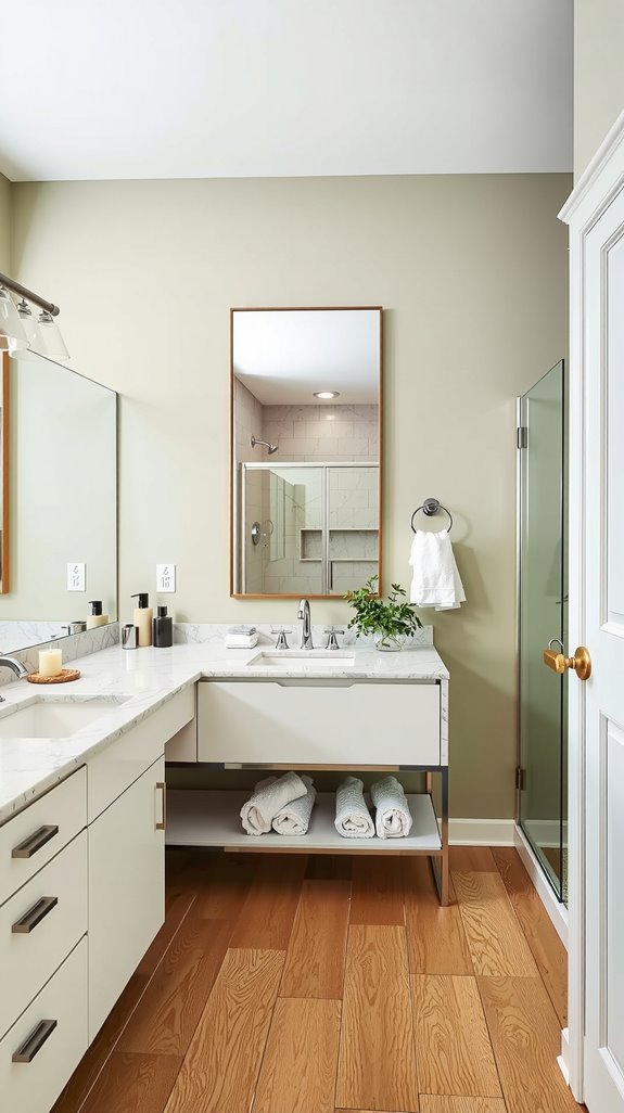
Neutral Bathroom Paint Colors That Never Go Out of Style
Warm vs Cool Neutrals for Bathroom Walls
Choosing between warm and cool neutrals is less about personal taste and more about what your bathroom is already doing. Warm neutrals, the beiges, creams, and taupes, create an inviting atmosphere that suits bathrooms with limited natural light or traditional fixtures.
Cool neutrals with gray, blue, or green undertones deliver a crisper, more contemporary feel that suits modern hardware and clean-lined tile. The distinction sounds subtle until you put two samples side by side on the same wall.
Pairing Neutral Paint with Tile and Fixtures
Your tile and fixtures make the final call on which neutral actually works. White fixtures are forgiving and pair with almost anything, but your hardware is less flexible: chrome and brushed nickel want a cool gray alongside them, while brass, gold, and bronze pull toward warmer beiges and taupes.
Cream subway tile deepens a warm neutral beautifully, while marble, with its cooler veining, tends to look sharper against grays. Pull the undertone from your most permanent surface first and work outward from there.
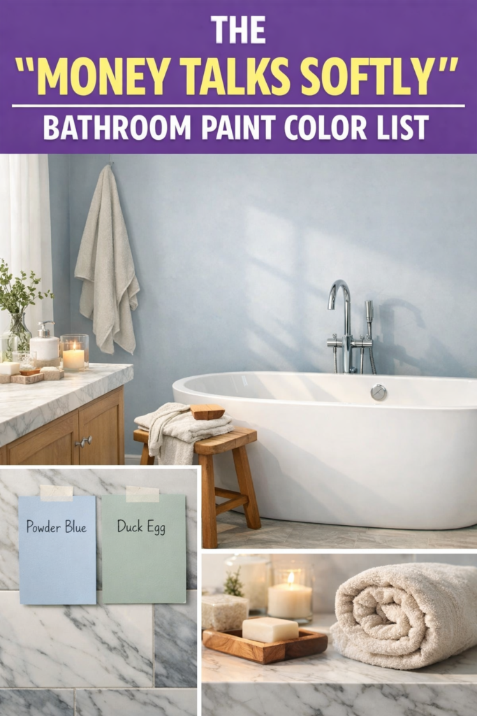
Blue Bathroom Paint Colors for a Calm, Spa-Like Feel
Soft Blue Shades That Feel Relaxing, Not Cold
Bright, saturated blues read cold and clinical on bathroom walls, but back off the intensity and something shifts entirely. Powder blue, duck egg, and misty blue all carry just enough gray or green undertone to stay warm and livable.
These shades don’t fight your fixtures or your towels; they settle in and let the room breathe. That’s the quality that makes them feel like a spa rather than a waiting room.
Coordinating Blue Paint with White and Natural Materials
The contrast between cool blue walls and warm natural materials is what keeps a blue bathroom from going flat. White subway tile and marble countertops give the eye a crisp edge to land on, while wood vanities, woven baskets, and linen towels pull warmth back into the room.
Chrome hardware sharpens the palette; brass softens it and adds a little age. Layer these elements thoughtfully and the room builds visual depth without ever feeling cluttered.
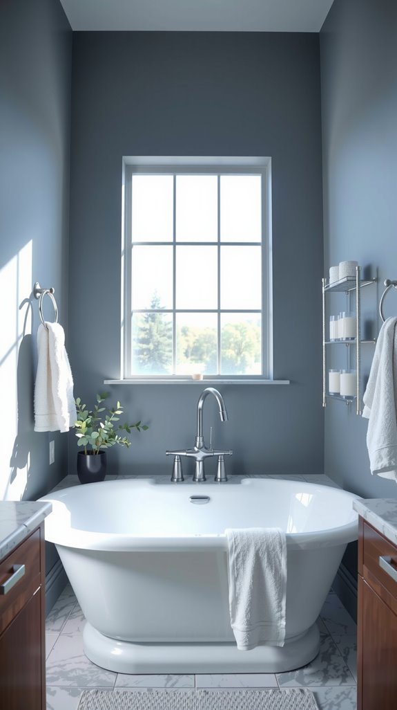
Gray Bathroom Paint Colors That Actually Feel Warm
Avoiding Cold, Flat Grays in Bathrooms
Gray is one of the most popular bathroom choices and one of the easiest to regret. Cool, blue-leaning grays look sophisticated in large showrooms and feel like a bunker in a small windowless bathroom.
The problem is almost always undertone: flat, cool grays drain warmth from a space faster than any other color family. Grays with beige or taupe in them, the ones sometimes labeled greige, are far more forgiving across different room sizes and lighting conditions.
Best Gray Undertones for Small and Large Bathrooms
Room size genuinely changes which gray you should reach for. Small bathrooms benefit from grays that lean warm, since beige and greige undertones prevent the walls from closing in.
Larger bathrooms have enough square footage to absorb cooler, blue or green-leaning grays without the room feeling cold. In both cases, test the sample in your actual bathroom under both natural and artificial light before committing, because gray shifts more dramatically than almost any other color under different light sources.
Bathroom Paint Colors for Low Natural Light Spaces
Paint Shades That Brighten Dark Bathrooms
When a bathroom gets little to no natural light, the paint has to work harder than usual. Light-reflective shades like soft whites, pale grays, and warm beiges maximize whatever light does enter the room, bouncing it off walls and ceiling to reduce that cave-like feeling.
Going darker might seem like a bold solution, but without natural light to balance it, a saturated color in a windowless bathroom rarely lands the way you picture it. Keep the palette pale and let the finish and lighting carry the rest.
Using Artificial Lighting to Enhance Paint Color
Layered artificial lighting can do a surprising amount of heavy lifting in a bathroom that lacks windows. Warm LED bulbs in the 2700 to 3000K range work well with neutral and warm paint tones, while cooler bulbs in the 3500 to 4100K range suit blue and gray palettes.
Vanity lights positioned at eye level eliminate the shadows that make colors look muddy and undertones unreadable. Get the lighting right first and your paint color will perform the way it was supposed to.
White Bathroom Paint Colors That Don’t Feel Sterile
Warm White vs Cool White in Bathroom Design
Two whites that look nearly identical on the chip can feel completely different once they’re on your walls. Warm whites carry yellow, cream, or beige undertones that create an inviting atmosphere, pairing naturally with wood vanities, gold fixtures, and soft textiles.
Cool whites lean blue, gray, or green and deliver a sharper, more modern feel that suits chrome hardware and contemporary tile. The undertone is the whole decision, and you won’t see it clearly until you’ve painted a large swatch and sat with it through different times of day.
Layering Texture to Add Depth to White Bathrooms
An all-white bathroom goes wrong when every surface reflects light at the same intensity and texture disappears entirely. The fix is deliberate layering: matte walls against glossy tile, rough-grain wood beside smooth stone, a woven basket next to polished chrome.
Plush towels, textured bath mats, and linen window treatments all add tactile interest that the eye reads as warmth. Get the texture right and a white bathroom feels curated rather than clinical.
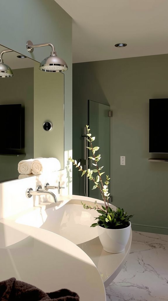
Green Bathroom Paint Colors Inspired by Nature
Sage, Olive, and Soft Green Bathroom Palettes
Muted greens bring an organic calm to bathrooms that’s hard to manufacture with any other color family. Sage creates a sophisticated backdrop that doesn’t demand attention, working quietly behind white fixtures and natural wood elements.
Olive adds more depth and richness, which suits larger rooms with strong natural light to balance the intensity. Soft green palettes pair particularly well with brass hardware and marble countertops, landing somewhere between spa and forest without trying too hard.
How Green Paint Pairs with Wood and Stone
Green and organic materials share an inherent visual language, which is why this pairing works so consistently. Natural oak vanities sit comfortably alongside sage walls, while marble countertops gain warmth against an olive background.
Stone tile floors anchor the whole composition, adding weight and grounding what might otherwise feel too soft. The result is the kind of layered, nature-inspired aesthetic that takes expensive spas years of interior design work to achieve.
Bathroom Paint Colors for a Luxury Look
Deep, Rich Paint Colors That Feel High-End
Deep navy, charcoal gray, and forest green transform ordinary bathrooms into spaces that feel genuinely considered. These saturated hues create a dramatic backdrop that makes marble, brass, and warm wood look more expensive than they are.
The instinct to avoid dark colors in bathrooms is understandable, but it’s also what keeps most bathrooms looking safe and forgettable. Commit to the depth and the room rewards you.
Using Contrast and Accents to Elevate the Space
Dark walls only work when the contrast elements are doing their job. Crisp white trim, brushed gold fixtures, and marble surfaces give the eye a place to land and prevent the room from reading as simply dark rather than intentionally dramatic.
A contrasting vanity color or a well-placed accent wall behind floating shelves draws the eye upward and adds dimension. It’s the tension between the dark field and the lighter details that makes a room feel luxurious rather than heavy.
Bathroom Paint Colors for Small Powder Rooms
Bold vs Light Paint Choices for Powder Rooms
Nobody lives in a powder room, which means you can do things there that would feel overwhelming in a full bathroom. Bold, saturated colors like navy and emerald create drama in small spaces that reads as intentional rather than claustrophobic.
Light neutrals work too, keeping the room airy and open for guests who might not share your taste for the dramatic. The choice really comes down to your home’s overall personality and whether you want the powder room to whisper or make a statement.
Using Color to Create Impact in a Tiny Space
A single bold color applied consistently, walls and ceiling the same shade, actually reduces visual fragmentation and makes a tiny room feel more deliberate. Dark, saturated hues push walls back and create unexpected depth that surprises people in the best way.
If bold feels like too much, a rich warm neutral in a high-sheen finish gives you depth and dimension without full commitment. Either direction, playing it safe with a standard pale neutral is the one choice most designers would tell you to avoid in a powder room.
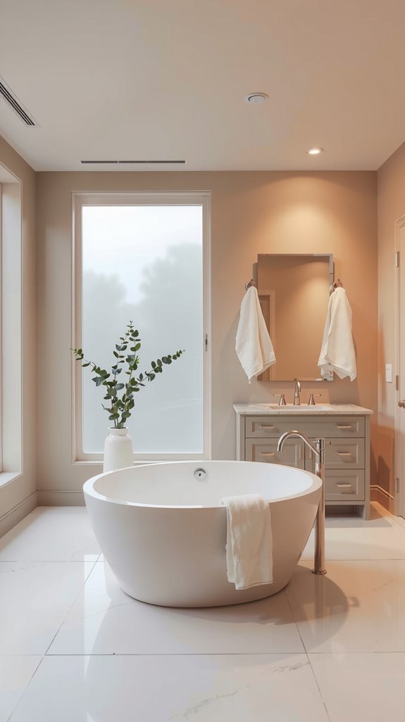
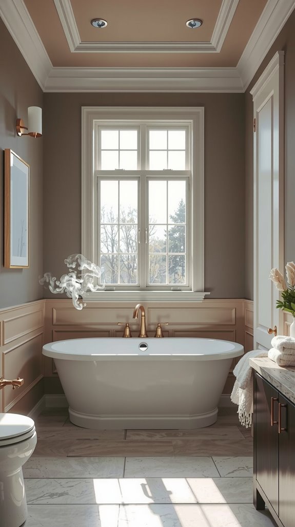
Warm Bathroom Paint Colors That Feel Cozy
Beige, Greige, and Soft Taupe Bathroom Ideas
Beige has a bad reputation it doesn’t entirely deserve, mostly because people choose the wrong version of it. The flat, muddy beiges of the 1990s earned that reputation, but greige and soft taupe are different animals: they have enough gray in them to feel current and enough warmth to make a bathroom feel genuinely comfortable.
These colors work especially well in bathrooms with limited natural light, where they add warmth without darkening the space. Layer two or three tones of the same family and you get subtle depth that a single flat color can’t achieve.
Creating a Comfortable Atmosphere with Warm Tones
Terracotta, warm caramel, and peachy beige do something that cool colors struggle to replicate: they make you want to linger. These shades wrap a bathroom in warmth and turn a routine morning into something that feels a little more considered.
They work particularly well alongside natural wood, warm metals, and soft textiles, materials that speak the same visual language. A bathroom painted in these tones never feels like a utilitarian space, which is exactly the point.
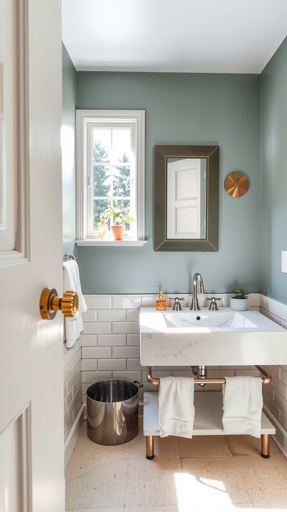
Bathroom Paint Colors That Pair Well with Tile
Matching Wall Paint with Floor and Shower Tile
Wall color and tile aren’t separate decisions, and treating them that way is how bathrooms end up feeling disjointed. Start with your tile, pull the dominant undertone, and use that as your anchor for the wall color.
A wall that echoes the tile’s undertone creates cohesion; one that gently contrasts it creates interest. Both approaches work, but you have to choose one intentionally rather than hoping they’ll figure themselves out.
Using Paint to Balance Busy Tile Patterns
Bold geometric patterns and intricate decorative tiles can carry a bathroom on their own, but only if the walls give them room to breathe. Soft neutrals like warm whites, light grays, and gentle beiges do that job without competing.
The wall color here isn’t supposed to be noticed; it’s supposed to make the tile look better. Understated done well is harder than bold, and in a room with a strong tile, restraint is the smarter play.
Trendy Bathroom Paint Colors Homeowners Love
Current Bathroom Color Trends Worth Trying
The colors showing up in bathrooms right now have moved well past safe neutrals. Earthy terracottas bring warmth and a handmade quality that pairs naturally with wood and raw stone.
Deep jewel tones like emerald and sapphire deliver a sense of luxury that lighter palettes struggle to match. Sage green continues to hold its ground because it works across a wide range of styles and ages better than most trend colors do.
How to Use Trendy Colors Without Dating Your Bathroom
The mistake people make with trend colors is committing to them everywhere at once. Apply a trending shade to a vanity, a single accent wall, or the ceiling, somewhere that can be repainted without a full renovation.
Pair it with timeless neutrals on the surrounding surfaces and let the accessories and textiles carry the seasonal updates. That way, when the trend cycles, you’re updating a throw rug and some towels rather than repainting the whole room.
Bathroom Paint Colors for Rental-Friendly Updates
Safe Paint Choices That Appeal to Most Renters
Neutral paint in a rental bathroom isn’t about playing it safe; it’s about playing it smart. Soft whites, warm beiges, and light grays work with almost any tenant’s belongings and photograph well for listings, which matters more than most landlords realize.
These shades also make spaces feel larger and cleaner, two qualities that consistently move properties faster. The return on a thoughtful neutral is real, and it shows up in both occupancy rates and turnover costs.
Temporary and Low-Risk Bathroom Color Updates
Renters who want a bathroom that feels like theirs without risking a deposit have better options than they used to. Removable wallpaper has genuinely improved: current products mimic marble, concrete, and wood convincingly enough that guests won’t question them.
Installation is straightforward and removal leaves walls clean when the product is applied correctly. It’s a legitimate design tool now, not a compromise.
Bathroom Paint Color Mistakes to Avoid
Common Bathroom Paint Errors That Affect the Space
Most paint regrets follow the same pattern: color chosen from a small chip under store lighting, applied to four walls, and evaluated for the first time when the room is already painted. Testing a large swatch on multiple walls and observing it through morning, afternoon, and evening light catches problems before they cost you time and money.
Ignoring your bathroom’s size when choosing dark shades is another frequent mistake, as is skipping moisture-resistant finishes in a room where steam is a daily reality. These aren’t obscure pitfalls; they’re the same errors that show up in bathroom after bathroom.
How to Test Paint Colors Before Committing
Paint a swatch at least a foot square on two or three different walls, because color reads differently depending on which direction the wall faces. Observe it in the morning under natural light, at midday, and again in the evening under your bathroom’s artificial lighting.
What looks like a clean, warm gray at noon can pull distinctly purple under a cool vanity bulb. That one extra day of observation is the difference between a color you love and one you’re already planning to repaint.