Some kitchen decisions are safe, and some are the kind you look back on and wonder why you waited so long. Painting your lower cabinets a deep sage green while keeping the uppers white is the second kind: a deliberate move that makes the entire space suddenly make sense.
Color blocking isn’t just about making things prettier, though that’s certainly part of it. Used strategically, color can make a cramped galley feel twice its size, create natural boundaries between cooking and prepping zones, and give your kitchen a personality that actually matches how you live in it. The trick is knowing where to go bold and where to hold back. And that’s exactly what these 18 ideas break down.

Contents
- 1 Navy Lower Cabinets With White Uppers for Classic Contrast
- 2 Bold Island in a Single Statement Color
- 3 Two-Tone Cabinetry Using Shades From the Same Color Family
- 4 Accent Wall With Dramatic Color Behind Open Shelving
- 5 Color-Blocked Wet Bar or Coffee Station Zone
- 6 Matte and Gloss Finish Combination for Textural Depth
- 7 Deep Jewel Tones on Base Cabinets With Neutral Walls
- 8 Painted Pantry Doors as Focal Points
- 9 Contrasting Color on Kitchen Island With Brass Hardware
- 10 Upper Cabinets in Bold Hues With Natural Wood Lowers
- 11 Color-Blocked Backsplash With Geometric Patterns
- 12 Colorful Furniture Pieces Against Neutral Cabinetry
- 13 Half-Painted Cabinet Doors for Subtle Blocking
- 14 Vibrant Range Hood as a Color Block Element
- 15 Deep Colors in Cozy Breakfast Nook Areas
- 16 Monochromatic Blocking With Light and Dark Versions
- 17 Color-Blocked Base Trim and Toe Kicks
- 18 Patterned Wallpaper Paired With Coordinating Cabinet Color

There’s a reason this combination keeps showing up in kitchen after kitchen. Navy grounds the space in a way that feels substantial without being heavy, while the white cabinets above keep everything from closing in on you.
The contrast does something clever with your sight lines, pulling your eye upward and making the ceiling feel higher than it actually is. Beyond aesthetics, navy hides the inevitable scuffs and fingerprints that collect on lower cabinets, while white maximizes the natural light that hits your upper storage areas.
Bold Island in a Single Statement Color

Your island shouldn’t apologize for existing, especially since it’s probably doing the hardest work in your kitchen. A shot of sunshine yellow or a deep emerald green turns it into the room’s anchor point, the place your eye lands first when you walk in.
This isn’t about matching your island to anything else in the room—it’s about contrast, about creating a visual break that naturally defines where people gather and where the real work happens. Pair that bold base with a contrasting countertop like white marble, and suddenly you’ve got something that looks intentional instead of accidental.
Two-Tone Cabinetry Using Shades From the Same Color Family

Layering shades from the same color family gives you depth without the drama of full-on contrast. Think charcoal gray on the lowers, lighter dove gray on the uppers—it reads as cohesive but never boring. This works particularly well if your kitchen straddles traditional and modern, because the subtle variation keeps things interesting without picking a side.
Playing with finish is where this approach really shines: a matte lower cabinet next to a glossy upper in a slightly lighter shade creates dimension you can actually feel, not just see.
Accent Wall With Dramatic Color Behind Open Shelving

Open shelving can look unfinished if you don’t give it a backdrop worth looking at. Paint the wall behind those shelves in electric blue or a warm terracotta, and suddenly your everyday dishes become part of the design instead of just things you grabbed at Target.
The color creates separation from the rest of your cabinetry and gives you a natural focal point that doesn’t require any additional work. Just keep what you display relatively minimal—the wall color should do the talking, not compete with a cluttered collection of mismatched mugs.
Color-Blocked Wet Bar or Coffee Station Zone

Your coffee setup deserves its own identity, especially if you’re one of those people who treats their morning routine like a religious experience. Color blocking this area with navy cabinets and warm wood shelving, or emerald lowers with white uppers, gives it the visual weight it needs to feel like an actual destination.
The key is creating enough contrast that the zone reads as separate from your main kitchen, but not so much that it feels like it wandered in from someone else’s house. Under-cabinet lighting sharpens those boundaries even more, making it clear where your coffee world begins and ends.
Matte and Gloss Finish Combination for Textural Depth

Texture matters as much as color when you’re trying to create depth. Glossy upper cabinets bounce light around the room while matte lowers absorb it, giving you a balance that feels grounded but never flat.
This isn’t about picking two different colors—it’s about using finish to make the same color feel like it has layers. Gloss amplifies whatever hue you choose, making bright colors brighter and dark colors richer, while matte brings a softness that keeps the whole thing from feeling too slick.
Deep Jewel Tones on Base Cabinets With Neutral Walls

Deep jewel tones on base cabinets do something almost magical when you pair them with neutral walls. Navy, emerald, or plum create this sense of weight and luxury down low, while white or warm beige walls keep the room from feeling like a cave.
The contrast lets your cabinets be the star without overwhelming every other element in the space. Add unlacquered brass hardware and marble countertops, and you’ve got a kitchen that feels expensive even if it wasn’t.
Painted Pantry Doors as Focal Points

Most people ignore their pantry door, which is a missed opportunity if you’re not ready to repaint every cabinet in sight. A bright turquoise or dusty blue-gray door adds personality without requiring you to commit to a full renovation.
Since it’s such a small surface area, you can go more adventurous than you’d dare with larger elements—this is where chalkboard paint or magnetic finish actually makes sense. Coordinate it loosely with something else in the room, maybe your backsplash or window treatments, and it’ll feel intentional rather than random.
Contrasting Color on Kitchen Island With Brass Hardware

Repainting just your island gives you the biggest visual change for the least amount of work and money. Go with navy, emerald, or even charcoal, then add brass hardware to bring warmth and a bit of formality to the whole thing.
Matte or antique brass works beautifully with darker colors, while polished brass looks sharper against lighter tones. Carry that brass up to your faucet and pendant lights, and suddenly your island isn’t just a different color.
Upper Cabinets in Bold Hues With Natural Wood Lowers

Flipping the usual formula, bold-colored uppers with natural-wood lowers, creates vertical drama that most kitchens lack. Navy or black cabinets above feel modern and sophisticated, while oak or cherry below brings warmth and keeps the whole thing from reading too cold.
The wood ages gracefully, developing character instead of just wear, and those painted uppers give you the flexibility to change colors down the road without ripping everything out. This combination works whether your style leans traditional or minimal, which makes it surprisingly versatile.
Color-Blocked Backsplash With Geometric Patterns

A color-blocked backsplash with geometric patterns turns a functional surface into actual architecture. Hexagons feel contemporary, cubic patterns add dimension, and the defined blocks of contrasting color create natural zones in your kitchen without requiring walls or barriers.
Ceramic and porcelain give you the most color options and hold up well to splashes and heat, while glass tile reflects light back into the room. The precision required for geometric patterns automatically gives your kitchen a modern edge, especially when paired with minimal cabinetry and stainless steel appliances.
Colorful Furniture Pieces Against Neutral Cabinetry

Sometimes the easiest way to add color is through pieces you can move. Navy chairs against white cabinets, burnt orange stools against beige. These combinations give you flexibility without the commitment of paint.
The furniture creates focal points that break up visual monotony and guide people naturally through the space. If you’re nervous about going bold, start with a small accent table or a single chair, then work your way up to larger statement pieces once you’re sure about the direction.
Half-Painted Cabinet Doors for Subtle Blocking

Painting just the top or bottom half of your cabinet doors gives you color blocking without the full commitment. This works especially well on Shaker-style doors where the flat panel creates a natural dividing line.
The technique is forgiving for DIYers—just tape off a clean line, use quality cabinet paint in satin or semi-gloss, and let each coat cure properly. Popular combinations pair white or gray with navy or forest green, giving you contrast that feels intentional but not aggressive.
Vibrant Range Hood as a Color Block Element
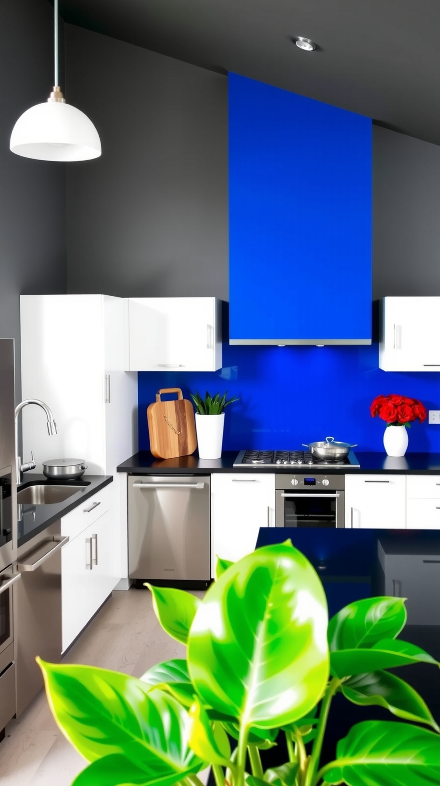
Your range hood sits right at eye level, which makes it the perfect candidate for a bold color choice. A black hood against white cabinets creates instant drama in modern kitchens, while copper brings warmth to farmhouse designs without trying too hard.
Stainless steel gives you durability with a clean finish, but painted steel opens up unlimited color options if you’re willing to commit. Match it to your accent wall or contrast it deliberately with your cabinets—either approach works as long as you’re decisive about it.
Deep Colors in Cozy Breakfast Nook Areas

If you’ve got a breakfast nook tucked into your kitchen, deep colors help it feel like its own room instead of leftover space. Navy, ochre, or charcoal on built-in banquettes creates boundaries without requiring actual walls.
Layer in velvet cushions and metallic pendant lights to add richness and reflection, then balance all that intensity with lighter textiles and plenty of natural light from windows. Built-in storage under the seating keeps the space functional while the color makes it memorable.
Monochromatic Blocking With Light and Dark Versions

Monochromatic blocking, using light and dark versions of the same hue, gives you sophistication without the complexity of managing multiple colors. Darker countertops against lighter upper cabinets create definition and prevent everything from blending into one continuous surface.
Adding varied textures like glossy tiles, matte finishes, and textured materials makes the light and shadow play more interesting within your single color palette. This approach works particularly well in smaller kitchens where too many colors would feel chaotic.
Color-Blocked Base Trim and Toe Kicks

The trim at the base of your cabinets barely registers in most kitchens, which is exactly why painting it a contrasting color creates such impact. This small detail creates visual separation between your cabinets and floor, making heavy lower cabinets feel lighter and adding architectural dimension that most kitchens lack.
You can coordinate the color with your hardware, countertops, or wall paint to tie everything together. It’s a detail most people won’t consciously notice, but they’ll feel the difference in how polished the whole room looks.
Patterned Wallpaper Paired With Coordinating Cabinet Color

Patterned wallpaper gives you a lot more visual interest than paint, and when you match your cabinet color to one of the tones in the pattern, everything clicks into place. Botanical prints look great with navy cabinets, while geometric patterns pop against white.
Apply the wallpaper strategically on an accent wall or behind open shelving rather than covering every surface, and make sure you choose moisture-resistant or vinyl-coated paper that can handle kitchen life. Protective panels behind the sink or stove keep the paper from getting destroyed while still giving you the impact you’re after.