Color sets the emotional temperature of a room before anyone sits down. Get it wrong and the space feels off in ways people can’t quite name. Get it right and the room pulls you in, makes you want to stay.
The difference usually comes down to understanding a few foundational principles, not chasing whatever shade Pantone declared relevant this year.
The combinations ahead are built around those principles, which is exactly why they hold up long after the trends move on.
What defines a modern living room color combination
Modern palettes are defined by restraint, not minimalism for its own sake, but the discipline to let two or three colors do the work instead of seven. You’ll notice that rooms with staying power pair neutrals with one or two deliberate accents, nothing fighting for attention.
The contrast is calculated, crisp boundaries between hues rather than muddled transitions. That clarity is what keeps a room from aging badly.
Clean lines, balanced contrast, and restrained palettes
Strip away ornate details and decorative excess and you’re left with the elements that make a color scheme feel genuinely contemporary. Modern palettes typically work within two to four colors that complement rather than compete.
Crisp boundaries between hues, deliberate negative space, and contrast that creates interest without chaos are what separate a considered scheme from a busy one. The restraint is the point.
| READ THIS GUIDE: Room Color Combination Ideas Designers Actually Use (And Why They Work). |
Why modern colors feel timeless rather than trendy
Trends burn bright and fade fast, but truly modern color combinations are anchored in how colors actually interact in space.
Neutral foundations, balanced proportions, and sophisticated restraint outlast any seasonal palette because they’re rooted in visual principles rather than editorial whims. A well-chosen gray-and-cream room from fifteen years ago still looks current today. That staying power isn’t an accident.
Best modern color combinations for living rooms
The combinations that consistently hold up share a few qualities: a clear dominant color, a secondary tone that supports rather than competes, and one grounding element that keeps the whole thing from floating.
White and gray, warm beige with charcoal, deep green with black accents, these aren’t random pairings. They work because the relationship between the colors is deliberate. Start with that logic and the specific shades become easier to choose.
SEE THIS: Two Color Combination for Living Room (Easy Pairings That Always Work).
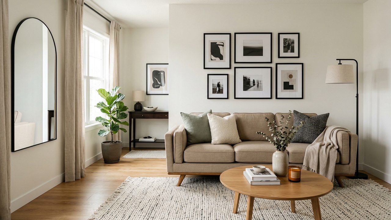
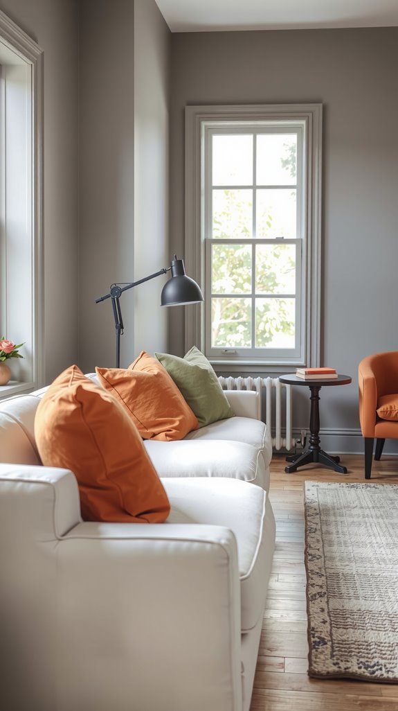
White and gray combinations
Few combinations have held up longer in contemporary interiors than white paired with gray, and there’s a reason designers keep returning to it. Layering charcoal, dove, and warm gray tones against a white wall creates depth without drama.
Furniture and artwork take center stage because the backdrop isn’t competing. In smaller rooms especially, this pairing opens up the space rather than closing it down.
| READ THIS: Color Combination for Living Room: Stylish Ideas That Always Work |
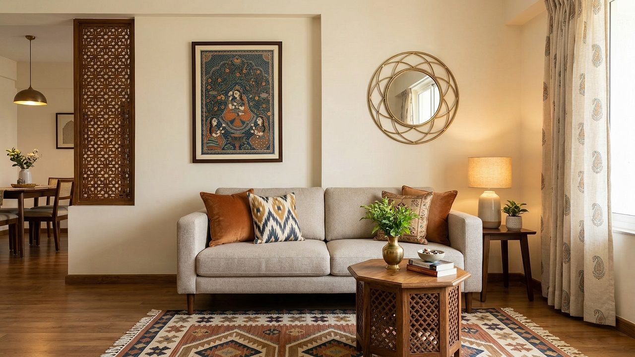
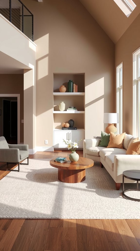
Beige and greige modern palettes
Stark gray-and-white schemes can read cold depending on your light, and that’s where greige earns its reputation. It sits right between beige and gray, carrying the warmth of one and the crispness of the other.
These tones work particularly well in rooms with north-facing windows, where cool light would otherwise flatten a colder palette. Pair greige walls with natural linen and wood and the room feels genuinely livable.
Black accents in modern spaces
A lot of people avoid black entirely, worried it will make a room feel heavy, but the opposite tends to happen when it’s used with a light hand. Black window frames, thin metal light fixtures, or tapered furniture legs give a neutral room its backbone.
Without that grounding element, beige-and-white spaces can start to feel unfinished, like a sketch without any ink. A few well-placed black details and suddenly everything else snaps into focus.
Neutral modern color combinations
One neutral flat on the walls isn’t a color scheme, it’s a starting point. The richness comes from stacking related shades, moving from lightest on the walls down through furniture and into darker accessories.
Understanding whether your neutrals are pulling warm or cool is what keeps the layers from clashing. Get that right and a room built entirely on neutrals can feel more complex than one loaded with color.
Warm vs cool neutrals in modern interiors
Warm neutrals like beige, cream, and taupe carry underlying yellow or red tones that make a room feel immediately inviting. Cool neutrals, your grays, whites, and charcoals, deliver a crisper, more contemporary atmosphere through their blue and green undertones.
The mistake most people make is mixing warm and cool neutrals without realizing it, and the room ends up feeling muddled rather than layered. Pick a direction first, then build around it.
SEE THIS: Modern Color Combination for Living Room (Clean, Stylish & Timeless).
Layering neutral shades for depth
Three to five related neutral shades working together create a visual richness that a single-color room simply can’t match. Start with your lightest tone on the walls, then bring in progressively deeper neutrals through furniture, textiles, and accessories.
Warm beige walls with a cool gray sofa and a charcoal throw create subtle tension that keeps the eye moving. That movement is what stops a neutral room from feeling like a waiting area.
Modern two-color living room combinations
Two-color schemes are harder to pull off than they look because there’s nowhere to hide a weak choice. The most reliable approach pairs a dominant neutral base with one stronger tone that provides definition without taking over.
Whether that second color is a deeper shade of the same family or something with more personality depends entirely on the light in the room. Get the ratio right and two colors are all you need.
Dominant neutral with a darker contrast
Beige walls with charcoal furniture, cream backdrops with navy blue elements, these pairings work because the neutral foundation provides visual calm while the darker tone introduces structure.
Without that contrast, a room full of light neutrals can feel formless, pleasant but not resolved. The darker element doesn’t need to dominate, a sofa, a rug, or even a single wall is enough. Let it anchor the room and the lighter tones will do the rest.
SEE THIS: Light Color Combination for Living Room (Bright, Airy & Timeless).
Soft modern color pairings
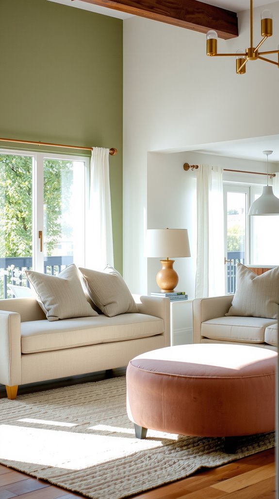
Sage green with cream, dusty blue with warm white, blush with soft gray, these combinations don’t shout, but they’re remarkably hard to grow tired of. They work because both colors are receding rather than advancing, so the room breathes.
In tighter living spaces this matters enormously, since aggressive contrast can make walls feel like they’re closing in. Choose one of these pairings, lean into texture, and the space does the rest.
Light Color combinations for living rooms
Light palettes are often mistaken for safe or boring choices, but a well-executed light scheme is one of the more demanding things to pull off. Too much uniformity and the room looks washed out.
Too little contrast and there’s nothing to anchor the eye. The goal is a palette that reads as open and airy while still having enough variation to feel intentional.
Light neutrals for open, airy spaces
Soft whites layered with warm beiges and pale grays establish a sense of spaciousness that darker palettes simply can’t replicate. These tones reflect natural light effectively, pushing the walls back and making even modest rooms feel generous.
The key is keeping the value range tight, too much contrast and the airy quality collapses. Vary the tones through furniture and textiles rather than on the walls themselves.
Subtle contrast in modern light palettes
A flat light palette reads as sterile faster than almost any other design mistake. Warm whites paired with cool grays, or cream walls set against charcoal accents, introduce just enough tension to keep the room visually alive.
Textured fabrics in varying shades add dimension that paint alone can’t provide. Black metal frames and dark wood ground the whole composition without pulling focus from the lightness of the room.
Dark modern color combinations
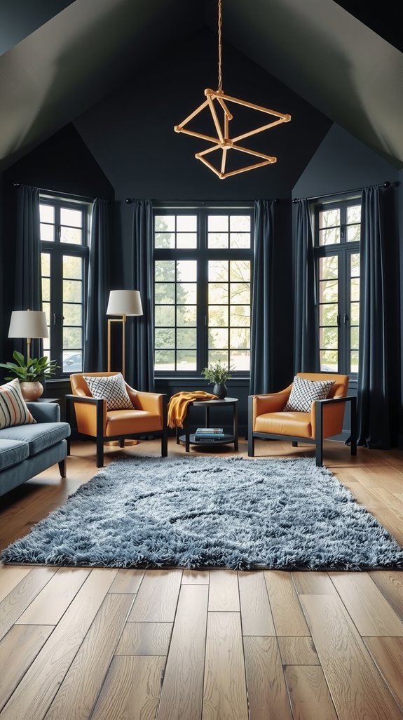
Dark rooms done well are among the most impressive interiors you’ll walk into, but they require commitment and good bones. The palette needs internal logic, colors that share the same visual weight and don’t fight each other.
What saves them from feeling oppressive is thoughtful layering of texture, metallic finishes, and carefully placed light sources. This is not a palette for a room with one overhead bulb and no windows.
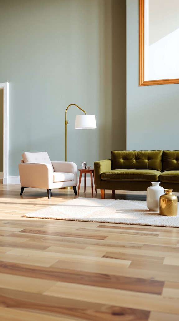
Charcoal, deep green, and black modern palettes
Charcoal, deep forest green, and black work together because they occupy similar tonal territory without competing. Used together in a room with enough natural light, they create a sense of depth that lighter palettes simply can’t achieve.
Metallic finishes, brass hardware, or a worn leather chair give the eye something warm to rest on. Balance is everything here, lean too far into any single dark tone and the room starts to close in.
Balancing dark colors with light and texture
Dark walls need contrast to breathe, and that contrast usually comes from texture before it comes from color. Linen, wool, and leather introduce variation in how surfaces catch and reflect light, which keeps the room from reading as a single flat mass.
Lighter accent cushions, a natural fiber rug, or bare wood shelving give the eye places to land. Without those breaks, even a beautifully chosen dark palette can feel relentless.
Lighting considerations for dark modern rooms
You can nail every color decision and still have a room that feels wrong if the lighting is flat or poorly placed. Dark schemes demand a layered approach, ambient ceiling fixtures, directional spots to highlight architectural features, and table or floor lamps at varying heights.
Natural light is equally important, and unobstructed windows in a dark-toned room are non-negotiable. Think of lighting as the last color you’re adding to the palette, because functionally, it is.