Your RV’s color scheme is either working for you or against you, and most people don’t realize which until they’re already living inside a mistake. Two hundred square feet is unforgiving; the wrong palette makes a cozy space feel like a storage unit, and no amount of clever organization fixes that.
The good news is that color is one of the cheapest changes you can make to a rig. Understanding a few basic principles about how color behaves in tight, light-limited spaces is all that stands between a cramped interior and one that actually feels like somewhere you want to be.
Here’s what those principles look like in practice, and how to put them to work in your own space.
How to Choose the Right RV Interior Color Scheme
Two hundred square feet has a funny way of exposing every bad design decision you’ve ever made. Paint the wrong color in a Class C and you’ll feel it in your chest by the third morning, like the walls are slowly tightening.
Get the color right, though, and that same space suddenly breathes. It’s not expensive and it’s not complicated; it’s just understanding how color behaves when it’s trapped in a box on wheels. That understanding starts long before you ever open a paint chip.
Understanding lighting inside an RV
Spend a full day inside your rig before you commit to anything. Watch where the sun hits at 8 a.m., where shadows pool by mid-afternoon, and which corners never seem to catch light at all.
Your window placement and orientation will shape every color decision that follows, more than any trend or personal preference. A warm tan that glows like honey under southern exposure can turn flat and muddy in a north-facing space..
| READ THIS: The Ultimate Guide to RV Decorating Ideas (Inside, Outside & Every Style in Between). |
Choosing a 2-3 color formula for cohesion
Most people pick colors they like individually and hope for the best, which is exactly how you end up with a rolling headache.
The 60-30-10 rule gives you a framework: one dominant neutral covers roughly 60% of the interior, a secondary complementary shade takes 30%, and a single accent color handles the rest. That ratio keeps the space visually organized without going so safe it feels sterile. Think of it less as decoration and more as spatial management.
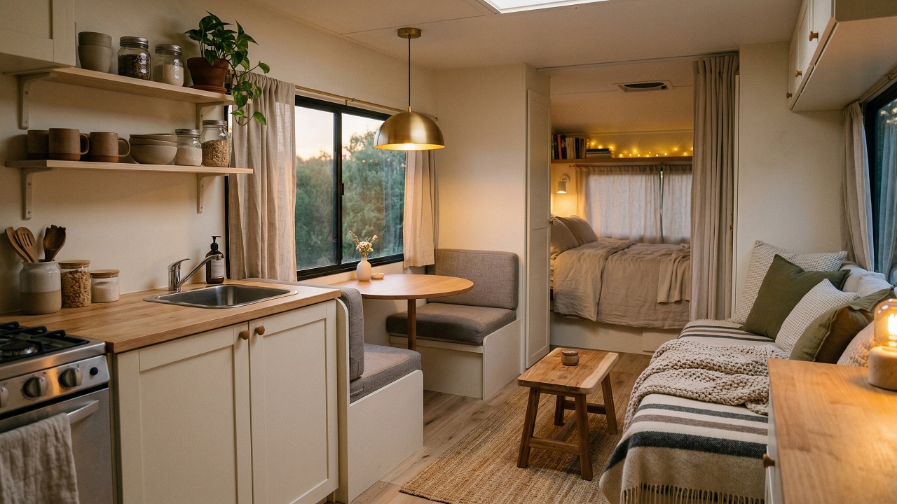
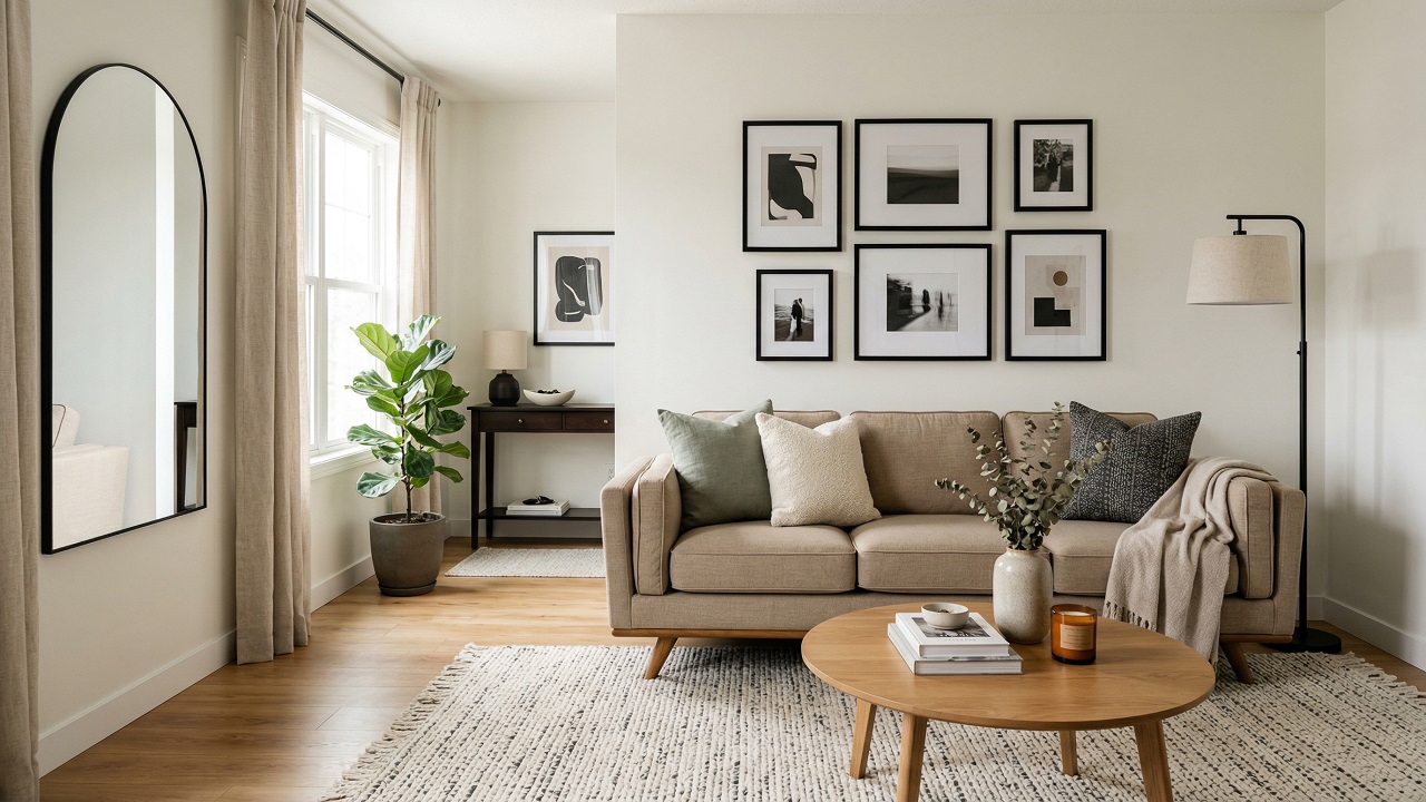
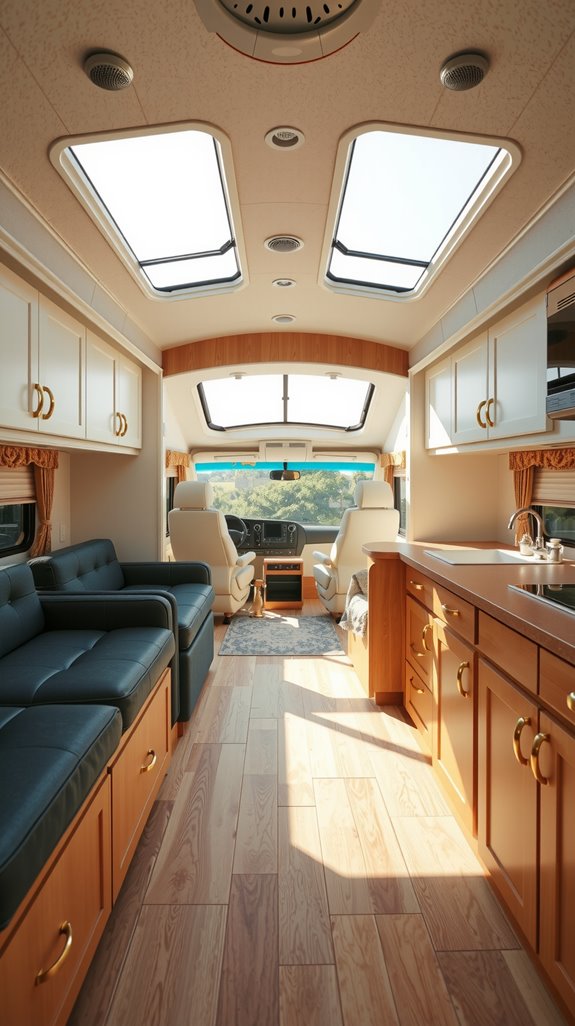
Light and Neutral RV Color Palettes
Warm whites, creams, and greige foundations
There’s a reason nearly every professional RV makeover starts with a warm neutral on the walls. These tones bounce natural light around a tight interior in a way that cool or stark whites simply don’t.
Creams and greiges also give you flexibility, swap a few throw pillows and your whole color story shifts without a drop of new paint. They’re not boring choices; they’re the smartest ones you can make in a small space.
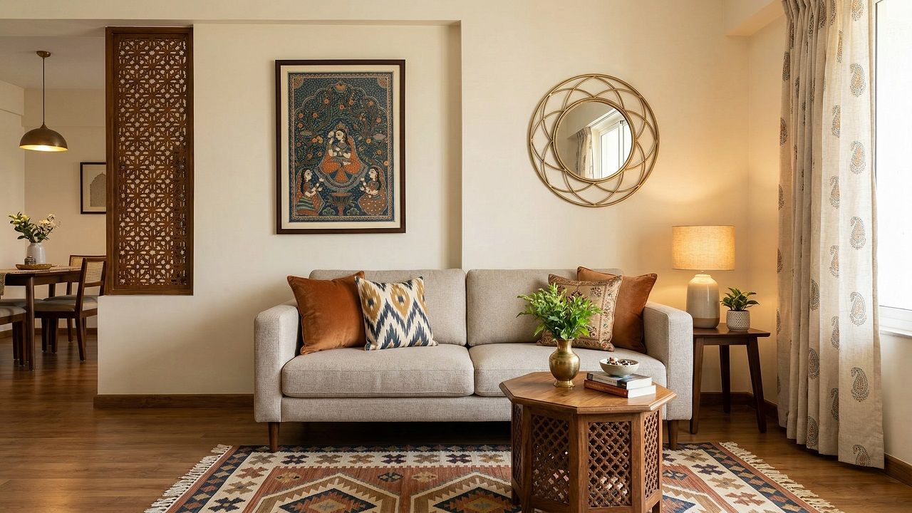
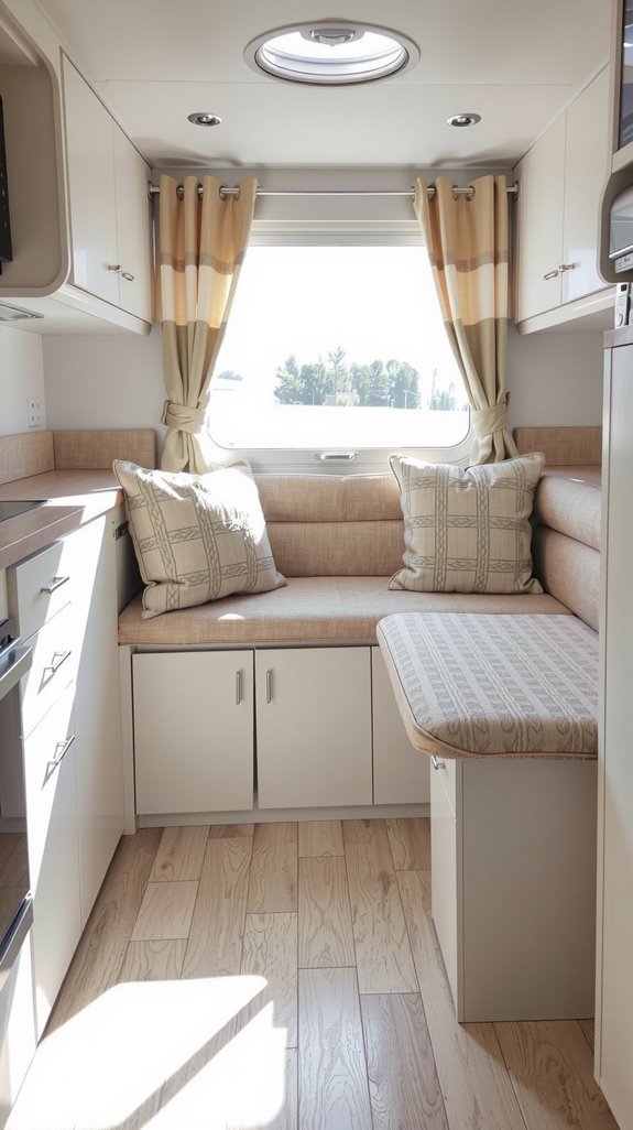
Adding soft accent colors like sage or dusty blue
Once your neutral base is in, resist the urge to go bold with your accents. Muted tones like sage green, dusty blue, or warm terracotta add real character without pulling the walls inward.
Introduce them through textiles first, since pillows, curtains, and a small rug are low-commitment and easy to swap if the look isn’t landing. Two or three accent pieces is usually enough; let them breathe.
SEE THIS: RV Outside Decorating Ideas for Stylish & Functional Campsites.
Dark and Moody RV Interiors Done Right
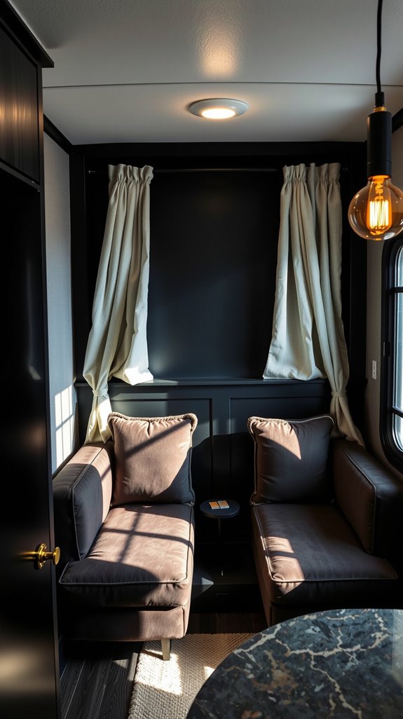
Using contrast to avoid a closed-in feeling
Bold, moody interiors in an RV aren’t the mistake most people assume, provided you understand how contrast works in your favor. Pair deep-toned walls with crisp white trim and light-colored surfaces, and the eye travels through the space instead of stopping cold.
That movement is what keeps a dark interior from feeling oppressive. Strategic contrast actually creates visual depth that an all-neutral palette can’t match.
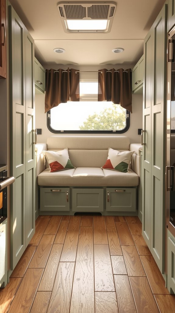
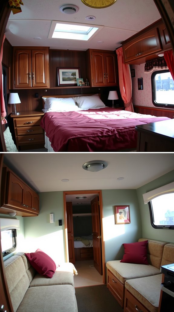
Pairing darker cabinets with light walls
Dark lower cabinets grounded against creamy upper walls do something interesting in a tight space; they anchor the room without shrinking it. The lighter walls above reflect enough light to keep the interior feeling open, while the rich cabinetry below adds a sense of weight and intention.
It reads as designed rather than accidental, which matters when you’re living in close quarters. As a practical bonus, darker cabinetry hides the scuffs and wear that come standard with life on the road.
SEE THIS: RV Decorating Ideas by RV Type (Class A, C & Fifth Wheel).
Coordinating Cabinets, Flooring, and Textiles
Balancing wood tones in compact layouts
Wood is warm and grounding, but too many competing tones in a small space will make it feel chaotic and unresolved. Stick to two complementary finishes at most, one dominant tone for major surfaces like floors and lower cabinets, and one accent tone introduced through furniture or trim.
The dominant finish should appear on your largest surfaces so the eye has somewhere to settle. That second tone is where you introduce depth, not variety for its own sake.
Creating flow from kitchen to bedroom
An RV isn’t a collection of rooms; it’s one continuous space, and your materials need to treat it that way. Let a single flooring material run wall to wall so the eye isn’t interrupted by unnecessary transitions between zones.
Coordinate cabinet finishes between the kitchen and bedroom so the space reads as intentional rather than piecemeal. From there, use textiles to draw the zones together without forcing them to match perfectly.
SEE THIS: RV Organization That Looks Like Decor.
Common RV Color Mistakes to Avoid
Overusing trendy colors without considering space
Jewel tones are having a moment in traditional home design, and that’s fine when you have 2,000 square feet to absorb them. In a 200-square-foot RV, saturated hues eat light and make an already compact interior feel genuinely oppressive by mid-afternoon.
You’ll also tire of a bold statement color far faster when you’re living inside it full-time rather than just visiting. Lean toward muted, livable versions of whatever trend interests you, and your future self will thank you.
Ignoring natural light direction
Unlike a house, your RV parks somewhere different every few days, which means the light hitting your windows is constantly shifting. A color you approved under bright desert sun in Arizona can look completely wrong parked under tree cover in the Pacific Northwest.
Always test paint samples across multiple lighting conditions, including morning light, afternoon shadow, and your artificial lighting at night. The color on the chip is never the color on the wall.