Choosing the right two-color combination for your living room doesn’t require a design degree, but it does demand strategic thinking.
Picking two colors for a living room sounds simple until you’re standing in a paint aisle holding seventeen sample chips and second-guessing everything.
Most people approach it backwards, falling in love with a color before thinking about how it’ll behave in their actual space, under their actual light, next to their actual furniture.
The results tend to look great on Pinterest and strange in real life. Get the thinking right first, and the colors will follow. That’s exactly what the pairings ahead are built around.
How to Choose the Right Two Color Combination for Your Living Room
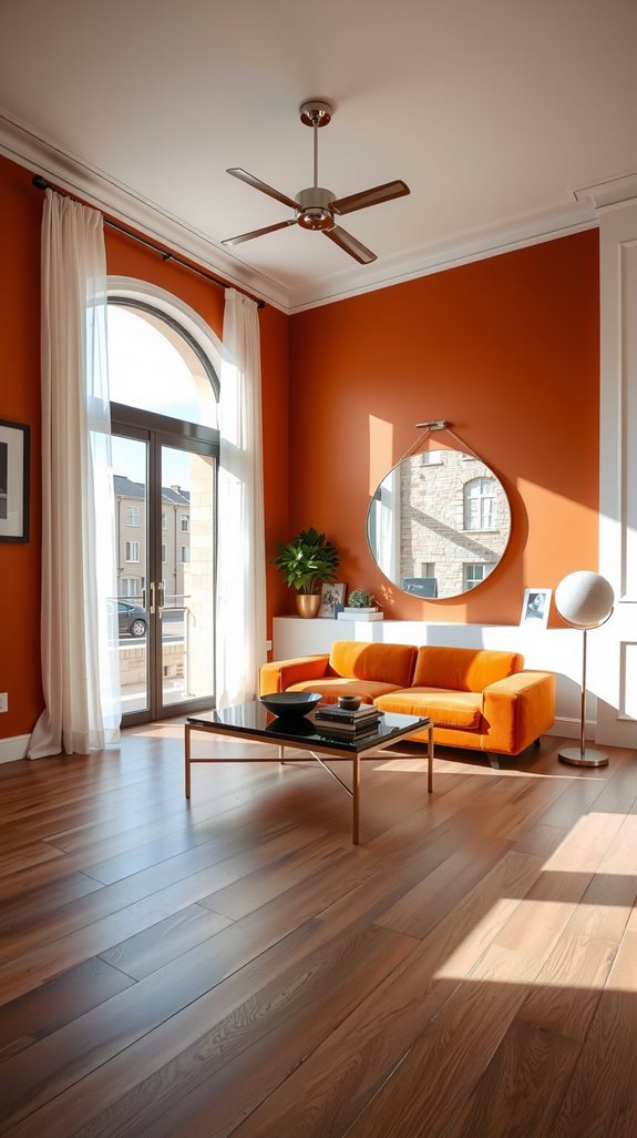
Every successful two-color room starts with one decision: which color leads and which one supports. Without that hierarchy established early, the rest of your choices will feel like guesswork.
Your dominant hue should cover 60-70% of the room, typically landing on walls or the largest furniture pieces. The supporting color works in the remaining areas, adding visual interest without competing for attention.
Choosing a dominant color vs a supporting color
Think of your dominant color as the room’s personality and the supporting color as its edge. The dominant shade handles the heavy lifting, walls, large sofas, area rugs, the things your eye hits first when you walk in.
The supporting color shows up in pillows, artwork, a side chair, or a throw, present enough to register but never loud enough to take over. Get that balance wrong and the room either feels flat or chaotic, get it right and it looks like you knew exactly what you were doing.
| READ THIS GUIDE: Room Color Combination Ideas Designers Actually Use (And Why They Work) |
How lighting affects two-color combinations
A color you loved in the store can look completely wrong once it’s on your walls, and lighting is almost always why. North-facing rooms pull cool and bluish, which flattens warm tones and makes reds look muddy.
South-facing spaces intensify warmth, sometimes turning a soft terracotta into something closer to orange. Test your samples at morning, midday, and evening before you commit, because you’re not just choosing a color, you’re choosing how it lives in light.
Two Color Combination for Modern Living Rooms
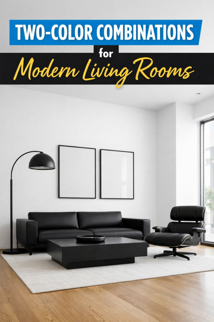
Modern interiors reward restraint, and the strongest two-color combinations in contemporary spaces tend to be ones that don’t try too hard. High contrast pairings like black and white create clean architectural lines, while warmer neutrals like greige combinations build depth without visual tension.
Muted pairings, sage green with soft terracotta or dusty blue with muted mauve, bring personality into a room without overwhelming it. The common thread is that each color has a clear job and doesn’t drift into the other’s territory.
Black and white modern living room palettes
Black and white is the combination designers keep returning to because it earns every bit of attention it demands. Crisp white walls against black furniture create sharp architectural clarity, while reversing the ratio produces something moodier and more enveloping.
The real advantage of this palette is what it allows: texture becomes everything, so matte blacks against glossy whites, rough linens against smooth lacquer, do the work that color would handle elsewhere. It’s a disciplined palette, but when it’s executed well, very few combinations can touch it.
| READ THIS: Color Combination for Living Room: Stylish Ideas That Always Work |
Gray and beige (greige) combinations
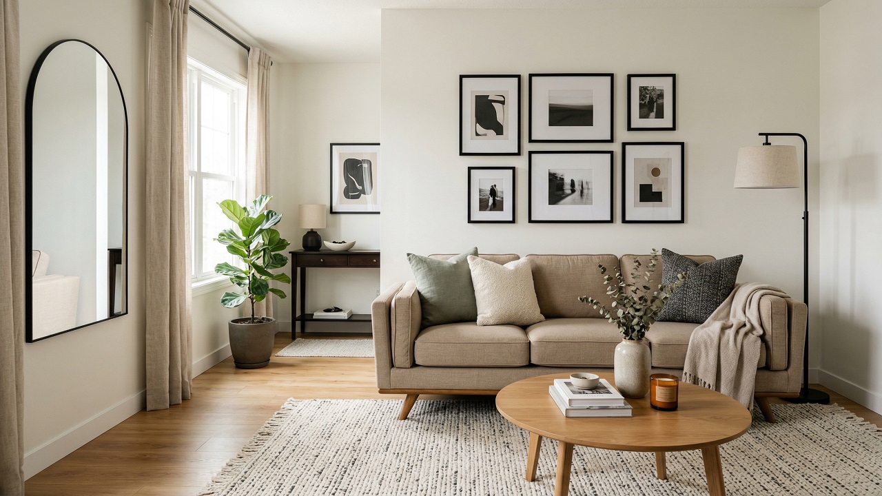
Greige sits in that quiet zone between cool and warm, which is exactly why it works so well as a two-color foundation. Pair two greige shades of different depths and you get a room that feels layered without feeling busy.
The neutral base also gives you freedom later, any accent color you bring in through art or cushions will read clearly against it. It’s the kind of palette that photographs well, ages well, and doesn’t demand much in return.
Muted color pairings for modern interiors
Not every modern room wants to be high contrast, and muted pairings give you sophistication without the tension. Sage green with soft terracotta creates warmth that feels organic rather than decorative.
Dusty blue with muted mauve introduces subtle contrast that reads as calm and considered. These combinations let your furniture and architectural details stay in focus, which is often exactly where you want the attention.
Light and Dark Two Color Living Room Combinations
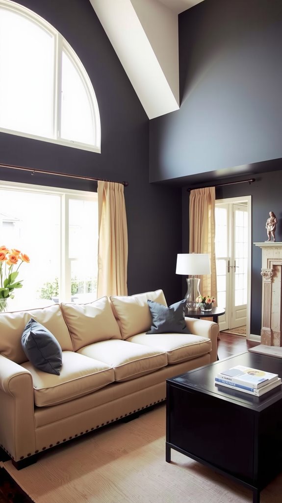
Light and dark pairings work because contrast gives the eye somewhere definite to land. The challenge is calibrating how much contrast you actually want, because the difference between dramatic and uncomfortable is narrower than most people expect.
A pale wall with dark furniture reads as grounded and intentional. Dark walls with light trim and accents pull the room inward in a way that feels like a deliberate retreat rather than a mistake.
Light walls with dark accent colors
Light walls with dark accents create a visual hierarchy that anchors a room without closing it in. Dark furniture, charcoal textiles, or bold artwork against a pale backdrop establish focal points that feel considered rather than accidental.
The light background keeps the space from feeling heavy, while the dark elements stop it from feeling thin. It’s one of the more forgiving combinations to work with because small adjustments in either direction tend to look intentional.
Dark walls paired with light trim and décor
Dark walls flip the conventional approach and the results, when done right, are hard to argue with. Navy, charcoal, or forest green against crisp white crown molding and baseboards creates contrast that feels architectural rather than decorative.
Cream furniture, pale throw pillows, and light-toned accessories pop against the dramatic backdrop in a way they simply wouldn’t on a white wall. The room pulls inward and feels like somewhere you’d actually want to spend an evening.
Avoiding harsh contrast
Not every room calls for drama, and sometimes the most sophisticated choice is restraint. If the full light-dark split feels too theatrical for your space, choose colors that sit only two or three shades apart on the same paint strip.
Charcoal walls with medium gray trim, or warm white walls with a soft linen trim, give you definition without the jarring jump. The room still has dimension, it just earns it more quietly.
Simple Two Color Combination for Living Room
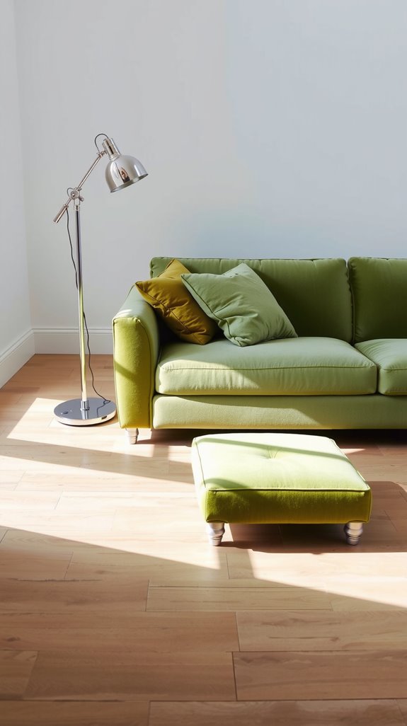
Simple two-color palettes tend to outlast trendier choices because they don’t depend on a moment in design culture to look right. Beige and white, gray and cream, taupe and ivory: these pairings create a quiet foundation that lets furniture and art carry the visual weight.
They also give you flexibility, when you want to refresh the room in a few years, you’re changing accents rather than repainting walls. That kind of longevity is worth more than most people give it credit for.
Neutral two-color palettes
Neutrals get dismissed as the safe choice, but executed well, they’re anything but boring. The key is treating the two shades as genuinely distinct rather than letting them blur into one another.
Pair a warm beige with a cooler white, or a blue-gray with a creamy ivory, so there’s enough differentiation to read as a real combination. The foundation you build with neutrals is what makes every other element in the room, furniture, art, plants, look intentional.
Using texture instead of bold color changes
When you’re committed to a simple palette, texture becomes the tool that does what color would otherwise handle. Layer smooth velvet cushions with chunky knit throws, pair glossy ceramic vases with rough jute rugs, or put sleek leather furniture next to woven baskets.
The eye reads those material contrasts as visual interest even when the color story stays quiet. A room with two neutral colors and five distinct textures will almost always feel richer than one with five colors and no textural variation.
Two Color Combination for Small Living Room
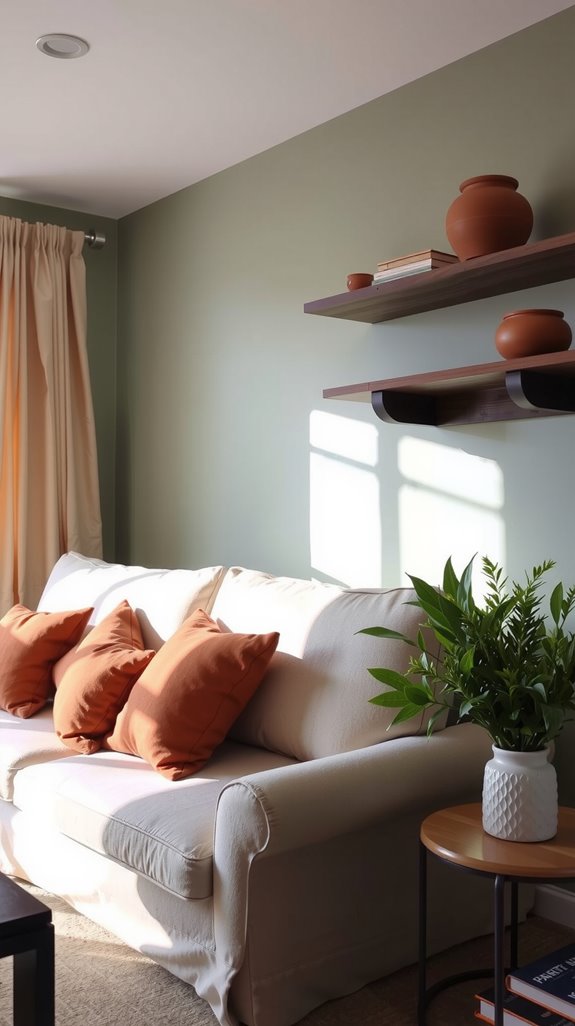
Small living rooms don’t forgive careless color choices the way larger spaces sometimes can. Every decision carries more consequence when the room has less room to absorb mistakes.
The right two-color combination can make a compact space feel more open, more considered, and more intentional than a room twice its size. The wrong one makes it feel like the walls are closer than they actually are.
Two-tone combinations that visually expand space
Light neutrals paired with soft whites are the reliable workhorses of small-room design because they reflect natural light rather than absorbing it. Cool tones like pale blue with crisp white create a sense of depth that the eye reads as physical distance.
Monochromatic schemes in varying shades add dimension without the visual noise that comes from strong contrast in a tight space. The goal is to make the room feel like it continues rather than stops.
Vertical color placement tricks
Where you place color matters as much as which colors you choose, especially in a room with low ceilings or limited square footage. Painting walls in a lighter shade while keeping darker tones low, on furniture and floor-level accents, pulls the eye upward and makes the ceiling feel higher than it is.
Floor-to-ceiling curtains in your secondary color reinforce that vertical movement and add the impression of height even in rooms that don’t have it. It’s one of those techniques that sounds minor until you see it working in an actual room.
Common Mistakes with Two Color Living Room Combinations
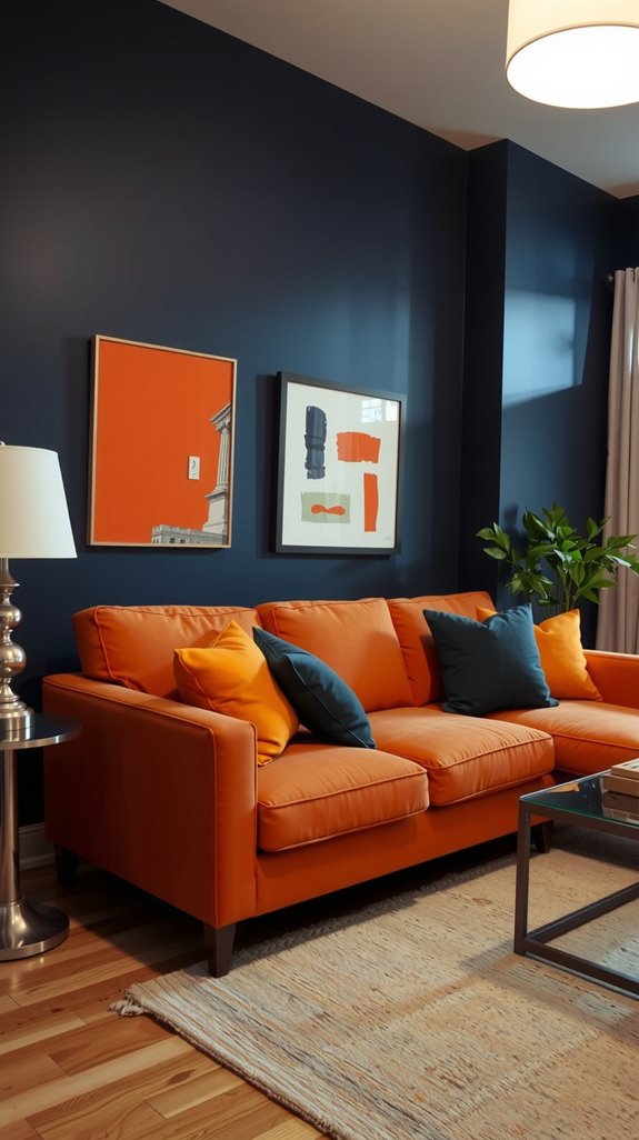
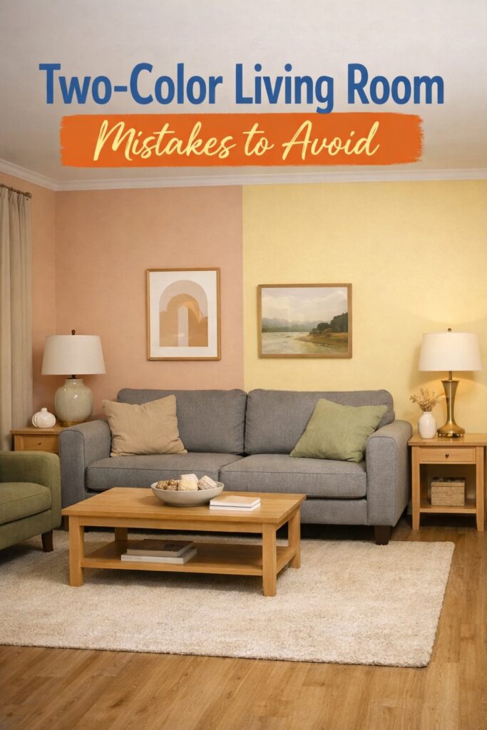
Most two-color mistakes come down to the same handful of errors, and they’re easy to avoid once you know what to look for. Identical undertones, equal color distribution, and ignoring existing furniture are the three that show up most often.
Each one produces a slightly different kind of visual problem, but they all share the same root cause: not thinking about how the colors will actually interact in the space. Catching these early saves you from repainting a room you just finished.
Choosing colors with the same undertone
Pairing two colors with identical undertones, both warm or both cool, produces a room that reads as monotonous rather than cohesive. The eye expects a little tension between two colors, something that signals they were chosen together rather than defaulted to.
Mixing a warm tone with a cool one creates that dynamic; the contrast between them is what generates depth and dimension. Without it, the combination technically works but never quite comes alive.
Using equal amounts of both colors
Splitting a room fifty-fifty between two colors creates visual confusion because the eye has no clear place to settle. Neither color reads as the dominant one, so the room feels like it can’t make up its mind.
The 60-30-10 rule exists for exactly this reason: 60% dominant color, 30% secondary, 10% for accents. That imbalance is what creates the hierarchy that makes a room feel resolved.
Ignoring furniture and flooring
Your furniture and flooring are already contributing color to the room, whether you account for them or not. A brown leather sofa and oak floors introduce warm neutrals that will interact with every paint color you put on the walls.
Treating them as neutral background elements rather than active parts of your palette is how you end up with combinations that fight each other. Count them in from the start, and your two chosen colors will have a much better chance of actually working.
