Think about the way your living room feels at sunset. The light turns honeyed, and everything looks softer than it did at noon.
That is the mood most people chase with warm colors. The trick is keeping that glow without making the room feel small. After painting more than a few walls twice, I’ve figured out what actually works, and I break it all down here.
What makes a color combination feel warm
Warmth starts with undertones, not the name on the paint can. A beige with yellow hiding inside feels different than one with gray.
Fabrics and woods carry the same subtle shifts. When those red and amber notes repeat around the room, the space settles into a calm glow.
Understanding warm undertones
Look closely at a cream wall in daylight and you will see its base. Some lean buttery, others lean pink, and that difference matters.
Even taupe can tilt warm if it carries a hint of red. Once you train your eye, mixing shades becomes far less risky.
Why warm colors create comfort and depth
Our brains link warm hues to firelight and late afternoon sun. Those memories make a room feel safe before we even sit down.
Warm shades also move forward visually, so walls feel closer. Used well, that closeness feels intimate instead of cramped.
Choosing warm color combinations for living rooms
Start with the largest surfaces and work outward from there. Walls and sofas set the tone long before throw pillows do.
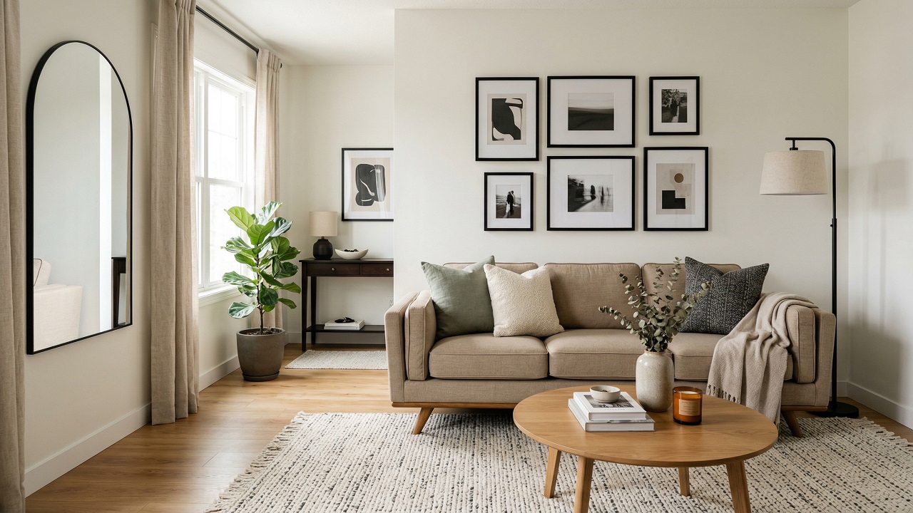
I usually anchor a room in a soft beige or creamy white. Then I layer deeper colors in pieces that can move or change.
Selecting warm base colors
A warm neutral on the walls gives you breathing room. Cream, light beige, or soft taupe hold light without glare.
They make wood floors look richer and skin tones healthier. Once that base is steady, bolder shades feel intentional rather than loud.
Balancing warmth with neutral shades
Too much warmth can feel heavy, especially at night. That is when cooler neutrals earn their keep.
A gray lamp base or crisp white trim cuts through the amber glow. The contrast keeps the room feeling fresh instead of stuffy.
Avoiding overly dark or muddy palettes
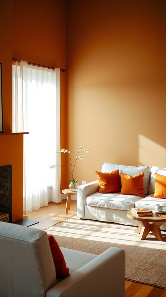
Deep browns and rust tones look beautiful in samples. Cover every wall with them and the room can shrink fast.
I have seen rich palettes turn cave-like by accident. One darker shade paired with lighter creams keeps the mood rich but livable.
Best warm color combinations for living rooms
Beige and brown combinations
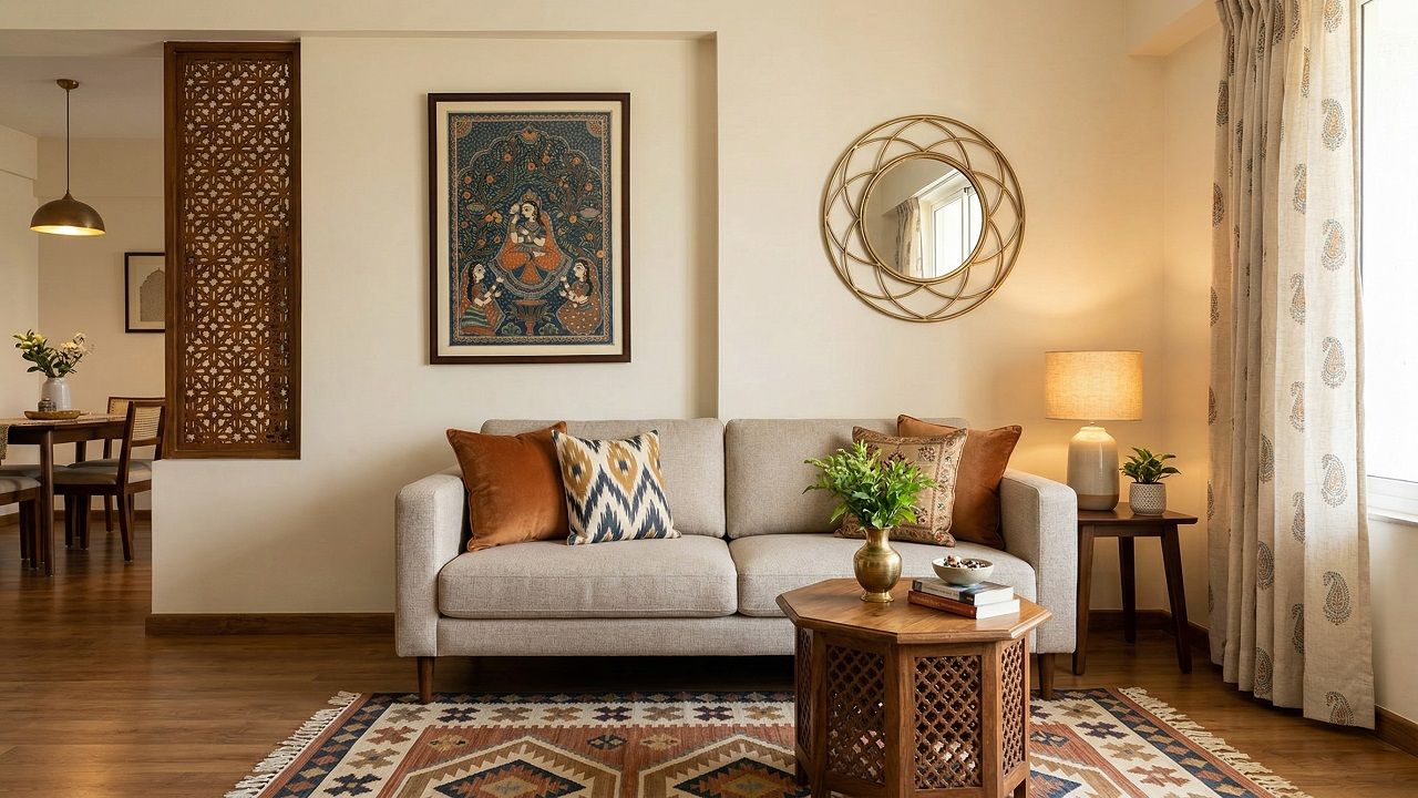
Beige and brown work because they share the same roots. Light beige walls let darker wood furniture stand out.
Add woven baskets or leather chairs and the depth builds naturally. The result feels grounded without trying too hard.
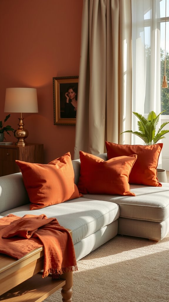
Cream and soft terracotta palettes
Cream paired with soft terracotta reminds me of sun-baked clay. Terracotta works best in doses like pillows or a single chair.
Against cream walls, it glows instead of shouting. The combination feels warm but still easy to live with.
Warm taupe and tan pairings
Taupe and tan look similar until you see them side by side. Taupe carries a touch of gray, which cools the golden edge of tan.
Mixing the two through rugs and upholstery creates quiet layers. It is subtle, but the room feels deeper because of it.
Warm color combinations for walls
Warm wall colors that reflect light
If your room lacks strong sunlight, choose lighter warm shades. Soft peach or pale beige can bounce what light you have.
Darker colors absorb light and make evenings feel dim. A mid-range tone keeps warmth without stealing brightness.
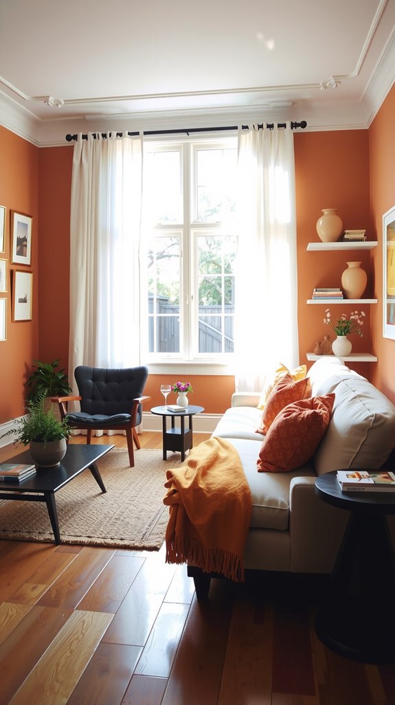
Accent wall ideas using warm tones
An accent wall lets you take a risk safely. A deep rust or muted ochre behind the sofa adds focus.
The other walls stay lighter, so the room does not close in. It is a controlled way to add drama.
Warm color combinations for small living rooms
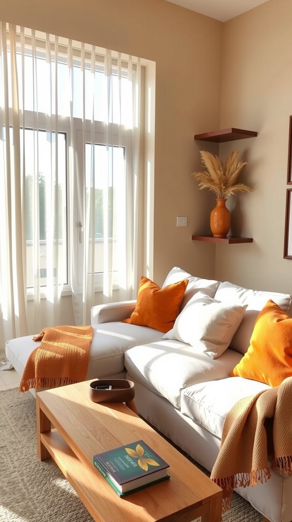
Light warm neutrals that keep spaces open
Small rooms need warmth with restraint. Light warm neutrals stretch the space visually. Soft beige or warm white keeps corners from feeling tight.
Layer texture instead of heavy color to build interest.
Soft warmth without overpowering the room
In tight spaces, color works best in smaller pieces. Try muted terracotta in cushions or art. Keep the larger surfaces calm and pale.
That way you feel the warmth without losing airiness.
Mixing warm colors with cool elements
Adding balance with cool accents
Even the coziest room benefits from a little contrast. A blue vase or green plant cuts through heavy amber tones.
Those cooler notes give your eyes a place to rest. Balance is what keeps warmth from turning sticky.
Preventing overly orange or yellow tones
Orange and yellow can take over quickly. I temper them with soft gray or off-white nearby.
Navy or sage in small doses also steadies the palette. The room keeps its glow without drifting into cartoon territory.
Using texture and metal finishes
Color alone never carries a room. Texture does half the work. Linen curtains, wool throws, and worn leather add depth without more pigment.
A touch of brushed nickel or chrome cools the space just enough to keep it honest.