We’ve all been there: you pick a paint color you love, roll it onto four walls, move the furniture back in, and suddenly the room feels like a mistake. Getting wall color right isn’t about taste alone.
It’s about understanding how light, proportion, and the surfaces around your walls all conspire to change what you’re seeing.
Most people skip that part, and that’s where things go wrong. Here’s how to think through it properly.
How to Choose the Right Color Combination for Living Room Walls
Understanding natural light and wall direction
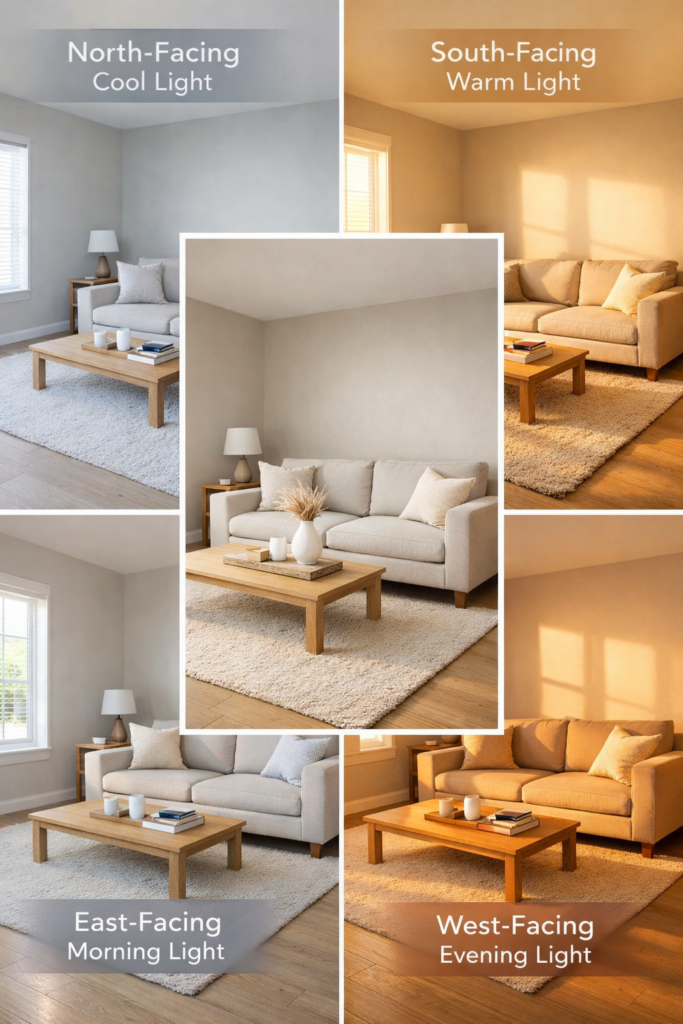
Natural light is the single biggest variable most homeowners underestimate, and it shifts constantly throughout the day.
A north-facing room gets cool, indirect light all day, which means warm tones like beige and cream keep the space from feeling flat and cold.
South-facing rooms flood with warm light, so they can handle cooler shades that might look washed out elsewhere.
East and west rooms are trickier because the light swings hard between morning and evening, so you need colors balanced enough to survive both.
Matching wall colors with flooring and ceilings
Before you ever open a paint chip, look down at your floor and up at your ceiling. Dark floors anchor lighter walls naturally, while medium-toned wood or tile gives you the most flexibility to go either direction.
A white ceiling pushes the room open and adds perceived height, but matching it to your wall color creates that cozy, enveloping quality that works well in dedicated sitting rooms.
Hold your samples vertically near both surfaces to see how those three planes interact under your specific light.
| READ THIS: Room Color Combination Ideas Designers Actually Use (And Why They Work) |
Choosing wall colors based on room size
Small living rooms respond well to soft whites, pale grays, and cool blues because those shades reflect light and make walls feel like they’re stepping back. Glossy or semi-gloss finishes push that effect further, bouncing both natural and artificial light around the room.
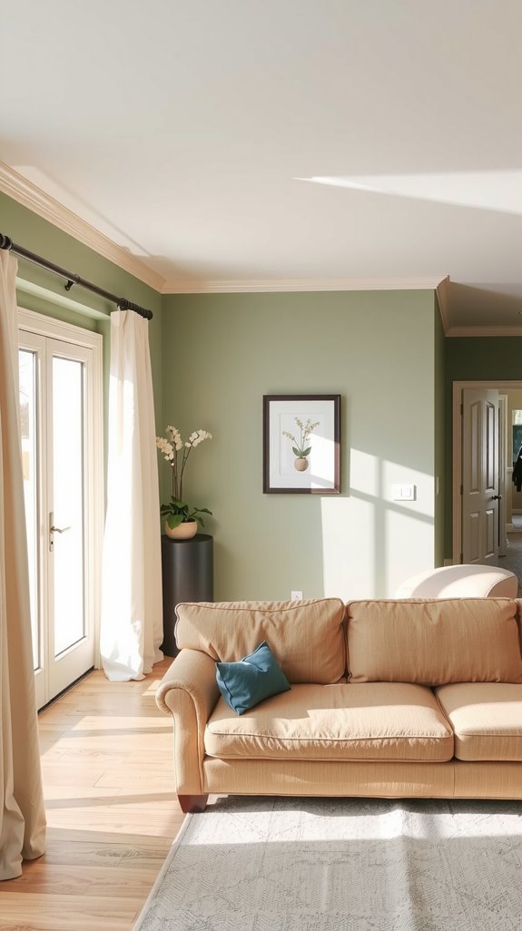
Larger rooms don’t need that help, and they actually benefit from deeper tones like forest green or rich burgundy that pull the space inward and make it feel intentional rather than cavernous. The mistake people make in big rooms is going safe and neutral when they had room to commit.
One-Color vs Two-Color Living Room Wall Combinations
When a single wall color works best
A single wall color is almost always the right call in smaller rooms, especially when your furniture and textiles are already bringing pattern and warmth into the space.
Multiple colors in a tight room create visual noise that makes everything feel busier and more cramped than it actually is.
It’s also the smarter move when your sofa, rugs, or artwork are doing the heavy lifting stylistically, because a unified wall color gives all of that room to breathe.
One strong, well-chosen color beats three competing ones every time.
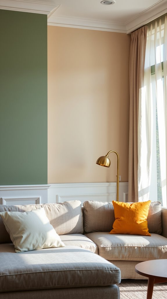
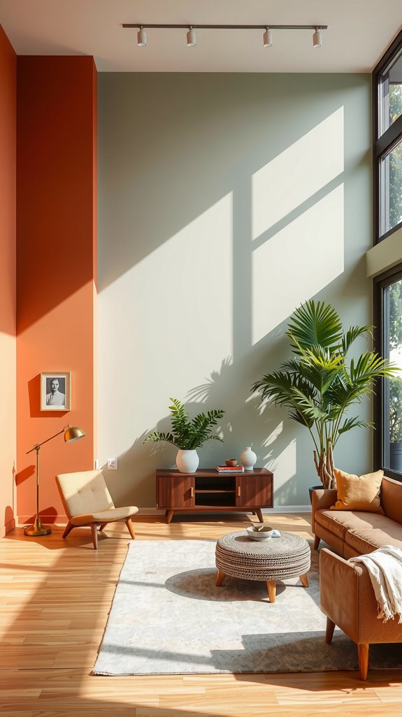
Two-color wall combinations that add depth
Two-color combinations add real architectural interest, particularly in larger rooms where a single flat tone can feel monotonous. Using a darker shade below a chair rail and a lighter one above gives the room visual weight at the base without making the upper half feel heavy or closed in.
You can also work with the same color in two different finishes, matte below and satin above, for a subtler version of the same idea. The goal is contrast that feels considered, not contrast that feels accidental.
| READ THIS: Color Combination for Living Room: Stylish Ideas That Always Work. |
Popular Wall Color Combinations for Living Room Walls
White and gray wall combinations
White and gray is the most forgiving pairing in residential interiors, and there’s a reason it’s been in steady rotation for decades.
Charcoal on an accent wall against white on the remaining three gives you strong contrast without the commitment of going dark throughout the entire room.
Light gray alongside bright white keeps things airy while adding just enough variation to prevent the space from feeling sterile.
It’s also one of the most furniture-friendly palettes you’ll find, working with almost any wood tone, upholstery color, or metal finish.
Beige and brown wall combinations
Beige and brown work especially well in rooms with wood furniture and leather seating because the tones feel like they belong to the same family.
Pairing a lighter beige field color with a richer chocolate or espresso accent wall adds depth without jarring contrast.
This combination tends to age well too, staying relevant as trends shift around it rather than becoming the thing that dates the room. Natural textures like linen, jute, and raw wood lean into this palette in a way that feels organic rather than decorated.
Cream and soft pastels for warm spaces
Cream paired with soft pastels like blush pink, powder blue, or mint green adds warmth in north-facing rooms where cooler light would otherwise make the space feel dim and flat. The key is keeping the cream as the dominant tone and letting the pastel play a supporting role on a single accent wall or in your soft furnishings.
This combination reads as sophisticated rather than sweet when the proportions are right. It also works particularly well in smaller living areas where you want warmth without the visual weight of a deeper color.
Accent Wall Color Combination Ideas for Living Rooms
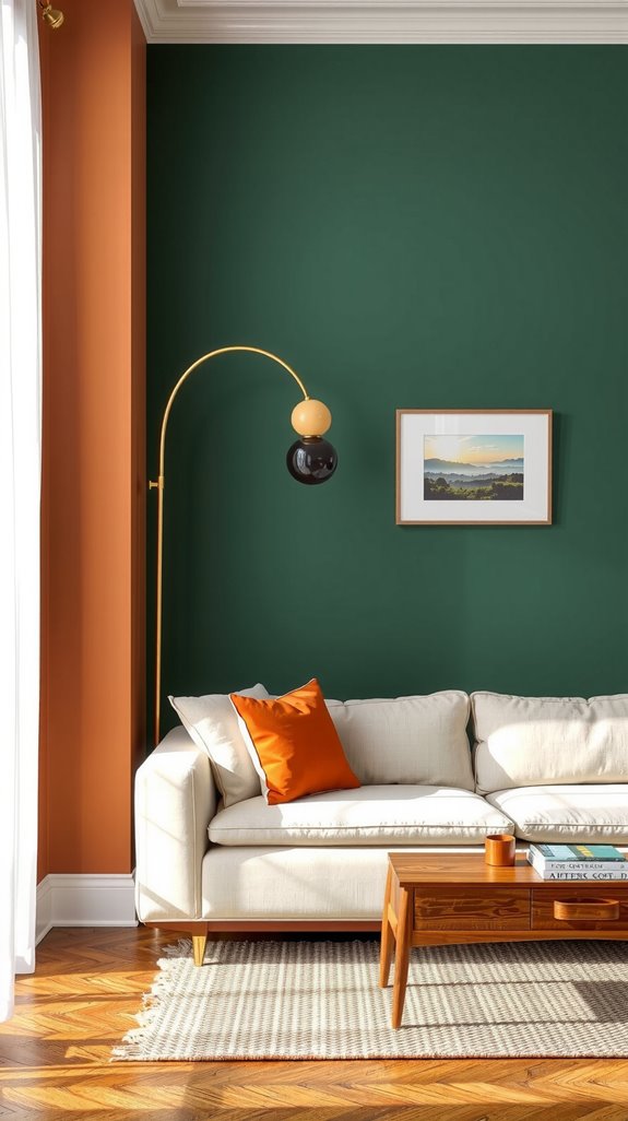
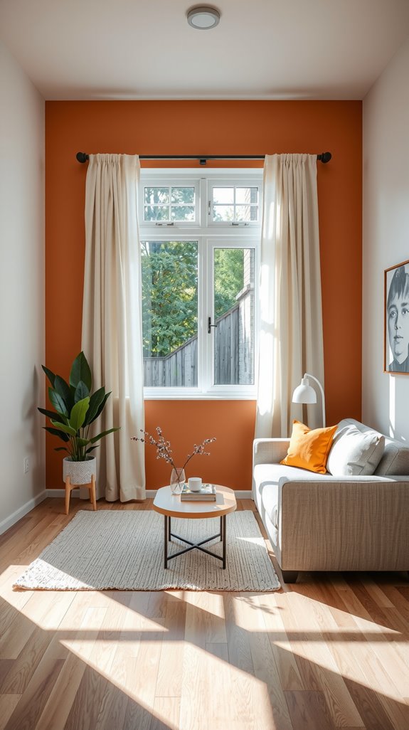
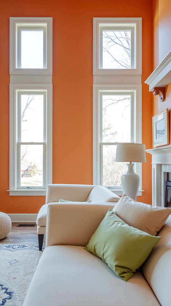
Bold accent wall color combinations
A bold accent wall only works when the remaining walls are calm enough to let it breathe. Navy against white, emerald against warm beige, or deep charcoal against cream all create strong focal points without tipping into visual chaos.
The accent wall should live behind your primary seating arrangement or your main architectural feature, anchoring the room rather than competing with it. Pick one, commit to it, and resist the urge to add a second.
Subtle accent wall ideas using texture and tone
If you’re not ready to go full bold, texture is your friend. The same color in matte and satin finishes on different walls creates real depth that reads as intentional without the drama of high contrast.
Shiplap, board and batten, or dimensional paint techniques in a monochromatic scheme do the same job, adding interest that you feel before you consciously notice it. This approach suits people who want a layered, considered room without a color they’ll second-guess in two years.
Light Color Combinations for Living Room Walls
Light wall colors that reflect natural light
When you’re working with limited natural light, choosing colors with high light reflectance values makes a measurable difference in how bright and open a room feels.
Soft whites, pale creams, and light grays typically reflect the majority of available light, keeping the room airy without feeling stark.
Cool-toned whites with blue or green undertones perform particularly well in north-facing rooms, while warmer whites suit south-facing spaces where you want to complement rather than amplify the existing warmth.
The finish matters here too: eggshell and satin reflect more light than flat paint and hold up better to cleaning.
Best light colors for low-light rooms
Rooms that don’t get much natural sunlight need colors that compensate without overcorrecting into cold and clinical.
Soft beiges and pale buttercream shades reflect available light while adding enough warmth to counteract the naturally cool feeling of a shadowy room.
These tones hold up better under artificial lighting than pure whites, which can take on a yellow or gray cast depending on your bulb temperature. Pair them with warm-toned light fixtures and you’ll largely solve the problem without ever touching a switch.
Dark Wall Color Combinations That Still Feel Balanced
Dark walls with light trim and ceilings
Dark walls earn their drama from the contrast around them, not from standing alone. Pairing deep tones with crisp white or light-colored trim and ceilings draws the eye upward and stops the room from feeling like it’s collapsing inward.
Crown molding and bright baseboards frame a dark wall in a way that actually highlights the architectural bones of the room. That contrast is what separates a moody, sophisticated space from one that just feels dim.
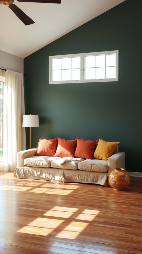
When dark wall colors work best
Deep colors hit differently in rooms with abundant natural light, where sunlight prevents the walls from absorbing all the brightness out of a space. Large rooms with high ceilings can carry dark tones without the visual weight becoming oppressive, particularly when the furniture is scaled appropriately.
Strategic lighting placement, uplights, table lamps, and sconces, keeps the space feeling alive after the sun goes down. Get those elements right and a dark room feels intentional and rich rather than heavy and uninviting.
Modern Wall Color Combination for Living Room
Neutral modern wall palettes
Warm grays paired with soft whites create depth and sophistication without committing to anything that will feel dated in five years.
Greige tones with cream accents hit a middle ground between cool and warm that works across a wide range of furniture styles and wood finishes.
The strength of a neutral modern palette is that it lets your furniture, artwork, and lighting carry the personality of the room.
These combinations hold up through furniture changes, renovation phases, and shifting tastes in a way that more specific color choices simply don’t.
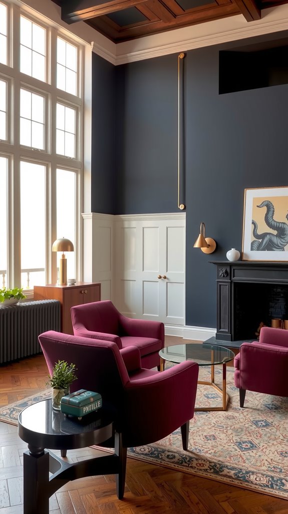
Black, gray, and white wall combinations
Monochromatic doesn’t mean boring when the contrast is calibrated correctly. White as the dominant shade, gray on secondary surfaces, and black reserved for a single accent wall creates a palette that reads as both timeless and visually striking.
This combination relies on proportion more than most: too much black and the room feels heavy, too little and the contrast disappears. Get the balance right and it’s one of the most graphic, architectural looks you can achieve without pattern or texture.
Wall Color Combinations for Small Living Rooms
Wall colors that visually expand space
Light colors make small rooms feel larger because they reflect light rather than absorbing it, which causes walls to visually recede. Soft whites, pale grays, and cool blues are the most reliable choices here, particularly when paired with eggshell or satin finishes that enhance that reflective quality.
Keeping your trim and ceiling in the same light family rather than introducing a contrasting color removes boundaries that would otherwise define and shrink the room. The fewer visual interruptions a small room has, the bigger it tends to feel.
Vertical vs horizontal wall color placement
Where you put color on a wall matters as much as which color you choose. Vertical placement, whether through stripes, paneling, or tall accent sections, draws the eye upward and makes low ceilings feel less oppressive.
Horizontal color blocking does the opposite, adding perceived width to rooms that are narrow and tall. Read your room’s specific problem first, then use placement strategically to address it rather than defaulting to four uniform walls.
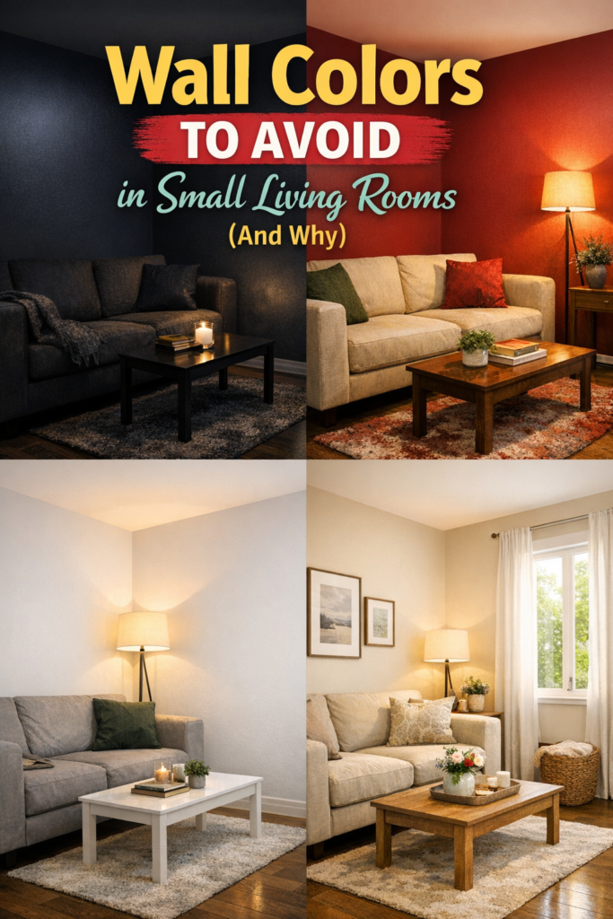
Wall colors to avoid in small rooms
Deep charcoal, navy, and black on all four walls absorb light and create an enclosed feeling that no amount of furniture arrangement can fix. Forest green and deep burgundy have the same effect at scale, even though both work well as accent tones in a larger room.
Pure white can go the other direction entirely, reading as cold and institutional rather than bright and open, especially under artificial light. Warm light-toned alternatives like soft cream or pale greige give you the reflectivity of white with enough warmth to keep the room feeling livable.
Simple Wall Color Combination Ideas That Always Work
Minimal two-tone wall palettes
Two-tone palettes work because restraint is doing the heavy lifting. Pairing white with soft gray, beige with cream, or charcoal with pale blue creates visual interest without overwhelming a room or making furniture selection feel like a puzzle.
These combinations are also forgiving when your taste evolves, because the field color stays neutral enough to absorb new pieces without clashing. That kind of longevity is worth more than it sounds when you’re making a decision you’ll live with for years.
Neutral wall color combinations for everyday living
Greige with white trim and soft taupe with cream are two of the most practical long-term choices in residential interiors because they adapt rather than compete. They work with wood tones across the spectrum, from blonde maple to dark walnut, and they don’t fight with upholstery colors that shift as you replace furniture over time.
These combinations also photograph well, which matters if you ever sell the home. More importantly, they don’t create that low-grade visual fatigue that comes from living inside a color that’s slightly too specific.
Mistakes to Avoid with Living Room Wall Color Combinations
Using too many wall colors
Painting each wall a different color almost never works the way people imagine it will. The eye doesn’t know where to settle, and the room ends up feeling busy rather than layered or intentional.
More than one accent wall compounds the problem, turning what could have been a focal point into competing distractions. One strong field color with a single complementary accent wall is almost always the ceiling for what a living room can handle without tipping into chaos.
Ignoring lighting conditions
Selecting paint based on how it looks on a small chip under fluorescent store lighting is one of the most reliable ways to end up with a color you don’t recognize once it’s on your walls. Colors shift dramatically between morning light, afternoon sun, and evening artificial light, and what reads as a warm greige in the store can look lavender or green in your actual room.
Sample large, paint full sections of wall, and observe those samples across morning, afternoon, and evening before you buy a full gallon. That extra step costs almost nothing and saves you from a repaint.
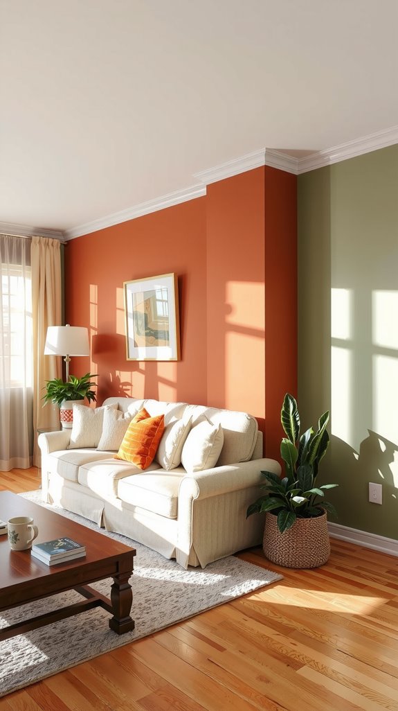
Choosing trendy colors without balance
Trendy colors aren’t the enemy, but using them without a neutral anchor is what gets people into trouble. Sage green, terracotta, and millennial pink all have a place in a living room, but that place is usually an accent wall or a set of throw pillows, not all four walls.
Pairing a trend-driven hue with a timeless neutral like white, beige, or warm gray lets you refresh the room when the trend cycles without repainting everything. The field color stays, the accent gets swapped, and the room keeps working.