You’ve stood in a small room and felt it pressing in on you. You’ve also stood in one the same size and felt completely at ease. Nine times out of ten, paint is doing the heavy lifting.
Color doesn’t just decorate a room; it rewires how your brain reads the space. Get it right and your compact living room stops feeling like a compromise. The combinations ahead show you exactly how to get there.
How color affects space perception
Light tones bounce illumination back into the room, pushing walls outward in a way that’s almost optical. Dark tones do the opposite, absorbing light and pulling surfaces toward you until the room feels half its size.
High contrast between walls and furniture creates visual stops, places where the eye hits a hard edge and stalls. Keep contrast low and surfaces similar in tone, and your eye glides through the space without interruption, reading it as larger than it is.
How light, contrast, and tone change the way a small living room feels
These three elements work together, and you rarely get to adjust one without affecting the others. A room with high contrast reads as fragmented because every shift in value registers as a boundary.
Low-contrast schemes let surfaces blur into each other, which extends the perceived depth of the space. Tone does the heaviest lifting: light tones optically push walls back, while dark tones advance them toward you and compress the volume of the room.
| READ THIS GUIDE: Room Color Combination Ideas Designers Actually Use (And Why They Work) |
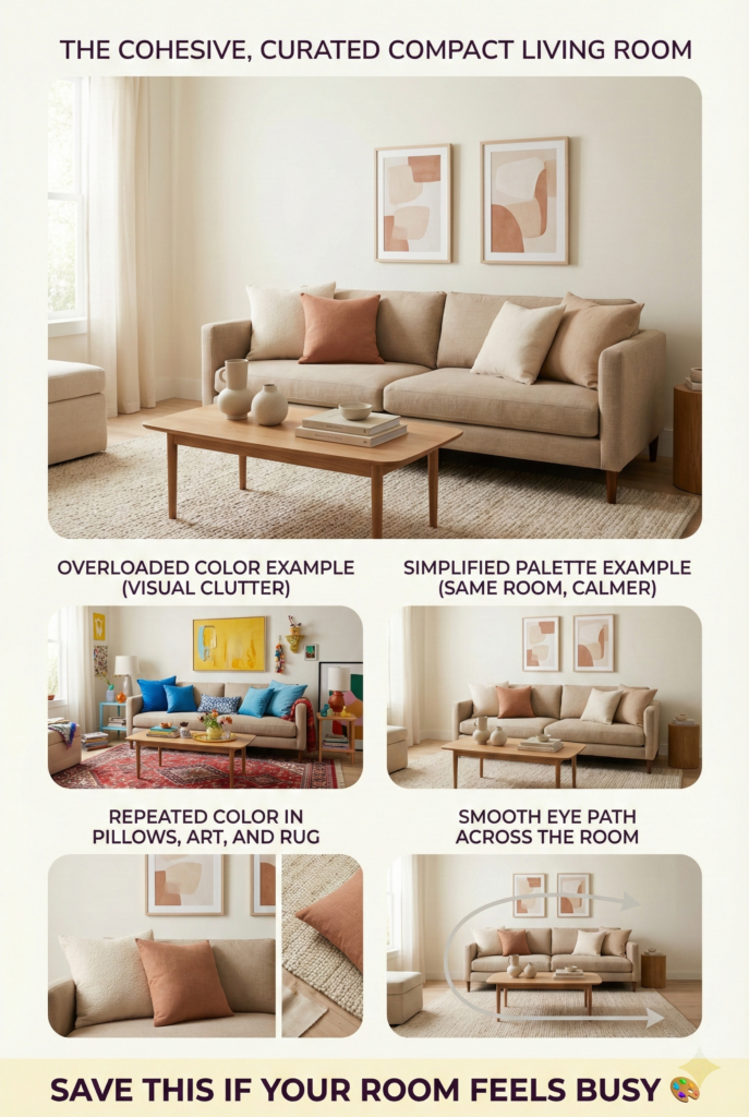
Why fewer colors work better in compact spaces
Walk into a room stuffed with competing colors and your brain starts working overtime just to process it. That mental friction translates directly into a feeling of crowding, even when the furniture is perfectly arranged.
Two or three coordinated colors give your eye a clear path through the space. The room reads as cohesive rather than chaotic, and cohesion is what makes a tight floor plan feel intentional instead of cramped.
Choosing the right color combination for a small living room
Selecting a main color and supporting shade
The 60-30-10 rule gives you a reliable starting point without locking you into anything rigid. Sixty percent goes to a dominant color, almost always a light neutral on the walls.
Thirty percent lands on larger furniture and rugs in a complementary shade, and the final ten percent covers accent pieces with a bit more personality. This ratio keeps the room anchored without letting any single color overstay its welcome.
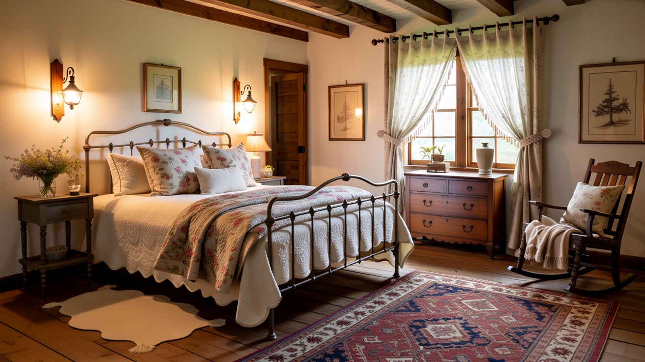
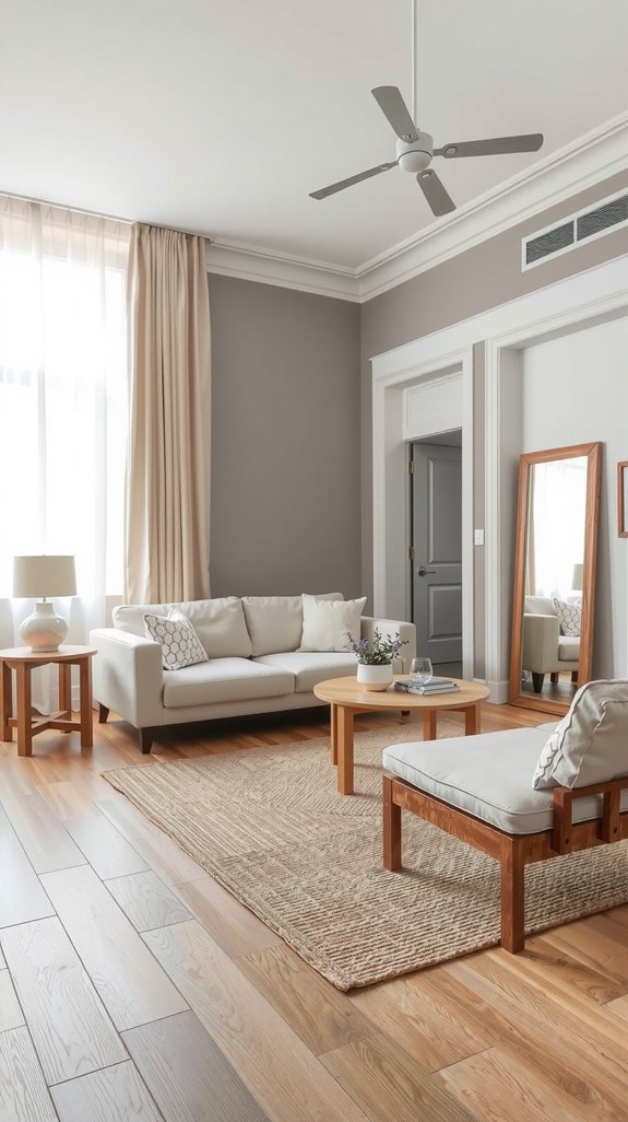
Matching wall colors with ceiling height and floor tone
Your flooring is fixed, so your wall color has to work with it rather than fight it. Warm wood floors pull toward yellow and red undertones, which means cool blue-gray walls will always read slightly off.
Match your wall’s undertones to whatever is already underfoot and the room develops a natural visual flow. Light walls paired with a white ceiling above darker flooring create exactly the kind of layered contrast that reads as height rather than compression.
| READ THIS GUIDE: Color Combination for Living Room: Stylish Ideas That Always Work |
Best color combinations for small living room walls
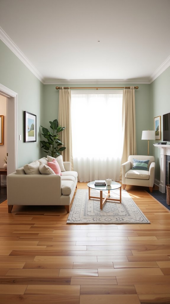
Light neutral wall combinations
Light neutrals earn their reputation because they do something more complex than just reflecting light. A well-chosen white or greige holds up differently at dawn, midday, and under artificial light, and the good ones stay readable across all three.
Pairing soft whites with warm beiges keeps the room feeling settled rather than sterile. Adding crisp ivory as a trim or accent tone sharpens the palette just enough to prevent it from feeling flat.
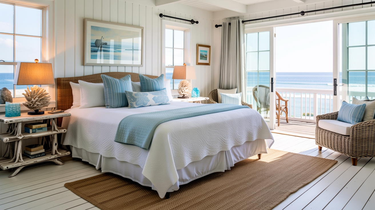
Soft color pairings that don’t overwhelm
Once you have your neutral foundation, a soft secondary color is what gives the room its character. Pale blue reads as calm and slightly expansive, particularly in rooms with limited natural light.
Dusty pink paired with light gray sounds unexpected, but lands as quietly sophisticated on a wall. These gentle combinations add visual interest while keeping the atmosphere airy enough that the room still feels bigger than it measures.
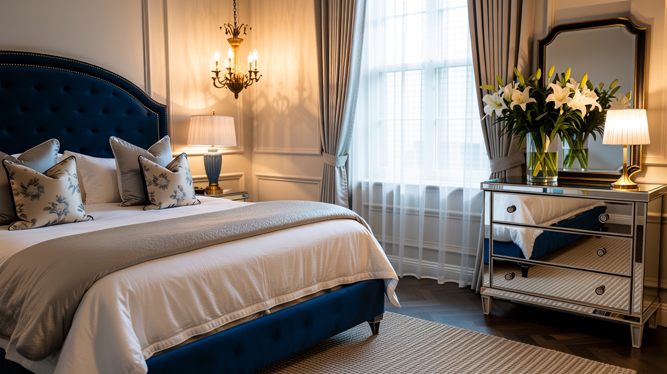
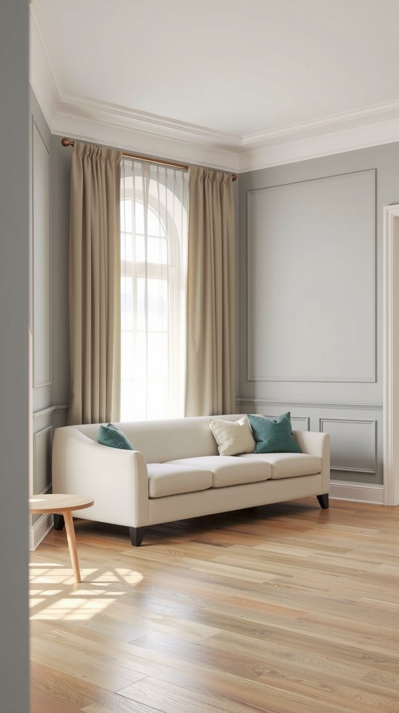
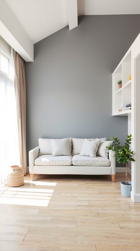
When darker accents can still work
The rule that small rooms must stay light is more of a guideline than a law. One accent wall in a deeper color, charcoal, navy, or forest green, can create genuine depth if the other three walls stay pale.
Dark tones also work well through furniture and accessories, where they add visual weight without locking in permanent decisions. One dark surface anchors the room; four dark surfaces swallow it.
Two-color combinations that work in small spaces
Vertical vs horizontal color placement
Where you place your second color matters as much as what that color is. Running a deeper shade along the lower third of a wall with a lighter tone above draws the eye upward and makes ceilings feel taller.
Placing an accent color on one end wall and keeping adjacent walls neutral creates width, which helps long, narrow rooms feel more balanced. Neither approach is universally better; it depends on whether your room’s bigger problem is low ceilings or a pinched floor plan.
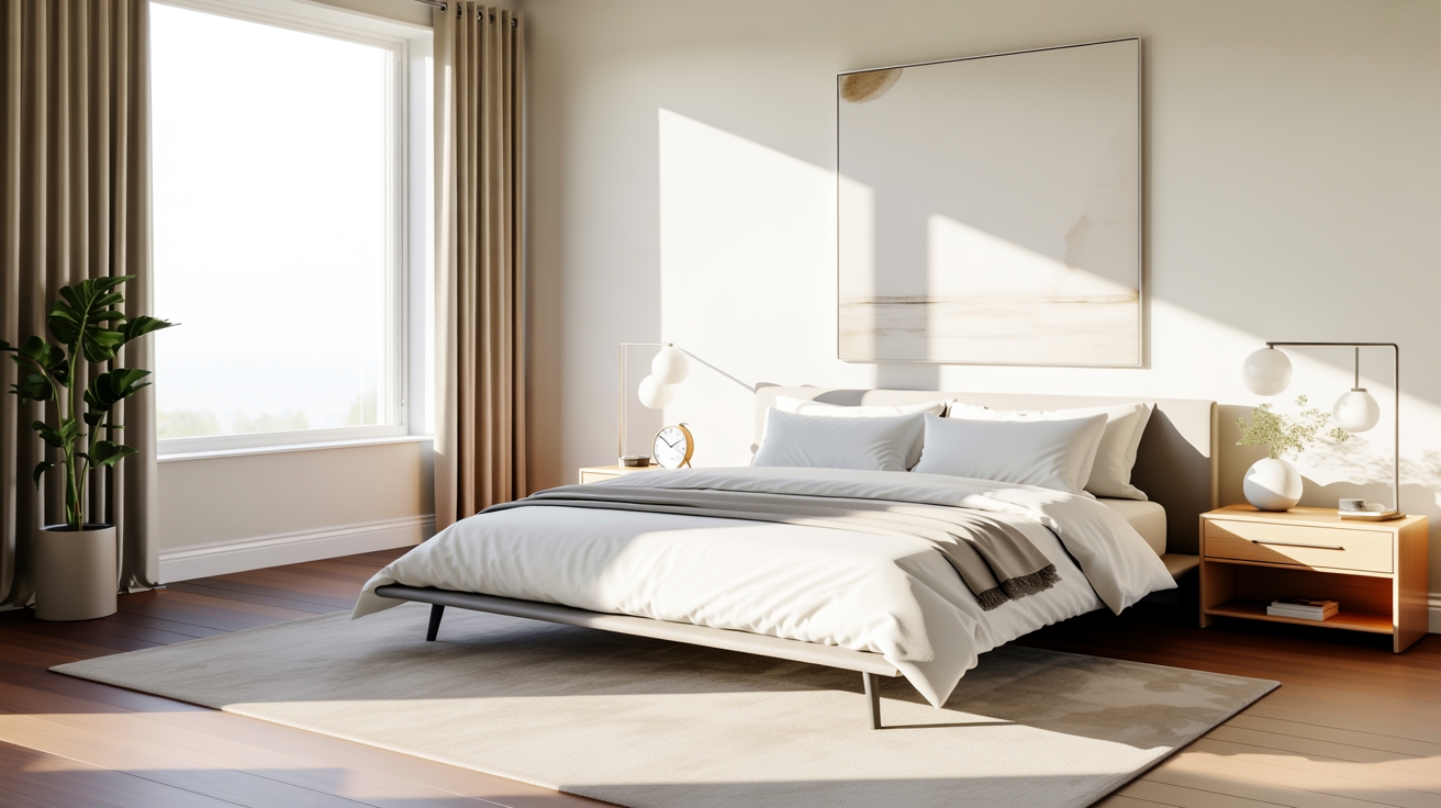
Light walls with subtle contrast
Bold contrast might seem like the more interesting choice, but subtle variation is almost always the smarter one in a small room. Selecting a base color like soft white or pale gray and then introducing depth through slightly darker shades of the same hue keeps the palette from feeling flat.
The eye picks up the dimension without registering a hard stop, so the room reads as layered rather than patchy. Visual continuity like that makes space feel larger in a way that drama rarely does.
Avoiding harsh color breaks
Small rooms amplify every visual division, so a jarring color transition that might go unnoticed in a large space becomes a real problem here. Colors that share undertones, warm beige with soft terracotta or cool gray with muted blue, move past each other without creating hard edges.
The eye follows a smooth path across the surfaces instead of stopping abruptly at each shift. That uninterrupted movement is one of the quieter tricks that makes a compact room feel more open than it has any right to.
Finishing tips for small living room color success
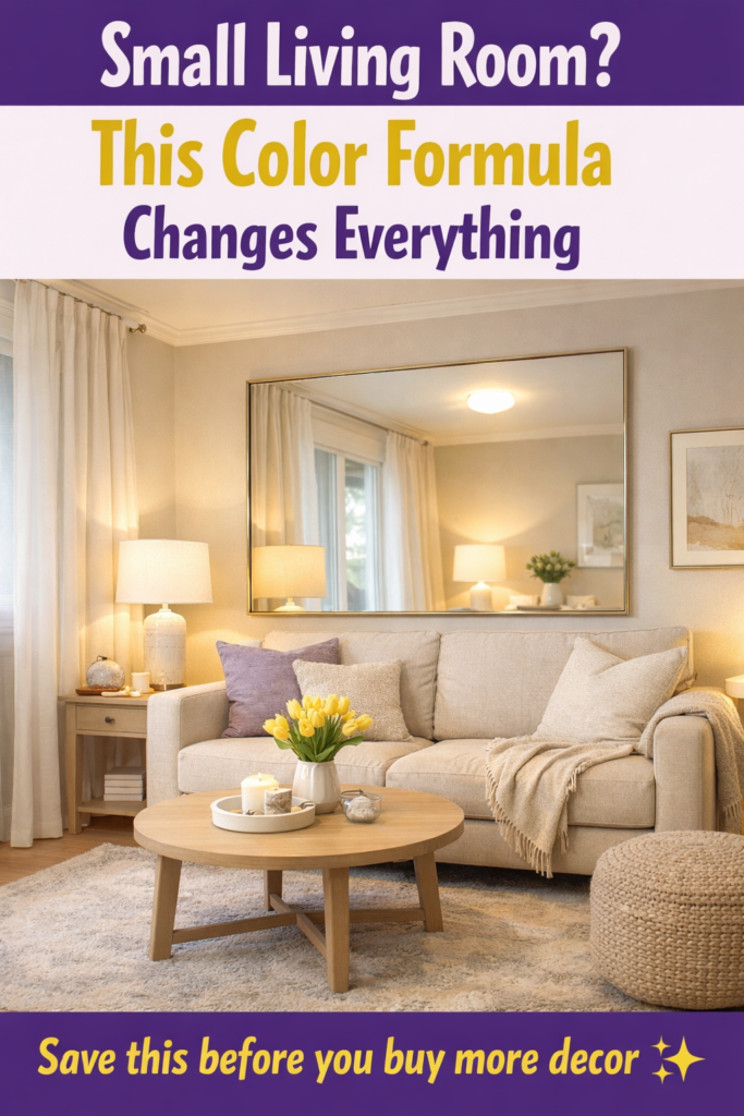
Using mirrors, lighting, and textiles
A large mirror on the right wall can effectively double a room’s depth, in a way no color trick quite matches. Layered lighting, ambient overhead, a table lamp or two, and a targeted accent light, eliminates the dark pockets that make corners feel like they’re closing in.
Lightweight curtains in your palette’s softer tones frame the windows without cutting into the visual field. Together, these elements reinforce what your color palette started, and the room holds together as a single coherent space rather than a collection of separate decisions.
Keeping the palette cohesive
The most common mistake is nailing the wall color and then filling the room with furniture and accessories that drift toward a different palette entirely. Pick your two or three core colors early and run them through every surface decision, walls, upholstery, curtains, and trim.
Repetition creates rhythm, and rhythm is what makes a small room feel considered rather than cobbled together. A tight palette executed consistently will always outperform a looser one applied with good intentions.