You do not need a big budget to calm a busy living room. A lot of DIY people learn this fact a little too late.
Too many colors made the space feel restless, even on quiet evenings. Once I narrowed it to two steady hues, everything settled down. The room finally felt like it could breathe.
That shift was simpler than I expected, and we covered all the combinations that made it happen here.
Why simple color combinations work so well
A tight palette gives your eyes a clear path across the room. Instead of jumping from shade to shade, your gaze moves easily.
That steady rhythm makes the space feel settled. It also keeps furniture and decor from fighting for attention. Fewer colors create unity without trying too hard.
Creating calm and visual flow
When tones are in harmony, the room feels connected. Walls, sofa, and rug start to speak the same language.
Your brain stops working overtime to process contrast. Even natural light looks softer against coordinated shades. The whole space begins to feel intentional instead of accidental.
Making spaces easier to decorate and update
Limiting color choices makes shopping far less stressful. You stop guessing and start looking with purpose.
Swapping pillows or artwork becomes a simple refresh. Nothing clashes because the groundwork stays consistent. Over time, that consistency saves both money and frustration.
Choosing a simple color palette for your living room
Selecting a base color
Start with the color that will carry most of the room. In my experience, soft white, warm beige, or light gray rarely disappoints.
Test samples on more than one wall before committing. Light shifts throughout the day, and paint changes with it. Once the base feels steady, the rest comes together naturally.
Adding a soft secondary shade
Your second color should support the base, not overpower it. Muted tones like sage, dusty blue, or warm taupe work well.
I like using this shade on chairs, curtains, or a large rug. It adds depth without stealing the spotlight. The room gains interest while staying calm.
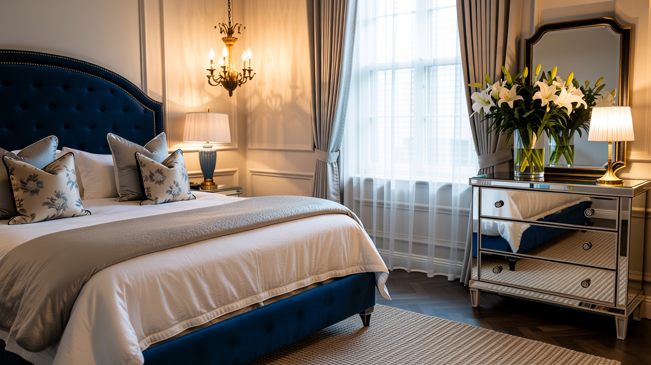
Best simple color combinations for living rooms
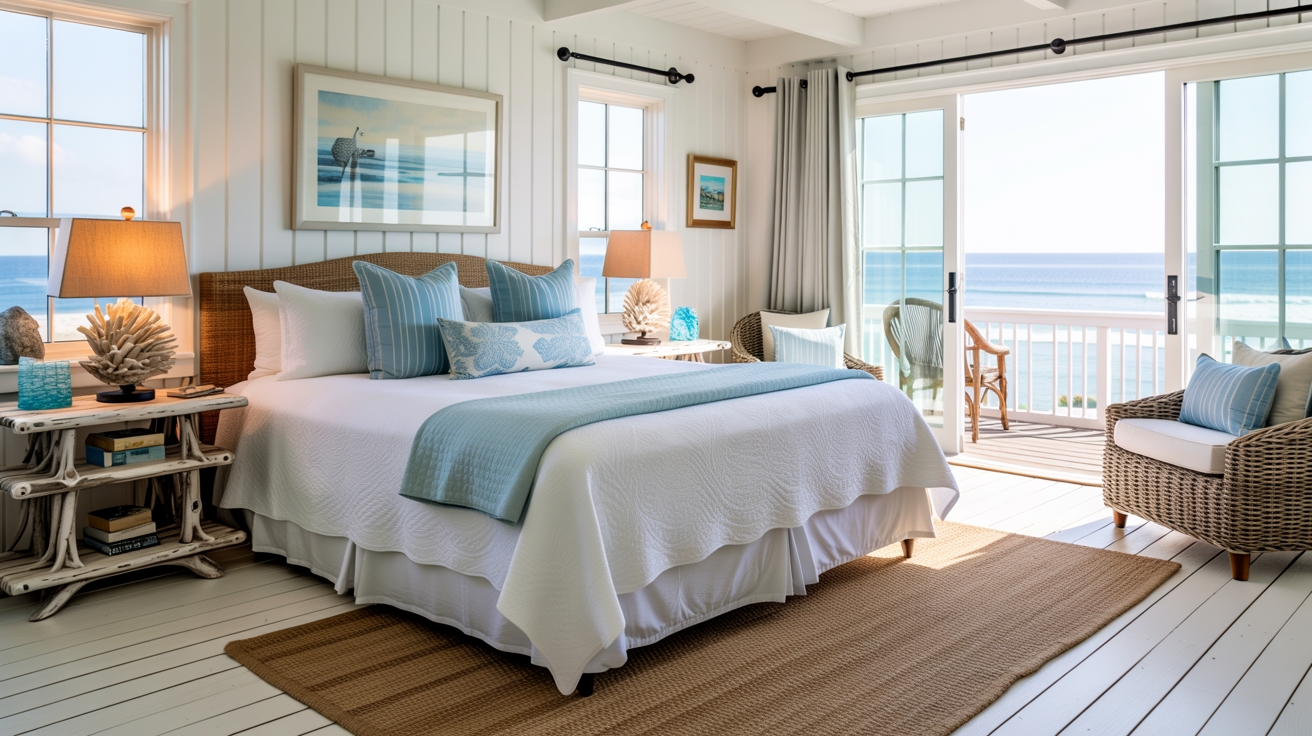
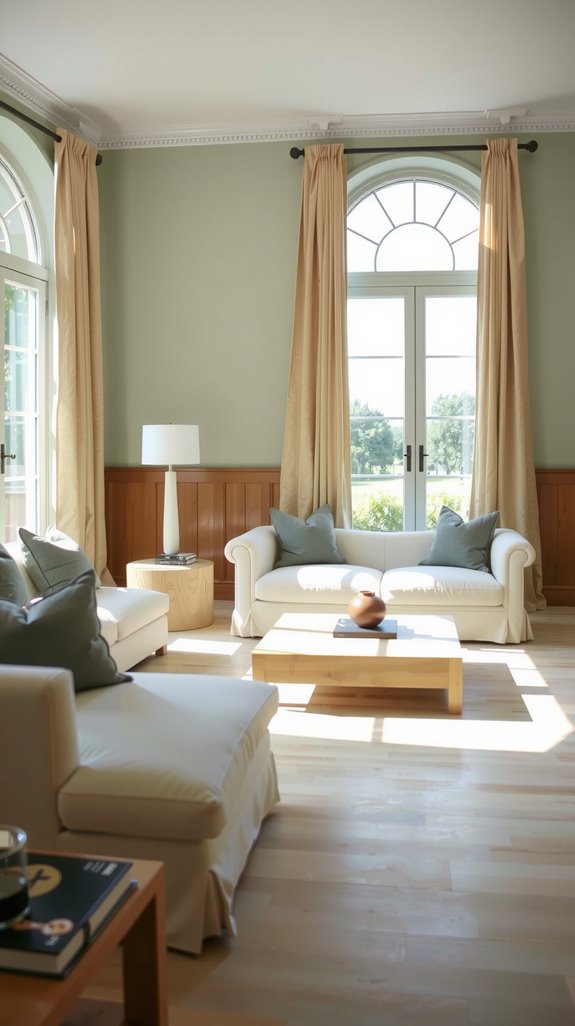
White and beige
White and beige create a light, welcoming feel. The key is layering texture so it does not look flat.
Think linen upholstery, woven baskets, and soft throws. Those details keep the palette from feeling bland. The result feels relaxed and quietly polished.
Gray and cream
Gray paired with cream balances cool and warm tones. In bright rooms, gray softens glare from windows.
Cream keeps the space from feeling cold. Add subtle metal or wood accents for structure. The combination feels current without chasing trends.
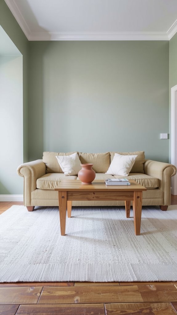
Soft greige combinations
Greige shifts gently between gray and beige. That flexibility helps it handle changing light. Pair it with cream seating and deeper accents for contrast.
Natural wood looks especially good against it. The room feels layered without adding more colors.
Two-tone simple living room color ideas
Subtle contrast instead of bold color changes
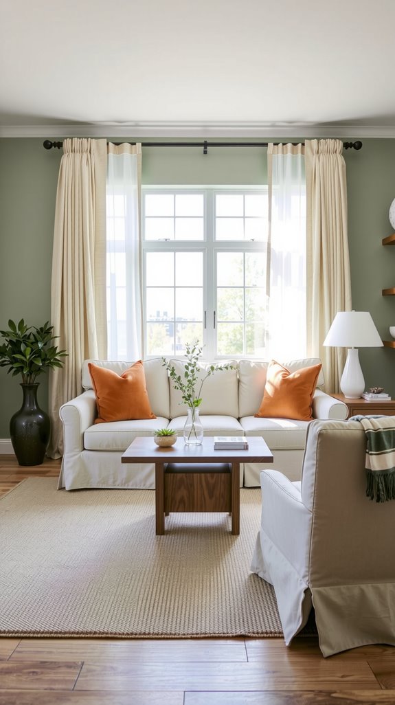
Strong color jumps can tire a room quickly. I prefer working with shades that differ slightly in depth. Warm beige next to soft taupe adds quiet dimension.
Light gray against charcoal creates depth without drama. The space stays interesting while remaining easy on the eyes.
Using finishes and texture for interest
When colors stay restrained, texture carries the mood. Matte walls beside glossy trim create a gentle variation.
Leather next to linen helps prevent a flat feel. A woven rug adds depth underfoot. These small shifts bring life without introducing new hues.
Where to place the second color
Be deliberate about where your second color appears. Use it on a sofa, accent wall, or built-in shelves. Keeping it concentrated builds a clear focal point.
Scattering it randomly weakens its impact. Thoughtful placement keeps the room balanced.
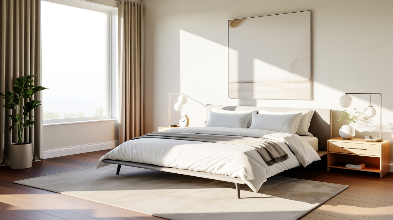
Simple light color combinations
Light neutrals that feel warm
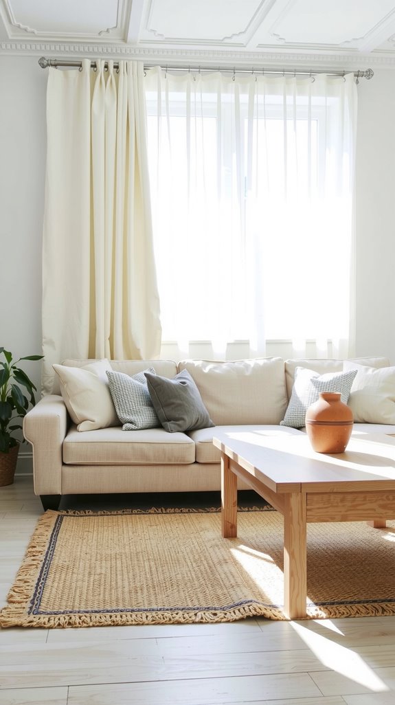
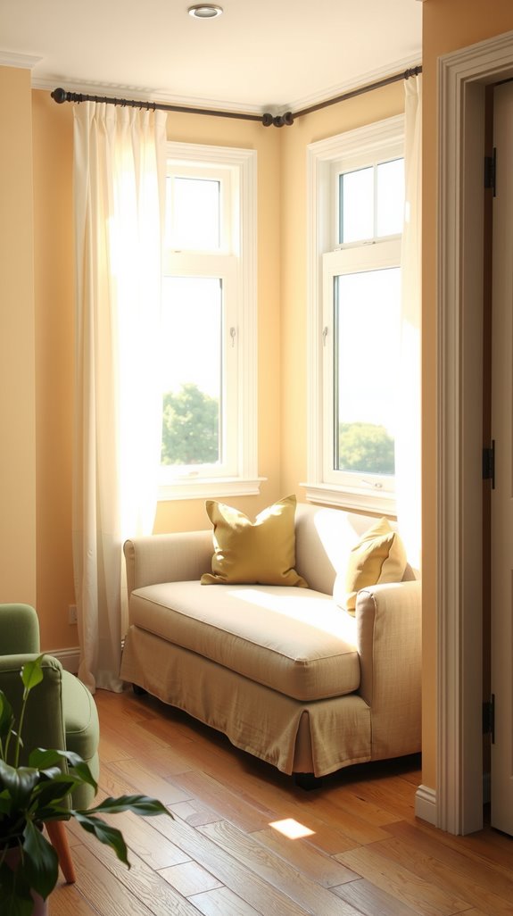
Light rooms need warmth to avoid feeling sterile. Beige, cream, and soft taupe help soften bright light.
They reflect sunshine without looking stark. Pair them with wood tones for grounding. The result feels airy but still inviting.
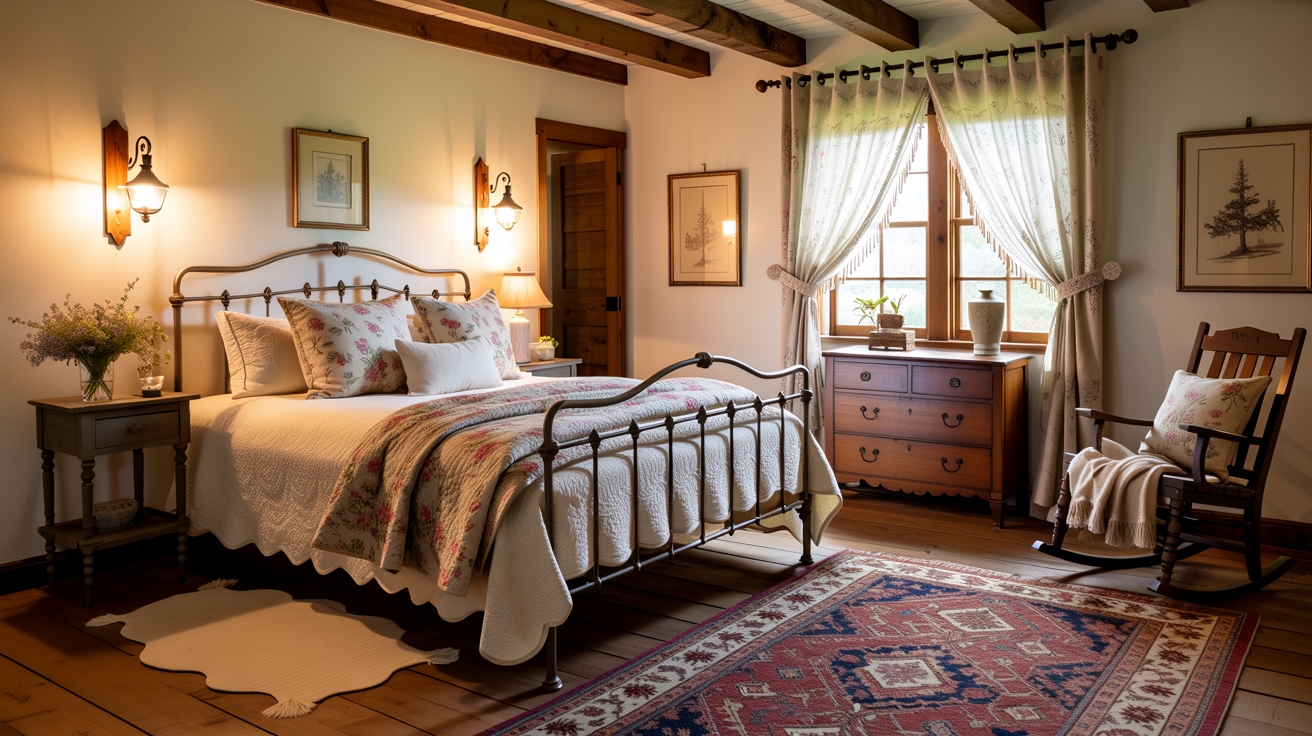
Using natural materials to add depth
Natural materials make simple palettes feel richer. Linen curtains filter light beautifully. Woven baskets and jute rugs add quiet pattern.
Wood in honey or walnut tones brings warmth. These layers add character without adding color.
Simple color combinations for small rooms
Minimal palettes that visually expand space
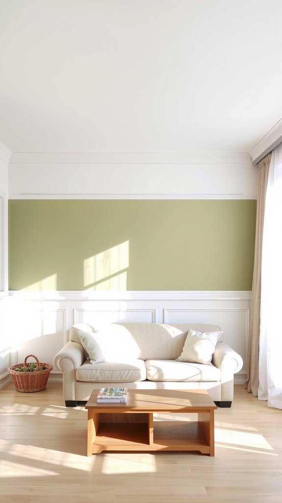
Small rooms demand restraint. Too many colors break the space into pieces. Two or three related shades keep walls from feeling boxed in.
Light tones help surfaces recede. The room feels larger because nothing interrupts the flow.
Light tones with gentle contrast
Even small spaces need a touch of contrast. Pair soft white walls with slightly deeper upholstery. Add cushions a shade darker for subtle depth.
These small changes create dimension without clutter. The space stays open while still feeling finished.