| What this is: A guide to the fall room aesthetics that nobody is talking about — from vintage fall aesthetic and dark academia bedroom to moody green, dusty pink, and neutral cream — for everyone whose idea of autumn has never been orange. Who it’s for: Anyone who scrolls past the standard rust-and-pumpkin inspo feeling completely unseen, and anyone who wants a cozy fall room that feels personal and specific rather than seasonal-display-aisle generic. Why read it: The Pinterest “fall room” category is dominated by one default look. This guide maps four genuinely distinct alternatives — each with its own palette, its own materials, and its own specific energy — so you can build the autumn room that’s actually yours. |
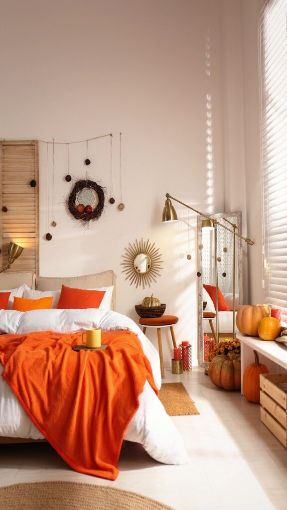
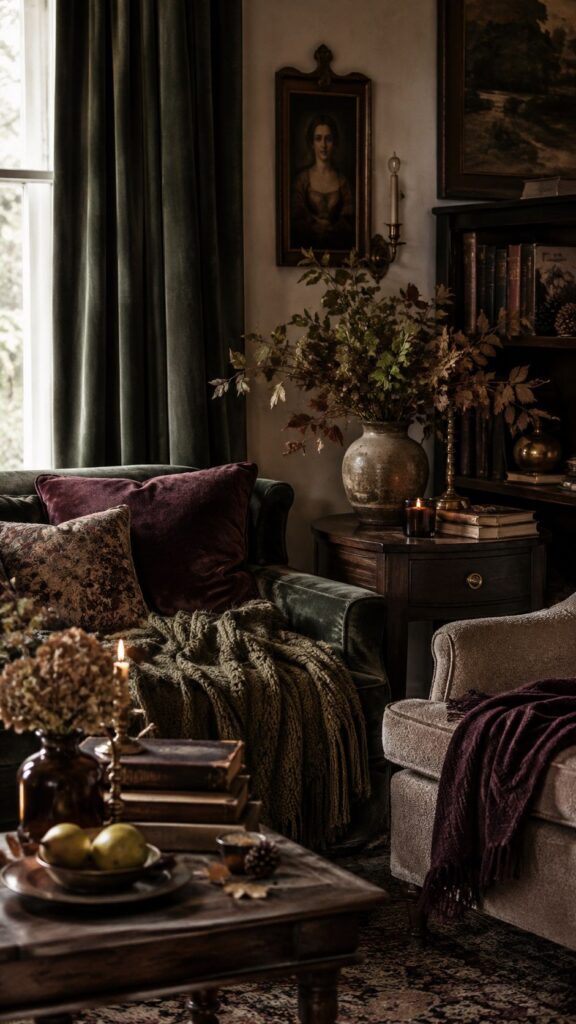
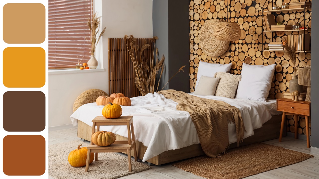
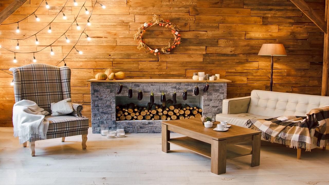
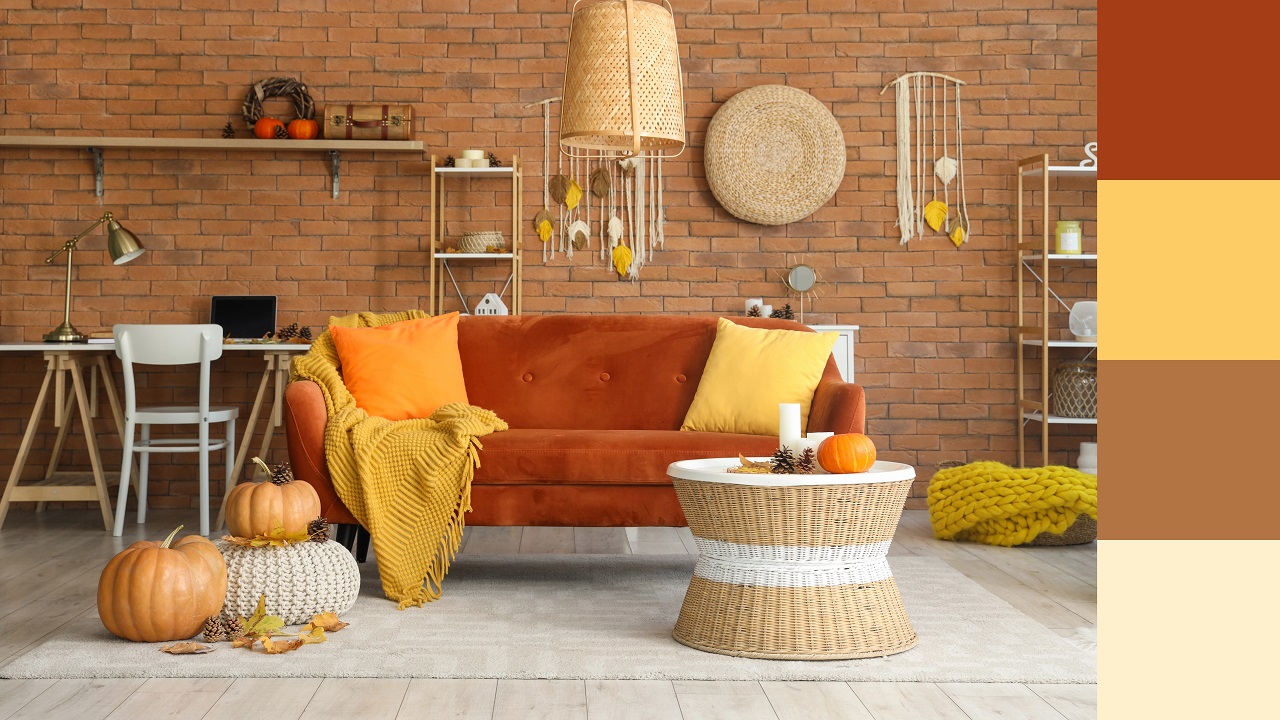
Can we talk about something? The standard fall room aesthetic has a look. You know the one: bright orange pumpkins, rust-red throw pillows, a plaid blanket, maybe a wooden sign that says “gather.”
And listen — no judgment, it’s warm and cozy and it works. But there are approximately fourteen million people searching “fall room ideas” whose idea of autumn involves none of those things.
People who want something moodier, or softer, or greener, or older-feeling than the default harvest display.
This guide is for them. Because the truth is, fall is a feeling, not a color. And that feeling — rich, layered, intimate, slightly nostalgic — is available in about a dozen palettes that have nothing to do with orange. Here are the four most beautiful ones, with everything you need to build each!
The Vintage Fall Aesthetic: Warm Sepia, Aged Brass, and Collected Character
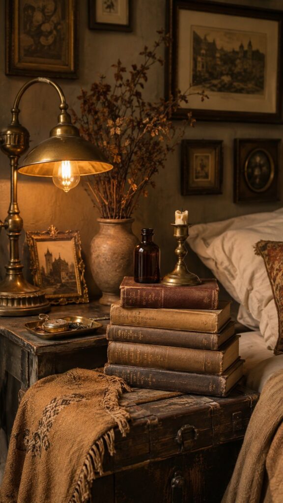
The vintage fall aesthetic is autumn filtered through the lens of antique markets, sepia photographs, old libraries, and objects with actual history. The palette runs in warm creams, faded ochres, aged brass, tobacco brown, and dusty terracotta — not the bright orange of the harvest aisle, but the deeper, quieter tones of something old and well-loved.
The foundation elements that build this look:
Aged brass and warm metals everywhere — lamp bases, picture frames, small trays, candlestick holders. Unlike cool silver, brass carries warmth into every surface it touches, and its slight patina reads as collected rather than purchased.
Vintage bronze fixtures and Edison-bulb lighting create exactly the warm, amber-toned glow this aesthetic is built on — not sharp and bright, but honeyed and atmospheric.
Stacked vintage books as decor. A stack of cloth-bound or leather-covered books on a nightstand or shelf adds the vintage fall room feeling instantly — and if you layer a small amber glass bottle or a small brass candlestick on top, the whole vignette reads like a scholar’s desk from another era. Genuinely one of my favorite five-minute styling moves ever!
Linen, cotton, and aged velvet textiles in cream, faded mustard, and warm mushroom tones. Think antique market finds, not department store displays. A slightly worn linen duvet cover in off-white and an aged velvet cushion in tobacco create the kind of layered, collected look that takes a room from “decorated” to “lived in for decades.” So beautiful!
Pro-tip: Thrift stores and estate sales are your absolute best friends for this aesthetic. The patina on a genuinely old brass candlestick is impossible to fake and costs you $2 at a vintage market. The vintage fall aesthetic rewards real hunting over new buying every single time!
The Dark Fall Aesthetic: Moody, Dramatic, and Deeply Cozy
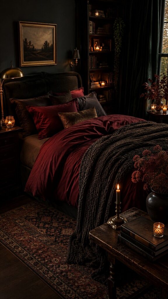
Dark fall aesthetic rooms are the ones where the walls feel closer and the light feels more precious — and honestly? They’re the coziest rooms I’ve ever been in.
The dark fall bedroom palette lives in charcoal, forest green, deep burgundy, midnight navy, and rich brown, and the effect isn’t heavy — it’s intimate and sheltered in a way that bright rooms simply can’t achieve.
According to Wayfair’s dark academia style guide, the key is chiaroscuro — the contrast between dark and light — which means a moody fall room works best when warm candlelight and brass fixtures punch against the darker background rather than competing with it.
This is why amber glass votives and warm-toned candlelight look so extraordinary in dark fall aesthetic rooms — the contrast amplifies both the darkness and the warmth simultaneously. Chef’s kiss!
The build:
One deep, saturated anchor tone for the largest textile surface in the room — your bedding, your main curtains, or your statement rug. Forest green velvet curtains, a deep burgundy duvet, or a charcoal chunky knit throw are all perfect entry points. This single bold choice does most of the atmospheric work; everything else can be lighter.
Dark wood accents — a walnut nightstand, a deep-stained wooden tray, a reclaimed wood shelf. Dark wood textures bring grounded, earthy richness that anchors the moody palette and prevents it from reading as cold or flat.
Velvet is non-negotiable. Whether it’s a single velvet pillow, a pair of velvet curtains, or a velvet headboard, this textile does more for a dark fall aesthetic room than any paint color could. It absorbs light in a way that makes the room feel wrapped and hushed. Luxurious and cozy — the dream combination!
Pro-tip: If you’re nervous about going full dark, start with one accent wall moment — a dark gallery wall, a deep-toned tapestry, or a single moody curtain panel — before committing the whole room.
The Decorilla dark academia guide recommends matte finishes specifically to enhance depth without adding shine. Matte everything, warm light, dark forest green — that’s the formula!
The Neutral Fall Aesthetic: Cream, Warm Beige, and Understated Warmth
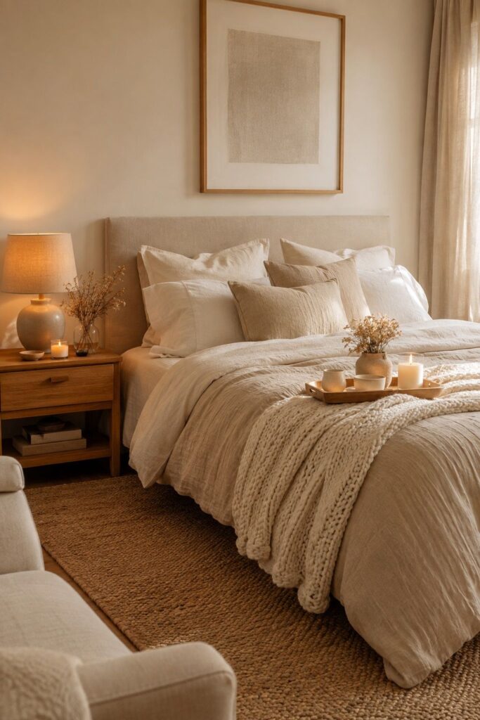
The neutral fall aesthetic is for people who want that warm bedroom aesthetic without any color commitment whatsoever.
The palette is warm cream, oat, mushroom, sand, and soft linen white — tones so close to each other that the room’s warmth comes entirely from texture and light rather than color contrast. And it’s extraordinary.
The key insight for this palette: neutral ≠ flat. A room that works in all-neutrals has a texture variety that more colorful rooms don’t need.
Layering warm-toned neutrals in different materials — linen beside chunky knit beside smooth ceramic beside rough jute — creates exactly the depth and richness that bold-color rooms get from contrast. The eye reads the texture variation as warmth, even when all the tones are similar.
The build for a cozy neutral fall room:
- A jute or natural fiber rug as the base — texture-forward and season-agnostic
- Cream and oat linen bedding layered with a chunky cream knit throw
- Warm wood accents — a honey oak nightstand, a raw wood tray, an unfinished wooden frame
- Dried botanicals in neutral tones — pampas grass, white cotton stems, dried wheat — in a simple dark bottle
- Warm white fairy lights doing all the atmospheric work that color would do in another palette
Pro-tip: The one accent that stops a neutral fall room from reading as “blank” is warm brass in small doses — a brass lamp base, brass picture frames, a small brass tray. It’s the warm metallic thread that makes the neutrals glow rather than flatten. Absolute perfection!
The Moody Green Fall Aesthetic: Forest, Sage, and Autumn’s Other Color
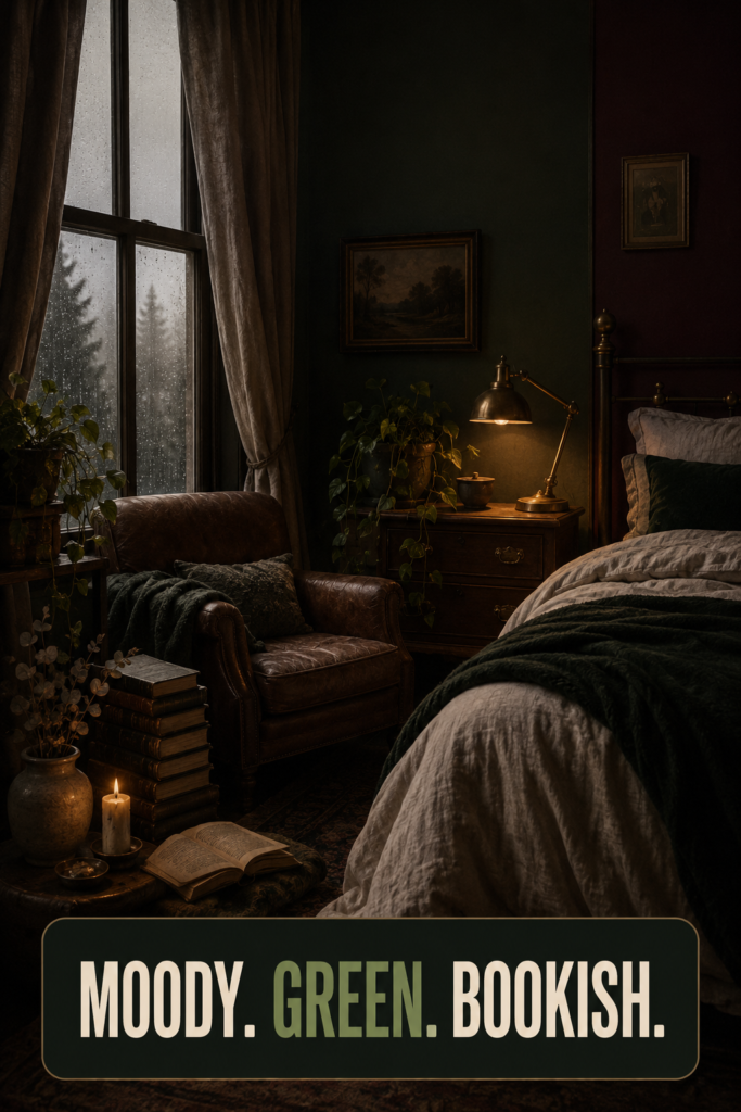
Here’s the one that genuinely surprises people: green is a fall color. Not the bright grass-green of summer, but the deep forest green, faded sage, and mossy olive of turning leaves and overcast October afternoons.
A green fall room has been quietly trending for two seasons now, and once you see it done well, the standard orange fall palette genuinely starts to look a little tired.
The moody fall aesthetic in green works in every room but is especially extraordinary as a fall bedroom. The palette pairs with:
- Warm cream and off-white as the primary light base (so the green doesn’t feel cold)
- Deep brown and cognac leather accents — a leather cushion, a cognac-toned throw
- Dried botanicals in warm tones — the amber and honey of dried grasses against a forest green backdrop looks stunning
- Aged brass hardware and fixtures — brass and forest green is one of the greatest color pairings in interior design, full stop
A thoughtful green and warm-neutral color scheme with deep olive walls or a forest green statement textile creates an autumn room aesthetic that feels like the actual forest in October — not the Target seasonal display version of it. Deeply satisfying and wildly underused as a fall room color palette!
Pro-tip: Can’t commit to a green wall? A single forest green velvet curtain panel or a sage linen duvet cover introduces the color at a completely reversible, no-landlord-conversation level. Start there and build outward. So chic and so worth it!
The Pink Fall Aesthetic: Dusty Rose, Warm Mauve, and Soft Autumn Femininity
The pink fall aesthetic gets left off almost every “fall room ideas” guide, which is a real shame because dusty rose and warm mauve in autumn lighting look like nothing else on earth.
The pink that works here isn’t bubblegum or hot pink — it’s the muted, slightly dusty, vintage-adjacent pink of dried roses and antique textiles.
Pair dusty rose or warm mauve with:
- Warm cream and antique white as the base
- Aged gold or rose-gold hardware — not bright gold, but the slightly worn, warm-toned version
- Dried floral arrangements — dried roses, pink pampas grass, dried lavender — which sit beautifully in amber glass vessels for that vintage fall aesthetic crossover
- Velvet and linen textiles in blush and dusty rose tones
The fall color palette in muted, earthy rose tones has the same warmth as the standard fall palette — it just reads as softer, more feminine, and more timeless. And in warm lamplight, dusty pink glows in a way that makes a room feel genuinely magical. Completely obsessed with this palette!
Your Fall Room, Your Way
The default fall palette exists because it’s safe and recognizable and photographically bold. And that’s genuinely fine — it works! But if you’ve scrolled past it feeling like your version of autumn isn’t represented, it is now.
Vintage, dark, neutral, green, pink — five completely distinct answers to “what does a fall room look like,” and every one of them is just as seasonal, just as cozy, and just as legitimately autumn as the standard orange-and-rust version.
The bedroom aesthetic that works for you is the one that makes you feel like you actually want to be in the room — and that feeling is completely available in every palette here.
Pick the one that feels most like you, and go build it. Fall is waiting! 🍂