Your caravan’s tired interior doesn’t need a complete gutting. I’ve watched countless owners throw thousands at structural changes when what they really needed was paint and better fabric choices.
The smartest renovation often costs the least but delivers the biggest visual punch. You’re working with small spaces, inconsistent natural light, and materials that need to survive road vibration and wild temperature swings. The colors you choose have to earn their keep in ways that house paint never will.
Understanding color in a caravan is its own discipline. What works in a suburban bedroom fails miserably in a space that’s constantly moving and changing environments.
The right palette can turn a cramped 1980s relic into somewhere you actually want to spend a weekend.
Let’s look at five color approaches that work in real caravans, tested by people who actually live and travel in them.
Key Takeaways
- Coastal whites and soft blues expand tight spaces while triggering that vacation mindset you’re chasing.
- Grey schemes with dark lower cabinets hide dirt while bouncing light where older caravans need it most.
- Neutral khakis work with existing wood features and won’t kill your resale value.
- Urban combinations using graphite and olive with gold hardware punch above their weight in compact spaces.
- Earthy greens connect your interior to actual landscapes instead of fighting against them.
Contents
- 1 Choosing Caravan Color Schemes: Space, Light, and Style Factors
- 2 Coastal Palettes for Bright, Airy Small-Space Interiors
- 3 Sophisticated Grey Color Schemes That Maximize Light
- 4 Warm Neutrals and Universal Khaki for Versatile Interiors
- 5 Urban Color Schemes: Graphite, Olive, and Gold Accents
- 6 Earthy Greens and Blues That Connect Indoors to Outdoors
Choosing Caravan Color Schemes: Space, Light, and Style Factors
The color wheel matters less than understanding your specific tin can. Light colors expand tight spaces, which explains the white obsession in modern caravan designs.
Natural light shifts dramatically from morning to evening, so that crisp blue you loved at 9 AM might look washed out by dinner. Your lighting needs to support your color choices, not undermine them at every turn.
Cool tones settle you down after eight hours of highway driving. Warm colors energize a space but can shrink already small areas into phone booths.
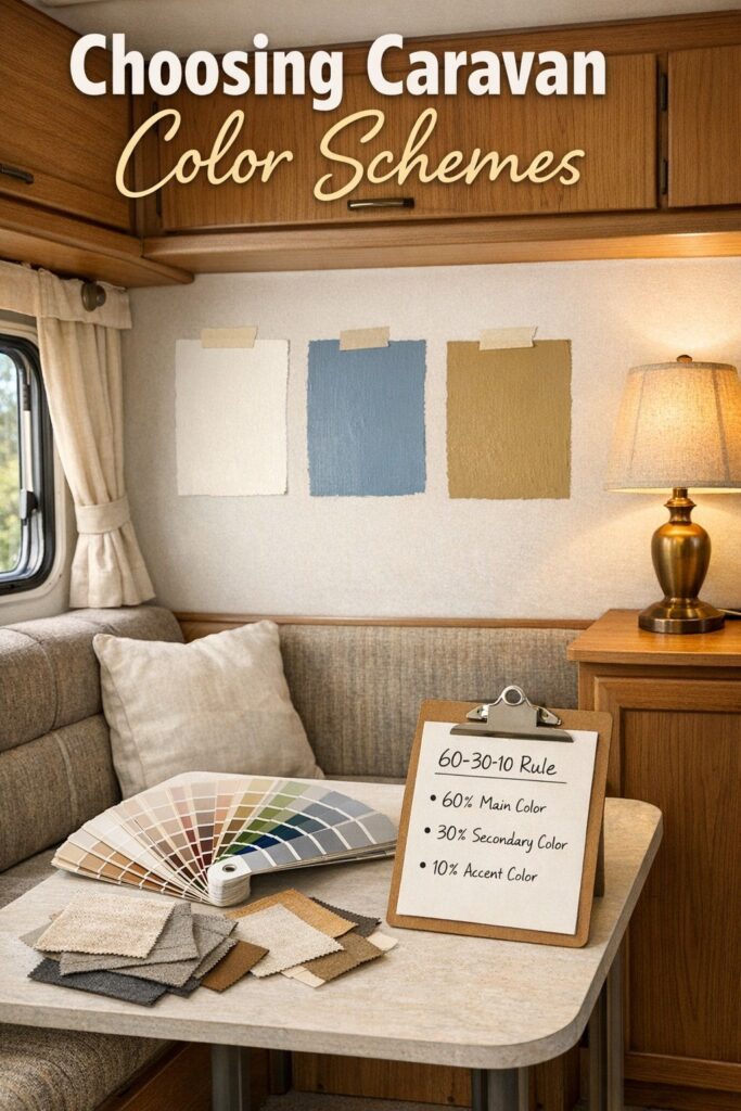
The 60-30-10 rule gives you structure: 60 percent dominant color, 30 percent secondary, 10 percent accent. Test your colors in actual conditions before painting entire walls.
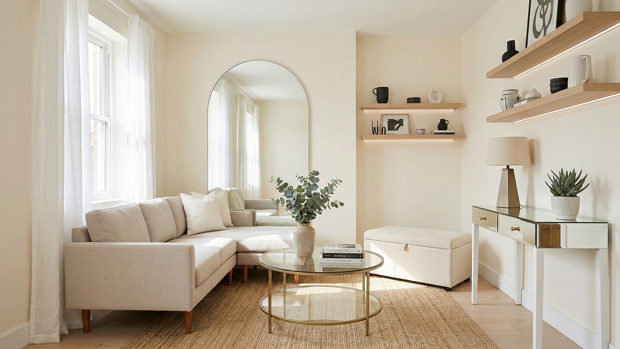
Coastal Palettes for Bright, Airy Small-Space Interiors
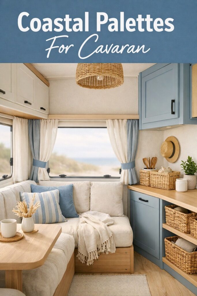
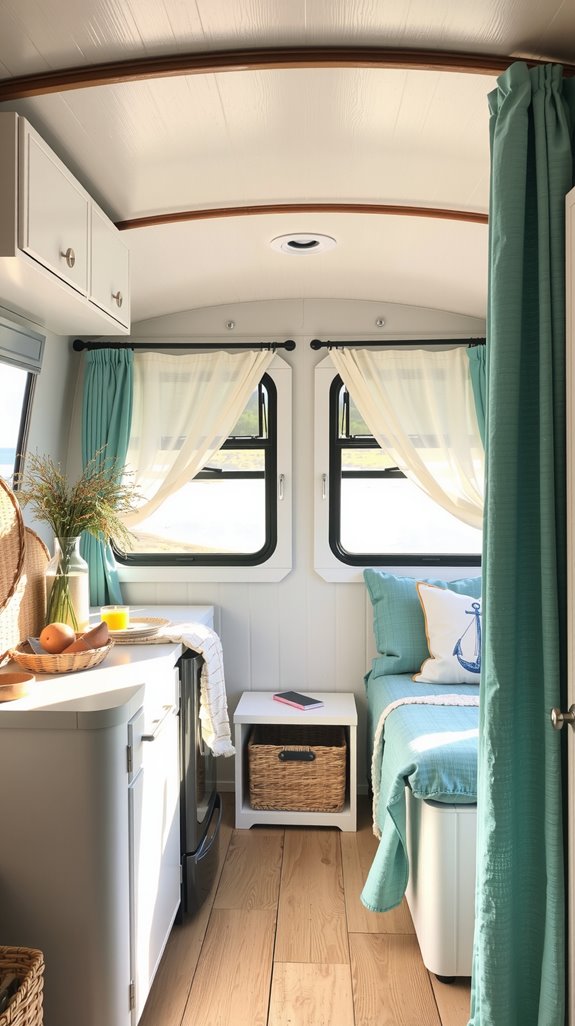
White walls form your baseline, but skip that harsh hospital white. Off-white or cream keeps things bright without the glare that causes headaches.
Layer in blues through replaceable elements like throw pillows, curtains, or a single feature cabinet.
This scheme has rescued some genuinely claustrophobic layouts I’ve seen over the years.
Natural materials prevent coastal palettes from feeling sterile and cold. Rattan storage baskets and wooden countertops add warmth that pure white lacks.
Linen fabrics outperform heavy cotton because they move with airflow and dry faster after spills. The goal is beach house, not meat locker.
Sophisticated Grey Color Schemes That Maximize Light
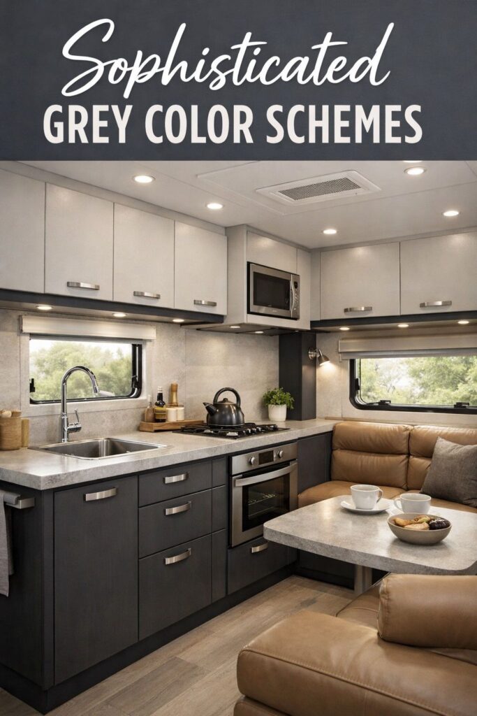
Grey isn’t boring when you understand how to deploy it properly. Dark grey on lower cabinets hides the inevitable dirt and scuffs that accumulate near floor level.
White or light grey upper cabinets bounce light around and prevent that cave effect. The contrast between upper and lower sections creates visual interest without requiring patterns that overwhelm small spaces.
Stone-look benchtops with subtle veining add character without visual chaos. Leather upholstery in cappuccino or charcoal ties everything together while wiping clean in seconds.
This combination neutralizes even the most offensive beige or orange furniture from previous owners. Grey is actually one of the most forgiving colors you can choose for caravan makeover work.
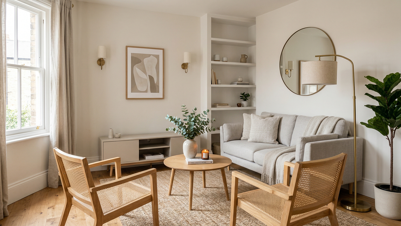
Warm Neutrals and Universal Khaki for Versatile Interiors
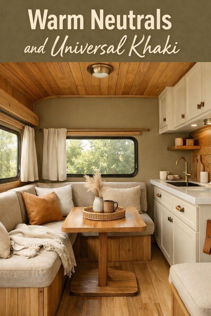
Khaki is the color equivalent of good denim. It pairs with everything, never dates itself, and makes other colors look better by proximity.
If your caravan has original wood paneling that’s dated but solid, khaki walls let you keep the structure without the 1970s museum effect. The warm undertones make spaces feel comfortable instead of clinical.
Pair khaki walls with white or neutral cabinetry to avoid going too earthy. Tan or natural linen cushions bridge the gap between wall and cabinet tones.
Leather accents and cotton textiles add necessary texture without pattern chaos. This palette preserves resale value because it offends nobody while still looking intentional.
Urban Color Schemes: Graphite, Olive, and Gold Accents
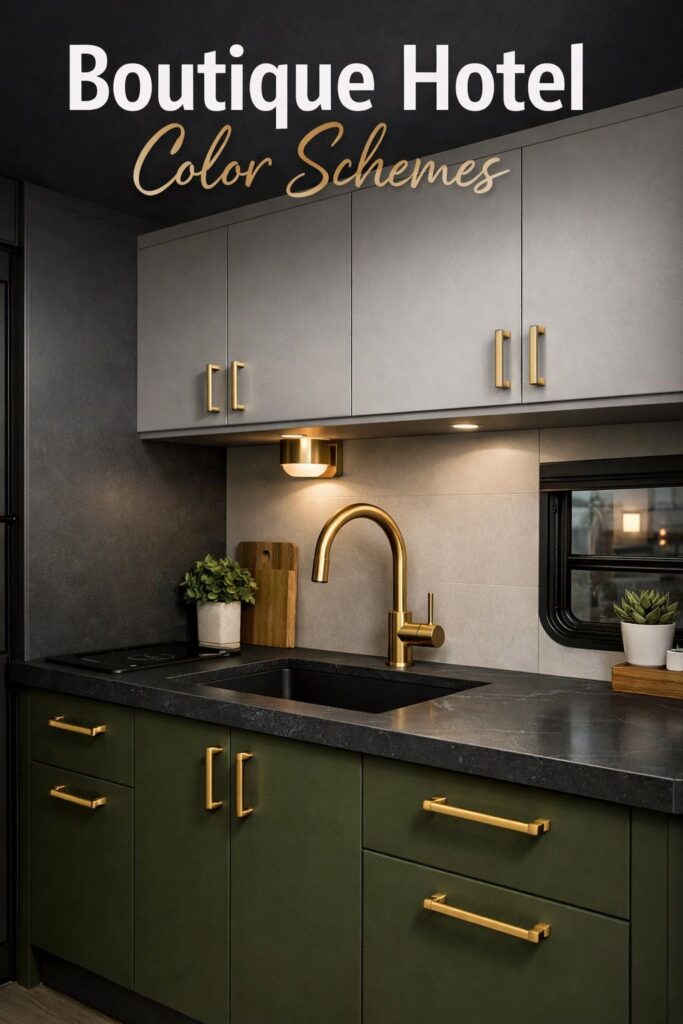
This scheme works when you want boutique hotel instead of camping trailer. Graphite countertops with fine veining deliver high-end looks without marble prices.
Light grey cabinets prevent the space from going too dark while maintaining modern lines. Olive green lower cabinets against white uppers create contrast that works in photographs and real life.
Gold hardware is your secret weapon in this setup. Cabinet pulls, faucets, and light fixtures in brushed gold warm up cool greys and complement olive undertones.
Matte finishes hide fingerprints better than glossy surfaces, which matters in tight quarters. This combination gives you over a hundred variations depending on which elements you emphasize.
Earthy Greens and Blues That Connect Indoors to Outdoors
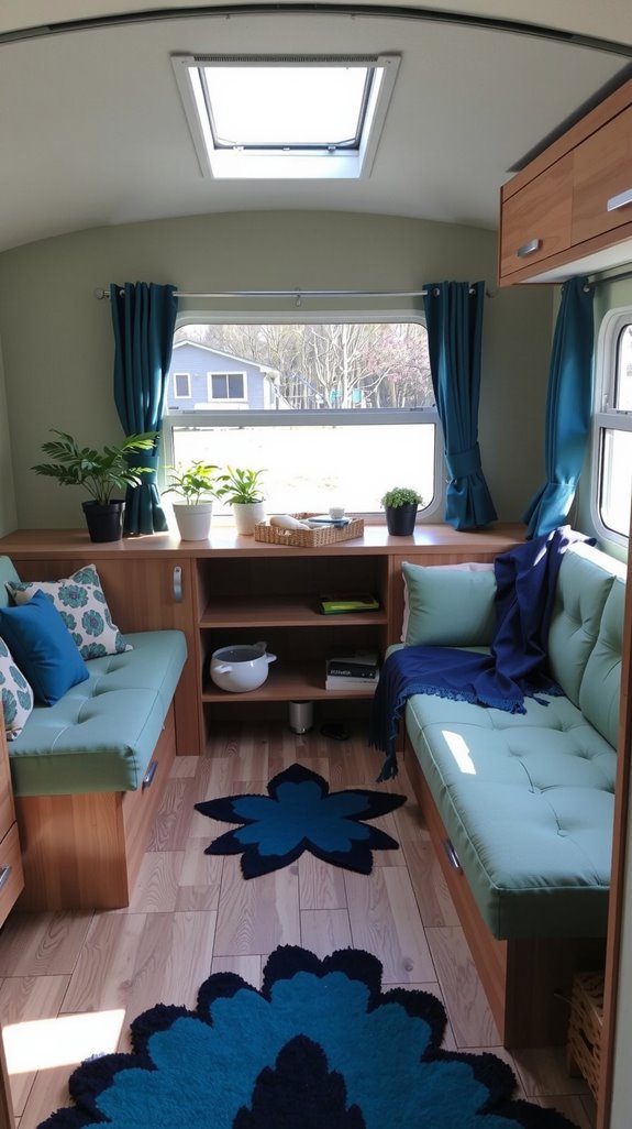
Sage green works because it’s soft enough to expand space but colorful enough to feel deliberate. It pairs naturally with wood grain and linen without looking forced.
Seafoam green leans coastal but earthier than straight blue, making it versatile across different camping environments. Muted olive adds warmth and grounds lighter elements without brown’s heaviness.
Navy blue makes a strong accent for small doses like cushions or Caravan’s cabinet interiors. Sky blue maintains airflow in compact floor plans that need every trick available.
These nature-inspired colors make psychological sense because they connect your interior to wherever you’ve parked. The effect is subtle but measurable.
Conclusion
The right color palette outperforms expensive renovations in most caravan interiors. Coastal schemes expand small spaces and create that vacation feeling you bought the thing for.
Grey combinations modernize outdated layouts while staying practical for actual use. Earthy tones connect your living space to the natural settings you’re traveling through.
Pick the scheme that matches how you actually use your caravan, not what performs on social media. Your best renovation might be three gallons of paint and new cushion covers.
Smart color choices prove that transformation doesn’t require a massive budget, just planning and the guts to commit.