The Pedestal Trick: Grounding Your Simple Spring Table Decor

The Pedestal Trick: Grounding Your Simple Spring Table Decor

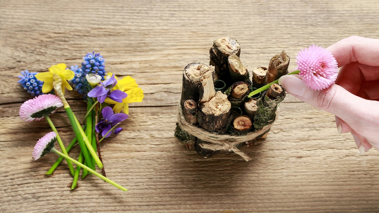
I’ve spent years styling my home, and I’ve learned that a beautiful spring dining table usually comes down to one secret. We’ve all been there: you set out your favorite bud vases and decorative eggs, only to realize the decor looks “messy” or like it’s floating aimlessly across the wood. I call this “flat table syndrome,” … Read more

The Boundary Trick: Why Spring Coffee Table Decor Trays Cure Clutter

The Boundary Trick: Why Spring Coffee Table Decor Trays Cure Clutter

Spring has a funny way of exposing things we’ve been ignoring all winter. The light gets brighter, the rooms feel more open, and suddenly the coffee table that “felt fine” starts looking… busy. Not dirty. Not messy. Just visually loud. I used to think this meant I needed fewer decor items. Fewer books. Fewer candles. … Read more

13 Spring Home Decor Tricks: Visual Editing & Spring Coffee Table Decor Trays for the Minimalist Mama

13 Spring Home Decor Tricks: Visual Editing & Spring Coffee Table Decor Trays for the Minimalist Mama

Spring always makes me want my home to exhale. As a minimalist mom, I’m not trying to buy more things—I’m trying to see my space more clearly. That’s where visual editing comes in. These spring home decor tricks are all about doing less, but doing it intentionally. I focus on spring room decor that feels … Read more

The Ultimate Spring Decor Roundup: 35 Ways to Refresh Every Space

The Ultimate Spring Decor Roundup: 35 Ways to Refresh Every Space

Spring always makes me want to hit the reset button on my home – not in an overhaul way, but in a lighter, fresher, everything-feels-better kind of way. This roundup is about those smart, satisfying updates that instantly lift a space. From color balance and light control to modern spring updates that don’t feel trendy-for-a-minute, … Read more

Warm Color Combination for Living Room (Cozy Without Feeling Heavy)

cozy warm living room

Think of your living room as a perpetual sunset, warm hues that wrap around you without the oppressive weight of midday heat. You’re aiming for that perfect balance where terracotta, amber, and honey tones create intimacy while strategic layering prevents the space from closing in. The secret lies not just in choosing warm colors but in understanding how they interact with light, texture, and those essential neutral anchors that keep everything from tipping into overwhelm.

Neutral Color Combination for Living Room (Warm, Calm & Flexible)

warm calm flexible palette

You might not realize that neutral living room palettes actually influence your stress levels and decision-making abilities more than bold color schemes do. When you’re selecting neutrals for your space, you’re not just choosing what looks good, you’re creating an environment that affects your daily mood and mental clarity. The key lies in understanding which warm, calm combinations work together and why certain neutral pairings outperform others in creating that flexible foundation you’re after.

Simple Color Combination for Living Room (Easy, Calm & Livable)

calm and easy colors

You don’t need to break the bank to transform your living room into a peaceful retreat. By selecting just two or three well-chosen hues, you’ll create a cohesive space that feels intentional rather than chaotic. The secret lies in understanding how colors interact with each other and your room’s natural light. Simple combinations eliminate decision fatigue while giving you flexibility to refresh your space through accessories and there’s a proven formula that works every time.

Modern Color Combination for Living Room (Clean, Stylish & Timeless)

timeless stylish living room

Your living room’s color scheme sets the tone for your entire home, and choosing the right modern combination requires more than just picking trendy shades. You’ll need to understand how neutrals, accents, and lighting work together to create a space that won’t feel dated in five years. The key lies in balancing timeless foundations with strategic color choices that reflect your personal style, while maintaining visual coherence.

Color Combination for Small Living Room (That Makes Space Feel Bigger)

light colors open space

You’ve probably noticed how some rooms feel cramped while others seem spacious, even when they’re the same size. The difference often comes down to color choices. Your small living room doesn’t need to feel claustrophobic if you understand how specific color combinations manipulate visual perception. The right palette can trick your eye into seeing expanded dimensions, but choosing it requires more than just picking your favorite shades.

Light Color Combination for Living Room (Bright, Airy & Timeless)

bright and timeless palette

You might think light colors make a room feel washed out, but the right combinations actually create depth while keeping your space open and inviting. Light color schemes aren’t just trendy, they’re timeless precisely because they work with both natural and artificial lighting to transform how your living room feels throughout the day. The secret lies in understanding which light tones complement each other and how to layer them strategically. Before you pick up that paint sample, theres a critical framework you’ll want to know.