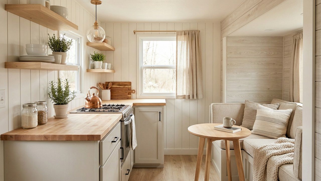
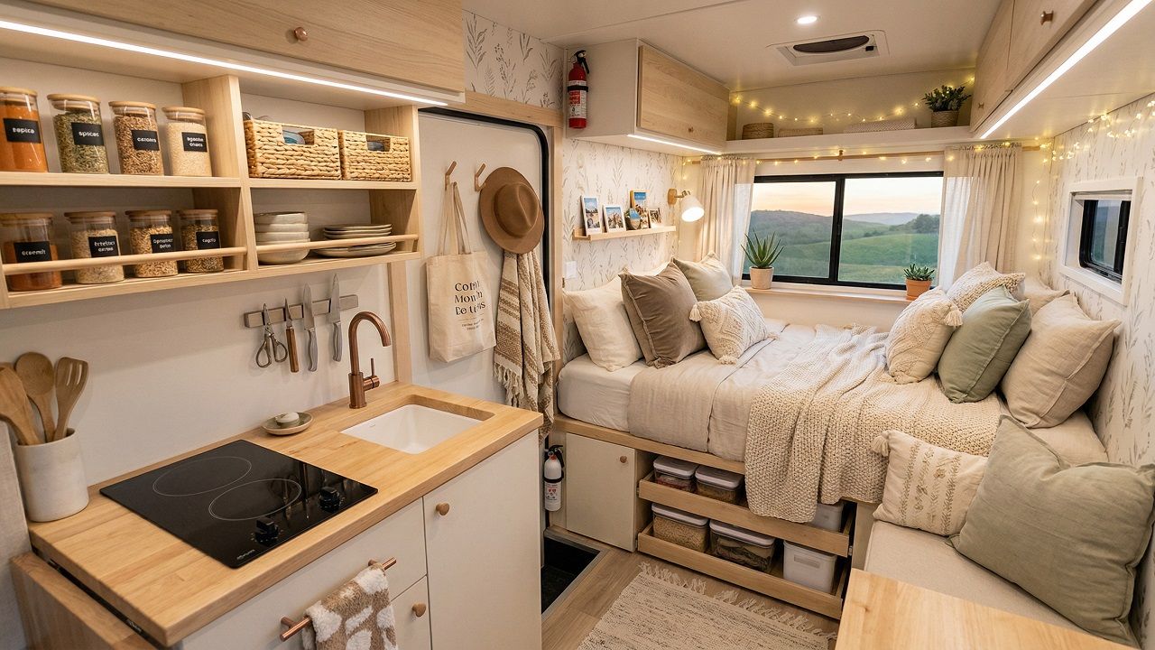
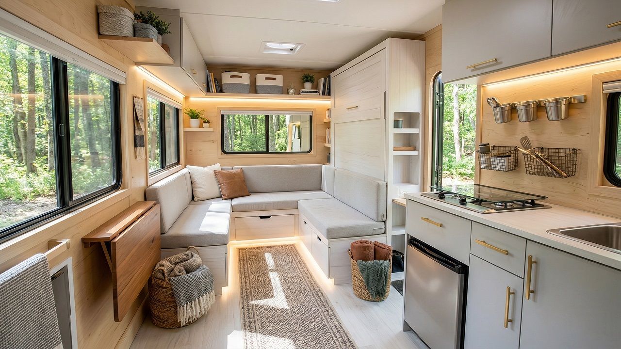
For years, van builders have been chasing minimalism, and somewhere along the way, mobile homes started looking like doctors’ waiting rooms.
Beige walls, neutral wood tones, everything carefully subdued. There’s another way to do this, and it takes color, personality, and a little courage.
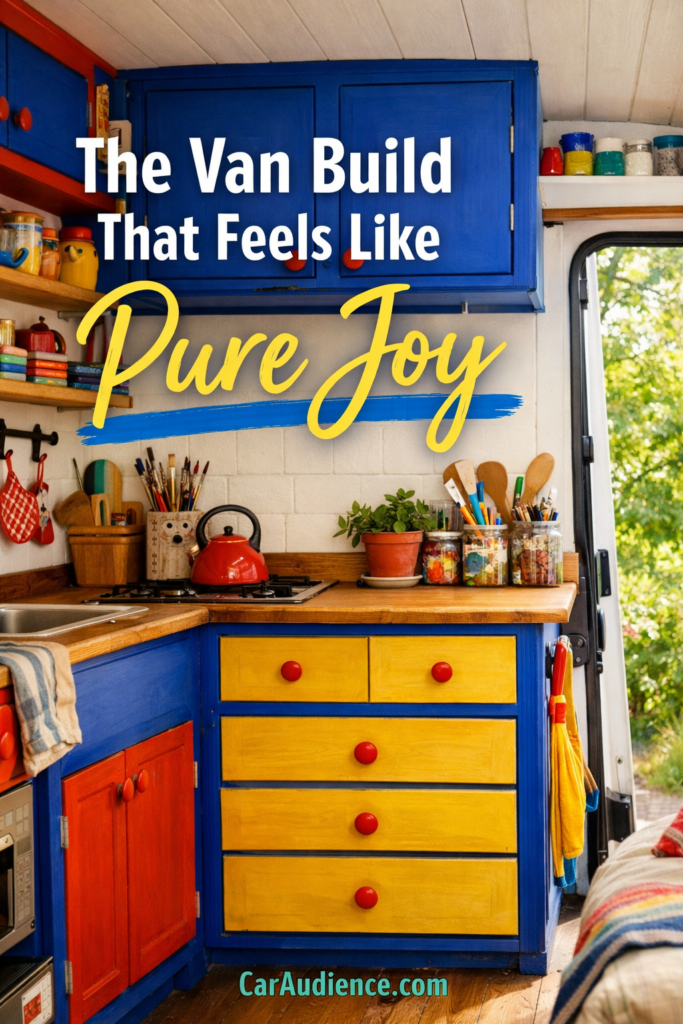
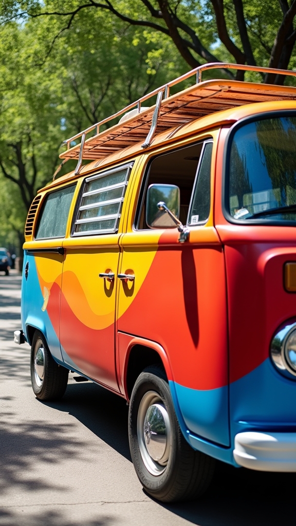
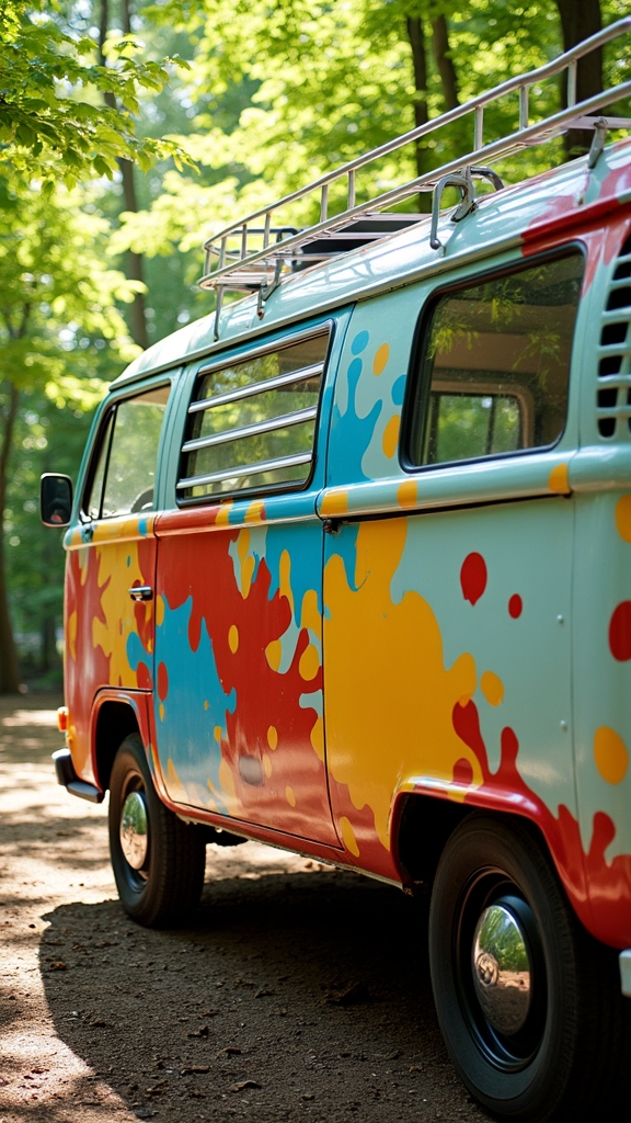
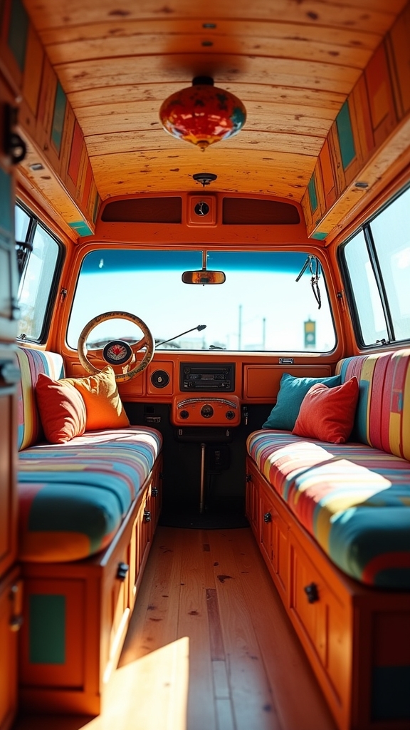
The primary play aesthetic borrows from kindergarten classrooms and vintage toy boxes, using bold hues and playful details to create spaces that feel genuinely alive.
And despite what the Scandinavian catalog crowd might suggest, some of the most practical builds out there are also the most colorful. The ones where red cabinets and yellow trim make you smile every time you open the doors. Here’s how to build one of your own.
What Is the Primary Play Aesthetic?
Think back to your elementary school art room, with its bright poster paints and construction paper in every color. Primary play design takes that same energy and applies it to adult spaces without making them look childish.
You’ll see this trend all over Pinterest right now, where people are finally admitting they’re tired of gray everything. The concept works particularly well in small spaces like camper vans because bold colors can actually make cramped quarters feel more intentional rather than just small.
The Rise of Grown-Up Playful Design on Pinterest
Pinterest went through its farmhouse phase, then its moody maximalist phase, and now it’s landed on something actually interesting. People are saving images of bright yellow kitchens and cobalt blue bathrooms like they’ve been starving for color after a decade of greige everything.
This isn’t kids’ room design spilling over into adult spaces—it’s adults finally admitting they never wanted boring neutral homes in the first place. The algorithm has caught on, and now you can’t scroll without seeing someone’s primary-colored coffee nook or rainbow-tiled shower getting thousands of saves.
Why It Works Perfectly in Camper Vans and Tiny Spaces
Small spaces need visual interest, or they start feeling like closets you happen to sleep in. When you paint a cabinet door bright blue or add red trim around a window, you’re creating focal points that break up the monotony of a long, narrow box.
I’ve found that color draws your eye around a space in a way that makes it feel bigger, not smaller. The trick is being deliberate about where you put those pops of color so they guide your eye instead of competing for attention.
Picking a Color Palette That Pops
Using Primary Colors Without Overwhelming the Space
Pick one primary color to lead with and let the others play supporting roles. If you go with red cabinets, maybe you can add small yellow accents and leave blue for just one special spot.
White walls or light wood paneling give your eyes a place to rest between the colorful moments. The mistake most people make is trying to use equal amounts of every color, which turns your van into a circus tent instead of a home.
Adding Accent Colors Like Pastel Pink or Sky Blue
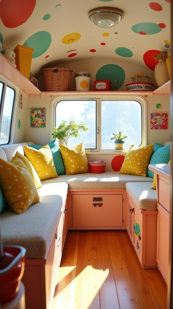
Pastels soften the punch of primary colors without losing the playful vibe. I painted my cabinet interiors a soft pink, so every time I grabbed a coffee mug I got that little surprise of color.
Sky blue works beautifully on ceilings in vans because it mimics the actual sky and makes the space feel taller. You can mix these softer shades with your bolder primaries to create layers of color that feel intentional rather than random.
How to Balance Bright Hues With Neutrals
The 60-30-10 rule from interior design applies even better in vans because you’re working with such limited square footage. Give 60% of your space to neutrals like white walls or natural wood, use 30% for your main color choice, and save 10% for that accent color that makes people say “wow.”
This ratio keeps things grounded while still delivering plenty of personality. I’ve seen builds that ignored this balance, and they’re exhausting to spend time in after about an hour.
Creative Painting Projects for Camper Vans
Hand-Painted Cabinets, Drawer Fronts, and Bed Frames
Painting furniture is where you can really let loose without commitment, since you can always repaint if you hate it. Sand everything down first or your paint will chip off within a week of driving on rough roads.
Marine-grade paint holds up better than regular interior paint because it’s designed to withstand humidity and temperature swings. I learned this the hard way after my first paint job started peeling in the desert heat.
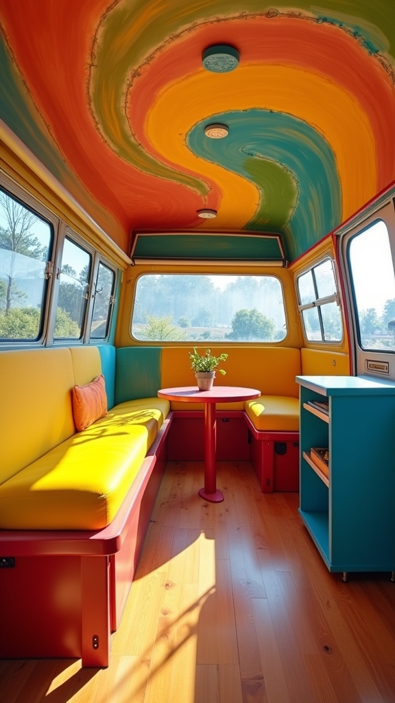
Designing Color-Blocked Walls and Ceilings
Color blocking means painting geometric sections of your walls in different colors, and it’s easier than you think. Use painter’s tape to mark off rectangles or triangles, making sure your lines are level unless you want a wonky look.
The beauty of this technique in a van is that you can hide imperfections in the walls by turning them into intentional design choices. Just remember that darker colors make spaces feel smaller, so save those for accent walls rather than the whole van.
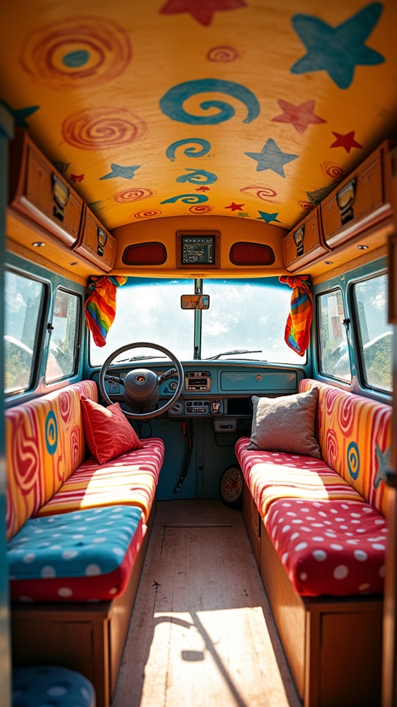
Painting Patterns: Stripes, Polka Dots, and Abstract Shapes
Stripes running lengthwise down your van can make it feel longer, while vertical stripes on the back wall add height. Polka dots are surprisingly easy if you use a sponge or even the bottom of a cup as a stamp.
Abstract shapes give you the most freedom since there’s no wrong way to do them, and they hide mistakes better than precise patterns. Whatever pattern you choose, test it on a piece of scrap wood first because what looks good in your head doesn’t always translate to reality.
Whimsical Wall Decor and Surface Styling
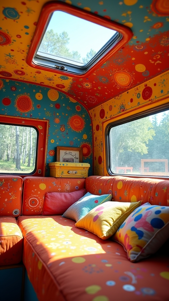
Van walls are criminally underused in most builds, with people treating them like they’re precious or fragile. The truth is, your walls can handle decals, paint, magnets, and all sorts of temporary or permanent decoration without losing structural integrity.
Surface styling is about creating visual interest on every plane of your van, from the ceiling down to the backs of cabinet doors. The best part about decorating vertical surfaces is that it doesn’t eat into your already limited floor space, so you can go wild without sacrificing functionality.
Adhesive Decals, Painted Murals, and Chalkboard Panels
Decals let you test drive a design before committing to paint, and they’re renter-friendly if you’re converting a leased vehicle. Murals take more skill, but turn your van into actual artwork that you’ll never get tired of looking at.
Chalkboard paint on one section of the wall gives you a place to write grocery lists, meal plans, or just doodle when you’re parked somewhere boring. I painted the inside of my cabinet doors with chalkboard paint so I could label what goes where without permanent markers.
Displaying Art, Stickers, or DIY Doodles
Your van walls are a gallery that travels with you, so fill them with things that make you happy. Command strips work better than nails in vehicles because they flex with the movement and won’t leave holes.
Rotate your art based on the season or your mood, since you’re not stuck with the same view like you are in a house. The stickers you collect from national parks and campsites become a visual diary of where you’ve been.
Layering Fun With Clipboards, Pinboards, and Photo Grids
Clipboards mounted on the wall hold changing displays of maps, postcards, or photos without any permanent commitment. Cork boards give you a tactile surface where you can pin up trail maps, ticket stubs, and other paper memories.
Photo grids made from string and clothespins create a timeline of your adventures that grows as you travel. These layered displays add depth to flat walls and give you something interesting to look at during rainy days stuck inside.
Furniture and Fixtures That Match the Mood
Repurposed School Chairs, Toy-Inspired Tables, and Retro Finds
Furniture in a van needs to work hard, but that doesn’t mean it has to look industrial or boring. The pieces you choose set the entire tone of your space, so a bright red chair hits differently than a gray folding one, even if they both do the same job.
Most van builders default to whatever’s lightest and cheapest, which is how you end up with a space that feels like a storage unit instead of a home. Choosing furrniture and fixtures that match your playful aesthetic makes the difference between a van you tolerate and one you actually love spending time in.
Updating Hardware With Funky Knobs or Painted Handles
Swapping out drawer pulls and cabinet knobs is the fastest way to add personality to a build without major work. Look for knobs shaped like geometric shapes, vintage toys, or just simple rounds in bright colors.
You can also take boring hardware and paint it yourself with enamel paint designed for metal. This costs maybe twenty bucks and takes an afternoon, but it completely changes how your cabinets feel.
Using Soft Shapes and Rounded Edges in a Build
Sharp corners are dangerous in a moving vehicle, so rounding them off improves safety while adding to the playful aesthetic. Rounded cushions on benches and beds feel more inviting than hard-edged foam rectangles.
Even something as simple as choosing curved shelving brackets instead of angular ones softens the whole space. I rounded the corners on my countertops with a router, which took an extra hour but has saved me from countless bruised hips.
Primary Play Lighting and Ambience
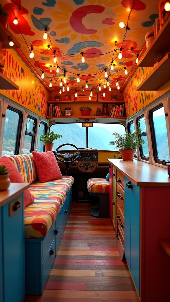
Using Rainbow Fairy Lights and Colored Bulbs
String lights in multiple colors give you adjustable mood lighting that can go from party mode to a relaxed evening with a switch. LED options barely drain your battery, and they don’t get hot like the old incandescent bulbs.
Drape them along the ceiling line or around windows to define spaces within your van. I’ve got mine on a dimmer so I can control the vibe depending on whether I’m reading, cooking, or just hanging out.
Lamp Shades and Lanterns in Bright, Fun Designs
Paper lanterns from home goods stores are cheap, lightweight, and come in every color imaginable. Look for lampshades at thrift stores and spray paint them whatever color your space needs.
The key is choosing lightweight options that won’t become projectiles if you hit a pothole. I zip-tie my lanterns to ceiling hooks so they stay put while driving, but still give off that soft, diffused light at night.
Creating Light Contrast With Painted Fixtures
Painting your light fixtures in contrasting colors turns them into design elements instead of just functional necessities. A yellow light fixture pops against a blue wall in a way that makes both colors look more intentional.
You can use heat-resistant spray paint on metal fixtures, just make sure everything’s completely dry before you install bulbs. This is another small change that takes minimal time but adds maximum visual impact.
DIY Decor Projects With a Childlike Spirit
Painted Flowerpots, Alphabet Blocks, or Wall Hooks
Terra cotta pots cost almost nothing and take spray paint beautifully, giving you custom planters in whatever colors match your van. Alphabet blocks from thrift stores make quirky bookends or can spell out words on shelves.
Wall hooks shaped like animals or basic geometric forms add function while reinforcing your playful theme. These small DIY projects are perfect for rainy days when you can’t work on bigger build elements.
Making Your Own Mini Gallery Wall or Sticker Display
Dedicate one small section of wall to a curated collection that changes as you travel. Removable adhesive strips let you rearrange things without damaging the walls underneath.
Mix photos with drawings, ticket stubs with pressed flowers, and let it grow organically. This becomes a visual journal that’s more interesting than any Instagram feed.
Creating a Travel Moodboard With Photos and Postcards
Pin up images of places you want to visit next to photos of where you’ve already been. This keeps your goals visible and reminds you why you’re living this way when things get hard.
Cork board mounted near your bed or dinette gives you something inspiring to look at every day. Add and remove items as your plans change so the board stays current with your actual life.
Organizing With Style in a Playful Camper
Using Colored Bins, Labeled Drawers, and Magnetic Boards
Storage containers in different colors can organize categories without needing labels that fall off. Red for cooking, blue for clothes, and yellow for tools becomes an instant visual system.
Magnetic boards on metal surfaces hold reminders, shopping lists, or photos without taking up valuable wall space. The goal is making organization so easy that you’ll actually maintain it while living on the road.
Turning Storage Into Decor With Coordinated Color
When your storage looks good, you don’t need extra decoration taking up space. Paint open shelving the same color as the items you’ll store there for a monochromatic look.
Alternatively, use contrasting colors to make your storage pop as a design feature. Either way, you’re making functional items pull double duty as decoration.
Keeping It Tidy Without Losing the Playful Spirit
The playful aesthetic falls apart if your van becomes a cluttered mess of colorful chaos. Give everything a specific home so you can clean up quickly at the end of each day.
Baskets and bins in fun colors hide the boring stuff while keeping it accessible. A few minutes of tidying each morning maintains the joyful vibe instead of letting it devolve into visual noise.
Capturing the Primary Play Aesthetic in Photos
Styling Interior Shots With Toys, Plants, and Props
Small plants in bright pots add life and color without taking up much room. Vintage toys on shelves give your photos personality and make them instantly recognizable as yours.
Props tell a story about how you actually live, not just how your van looks when it’s empty. Just don’t stage things so heavily that your photos look fake because people can spot that immediately.
Editing to Enhance Bright Colors Without Oversaturation
Boost vibrance slightly but stop before colors start looking radioactive. Natural light is your friend, so shoot during golden hour when possible.
Increase contrast to make colors pop, but watch that you’re not losing detail in shadows. The goal is to make your colors look true to life but slightly enhanced, not like you discovered the saturation slider for the first time.
Creating Before-and-After Visuals That Show Joyful Progress
Shoot from the exact same angle for before and after photos so people can see the real transformation. Good lighting matters more than a fancy camera, so wait for the right conditions.
Include some process shots showing the work in progress, not just the finished product. These photos document your journey and inspire others who are scared to try something bold with their own builds.