Pale walls are often associated with a washed-out room, but that’s usually a failure of execution, not color choice. The right light palette creates depth while keeping a space feeling open and genuinely livable.
Rooms can be transformed by nothing more than swapping a muddy greige for a considered cream-and-gray pairing, and the difference is startling.
That’s the power of understanding which light tones actually work together and why. It’s the difference between a room that feels intentional and one that just feels beige. And the combinations below break down exactly how to land on the right side of that line.

Why Light Color Combinations Work So Well in Living Rooms
How light colors affect space perception
Pale hues do something that darker colors physically can’t: they bounce light around a room rather than swallowing it. That reflective quality makes walls appear to recede, which gives a room a sense of openness that has nothing to do with square footage.
Smaller living rooms benefit most dramatically because the visual boundary softens instead of pressing in. Darker shades absorb light and pull walls closer; lighter ones push them back.
| READ THIS GUIDE: Room Color Combination Ideas Designers Actually Use (And Why They Work) |
Light colors and natural light reflection
Natural light entering a room doesn’t just illuminate the spot it lands on. It multiplies off light-colored walls, reaching corners and shadows that would otherwise go dim by mid-afternoon.
That compounding effect changes how a room feels throughout the entire day, not just at noon when everything looks good anyway. You’ll also find yourself relying less on lamps during daylight hours, which shifts the whole atmosphere.
When light colors are the best choice
Smaller rooms are the obvious candidates, but light palettes earn their place in plenty of other situations too. Rooms with limited natural light especially benefit, since pale walls reflect whatever illumination is available rather than competing with it.
Bold, dramatic schemes have their place, but they can’t do what a well-chosen light palette does in a space that’s already fighting for brightness. That’s the advantage darker colors simply can’t match.
Best Light Color Combinations for Living Room Walls
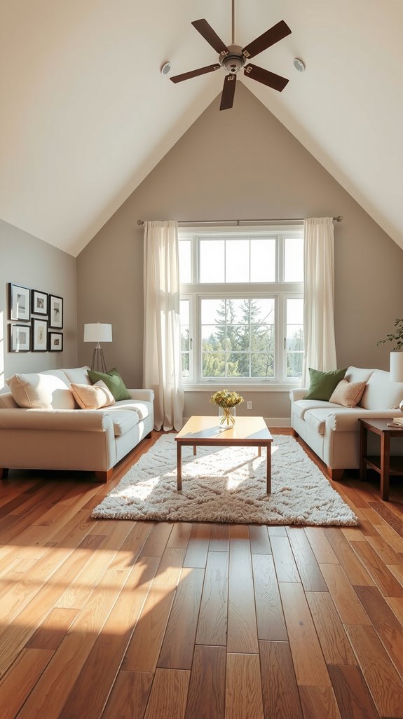
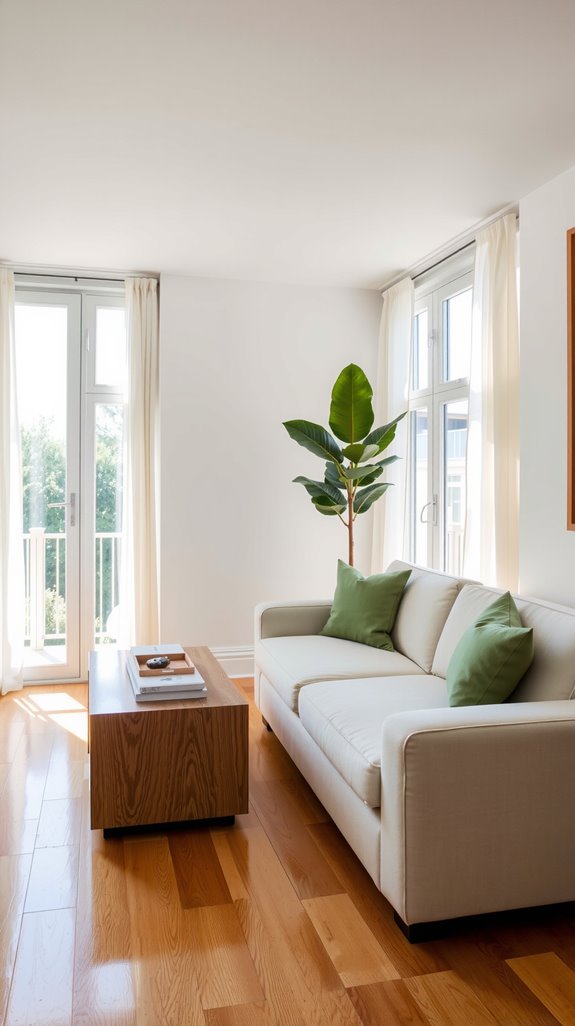
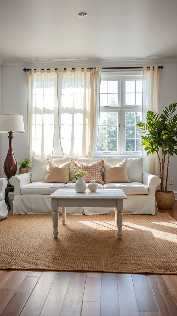
White and warm neutral combinations
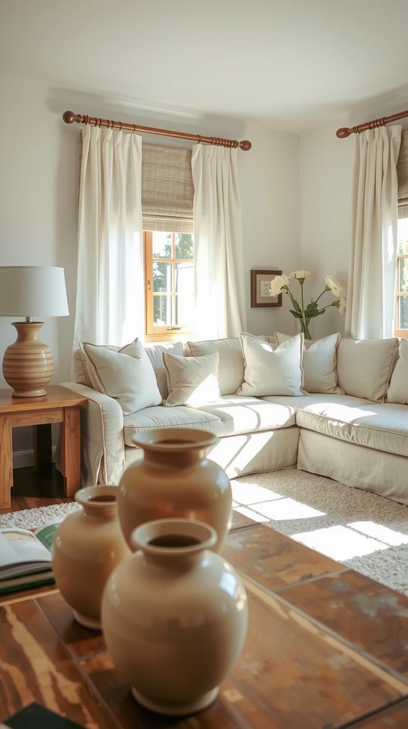
White paired with warm neutrals like beige, soft taupe, or cream is the combination that never stops working, and there’s a real reason for that staying power.
The warmth in the secondary tone keeps white from reading as clinical or cold, which is the failure mode most people are quietly afraid of.
Rooms with strong natural light handle this pairing especially well, since the warm undertones prevent any harshness.
Layer in different textures through furniture and textiles and the palette gains dimension without needing a third color.
Cream and soft gray palettes
Few pairings feel as quietly sophisticated as cream against soft gray, and the balance between them is what makes it work. Cream carries just enough warmth to lift a room that doesn’t get great natural light, while gray keeps things from tipping into sweetness.
These two tones have enough contrast to read as distinct while staying firmly in the light range, so nothing fights for attention. If your living room feels like it’s struggling to find a personality, this combination gives it one without drama.
| READ THIS GUIDE: Color Combination for Living Room: Stylish Ideas That Always Work |
Light beige and pastel combinations
Beige gets dismissed as boring, but it’s one of the most useful foundation colors available precisely because it accepts pastel accents without argument. Soft pink, dusty mint, and powder blue all sit comfortably against beige’s neutral warmth, creating gentle color movement rather than jarring contrast.
Rooms with strong natural light are where this pairing really opens up, because pastels in direct sun maintain their delicacy instead of going chalky. The beige does the grounding work so the pastels can stay soft and interesting.
Light Color Combination for Small Living Room
Light palettes that visually expand space
Square footage changes your priorities fast, and in a small living room, color choice is a functional decision as much as an aesthetic one. Soft whites, pale grays, and warm beiges reflect available light effectively, making the space feel less bounded even when the walls haven’t moved.
Monochromatic schemes help here because they eliminate the visual breaks that mentally chop a room into smaller pieces. Cool-toned palettes push walls back perceptually, adding depth that no furniture arrangement can replicate.
Best light colors for low ceilings
Ceiling height is something most people overlook until they’re already living with the problem. Paint your ceiling a shade lighter than your walls and the room suddenly feels taller without touching a single piece of furniture.
White, cream, and pale blue work particularly well because they draw the eye upward rather than letting it settle at the wall-ceiling line. Finishing the ceiling trim in glossy white adds another layer of light reflection that emphasizes that vertical movement.
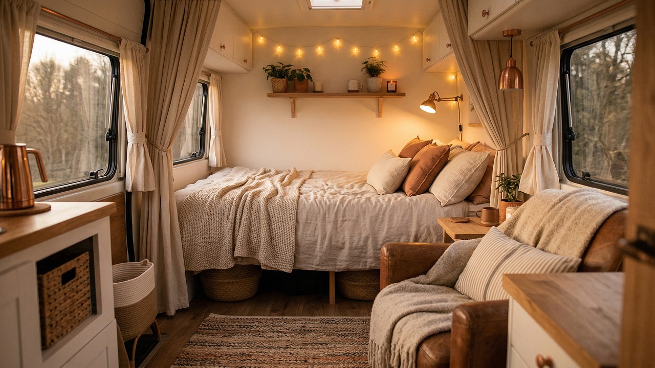
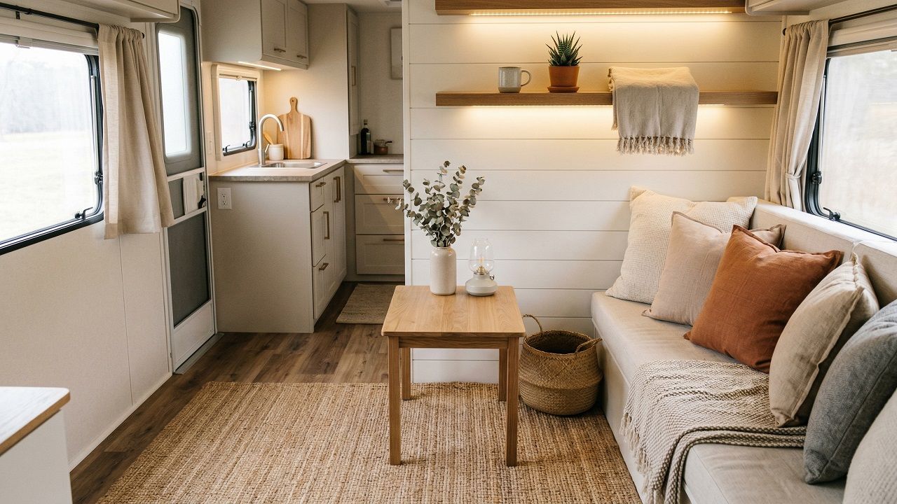
Warm Light Color Combinations for Cozy Living Rooms
Warm whites and creamy neutrals
Ivory, eggshell, and soft beige create something that crisper whites often don’t: a room that feels genuinely welcoming rather than showroom-ready. These shades reflect natural light beautifully while holding onto their warmth as the light shifts throughout the day.
Layering different cream tones adds depth while staying within the warm neutral family, which keeps the palette cohesive rather than busy. It’s a backdrop that works equally well behind traditional wood furniture and contemporary pieces.
Soft earth tones in light palettes
Pale terracotta, sandy beige, warm taupe, and muted clay move warmth further toward the organic, and that’s exactly what makes them feel grounded. These tones evoke natural landscapes without trying too hard, which keeps the room from feeling themed.
They pair especially well with wood, linen, and rattan, where the color and material language reinforce each other naturally. The result is a room that feels considered rather than assembled.
Lighting choices that enhance warmth
Color choices lay the foundation, but lighting is what makes warm palettes actually perform after dark.
Warm-toned bulbs in the 2700K to 3000K range bring out the amber and honey notes in cream and terracotta that cooler bulbs flatten entirely.
Layer your sources…
Dimmable overhead fixtures, table lamps, and accent lights give you control over the mood as the day shifts. That layered approach lets the room feel cozy at night without sacrificing brightness during the day.
Light Walls with Dark Furniture: How to Balance the Look
Choosing the right contrast level
High contrast between pale walls and dark furniture looks intentional when it’s calibrated correctly and accidental when it isn’t. The key variable is your room’s natural light: abundant sunlight supports bolder contrast, while a dimmer room needs the gap narrowed.
Mid-tone accents through rugs, textiles, and artwork bridge the extremes and give the eye places to rest. Without those transitional tones, the room reads as two separate halves rather than one cohesive space.
Using rugs and textiles to soften contrast
Hard surfaces amplify the divide between light walls and dark furniture, and textiles are your most effective tool for closing that gap. A cream or beige area rug placed beneath dark pieces creates a transitional zone that pulls the room together more than almost any other single addition.
Throw pillows in graduated tones, moving from light to medium shades, carry that bridge up onto the furniture itself. Draping a textured blanket over a sofa introduces warmth and distributes visual weight in a way that feels natural rather than calculated.
Simple Light Color Combination Ideas That Never Go Out of Style
White-on-white variations
White-on-white sounds like a recipe for sterility, but layering warm ivories against cooler alabasters creates real depth without introducing another color.
The variation in undertone is enough to keep things visually interesting, while texture in the fabrics and materials does the rest of the heavy lifting.
Linen, wool, and cotton each catch light differently, which gives a monochromatic white room far more dimension than it appears to have at first glance.
It’s a considered choice, not a cautious one.
Two-tone light neutral palettes
Two-tone neutral palettes take that same logic one step further by introducing just enough contrast to define a room’s structure. Soft gray walls against cream trim, or warm beige paired with crisp white architectural details, let the bones of a room do the talking.
The contrast is subtle enough that nothing competes, but present enough that the space feels shaped rather than flat. These combinations keep coming back in well-designed rooms because they continue to work regardless of what fills the space around them.