Accent walls fall flat when they fight for attention instead of supporting the room around them. I’ve walked through enough homes to know that the difference between a stunning focal point and a decorating mistake often comes down to restraint.
The best living rooms I’ve encountered use accent walls as architectural anchors, relying on saturated colors and interesting textures to carve out distinct areas without making the space feel chaotic. Whether you’re considering a deep forest green, a burnt terracotta, or a sophisticated plum, these seventeen examples will show you how to balance bold color with the kind of textures that make a room feel livable.

Contents
- 1 Key Takeaways
- 2 Moody Green Accent Walls With Warm Oak Paneling
- 3 Deep Terracotta Walls Behind Curved Sculptural Sofas
- 4 Chocolate Brown Accent Walls for Cozy Reading Nooks
- 5 Plum Accent Walls in Intimate Conversation Areas
- 6 Earthy Olive Walls With Bouclé and Chenille Textures
- 7 Intense Pink Feature Walls in Gallery-Style Rooms
- 8 Deep Blue Accent Walls for Modular Seating Zones
- 9 Rich Brown Walls Behind Croissant Sofas
- 10 Color Capping Your Accent Wall Onto the Ceiling
- 11 Tonal Gradients From Walls to Upholstery
- 12 Tone-On-Tone Layering With Warm Neutrals
- 13 Cream and Camel Accent Walls With Wood Tones
- 14 Grasscloth Accent Walls for Textural Depth
- 15 Microcement Feature Walls With Metal Accents
- 16 Stone and Plaster Accent Walls in Defined Zones
- 17 Choosing Accent Wall Colors for Small Spaces
- 18 Pairing Accent Walls With Antique Furnishings
Key Takeaways
- Deep colors like terracotta, plum, chocolate brown, and olive green anchor modern living rooms with warmth and sophistication.
- Textured finishes such as limewash, Venetian plaster, microcement, and grasscloth wallpaper bring dimension that flat paint simply can’t match.
- Pairing strong wall colors with complementary fabrics like velvet, bouclé, and rattan keeps the room from feeling one-dimensional.
- Extending your wall color onto the ceiling creates an intimate, wrapped effect that works surprisingly well in both small nooks and larger seating areas.
Moody Green Accent Walls With Warm Oak Paneling
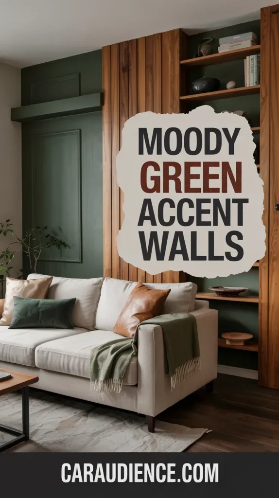
A moody green wall paired with warm oak paneling creates the kind of sophisticated atmosphere that feels both grounded and elegant. The contrast works because oak’s honey tones soften the intensity of forest or emerald green without diluting its impact.
I’ve seen this combination shine in home libraries where built-in oak shelving amplifies the green’s dramatic quality. Deep brown wood flooring ties everything together and keeps the space from feeling too precious.
Deep Terracotta Walls Behind Curved Sculptural Sofas
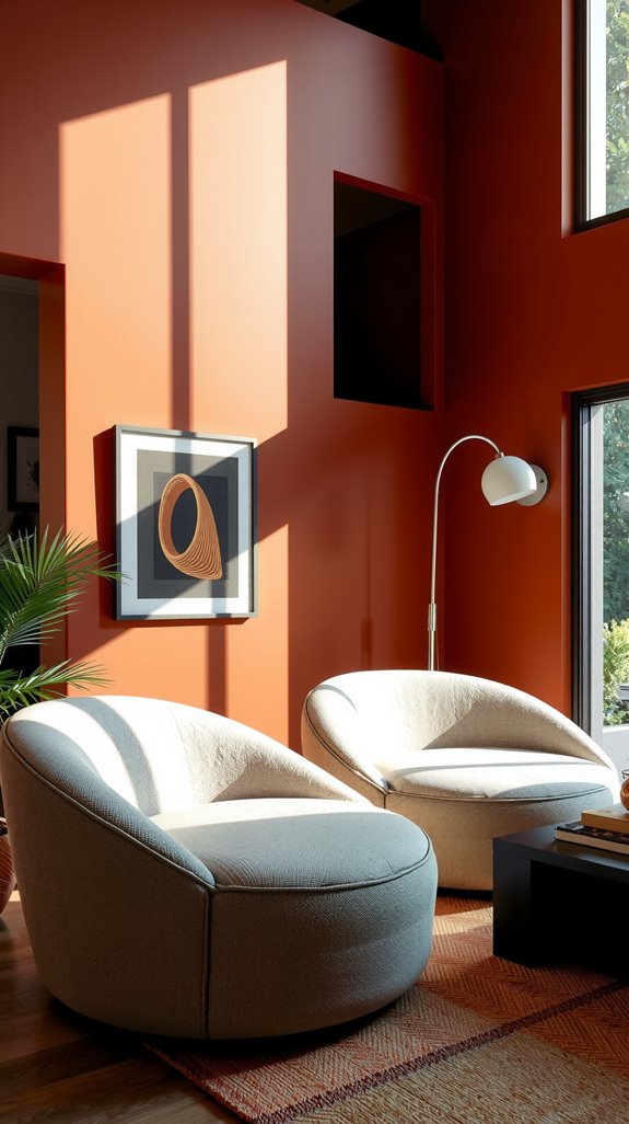
Terracotta brings a Mediterranean warmth that feels completely different from cooler accent colors. Positioning this earthy shade behind a curved sofa draws attention to the furniture’s organic shape while anchoring the entire seating area.
Limewash or Roman clay finishes add texture that shifts throughout the day as natural light moves across the surface. For the right depth, look for shades like Ember Red that read rich without turning orange.
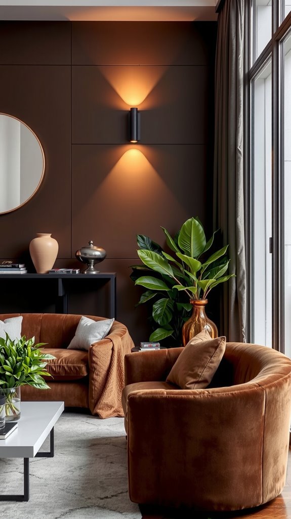
Chocolate Brown Accent Walls for Cozy Reading Nooks
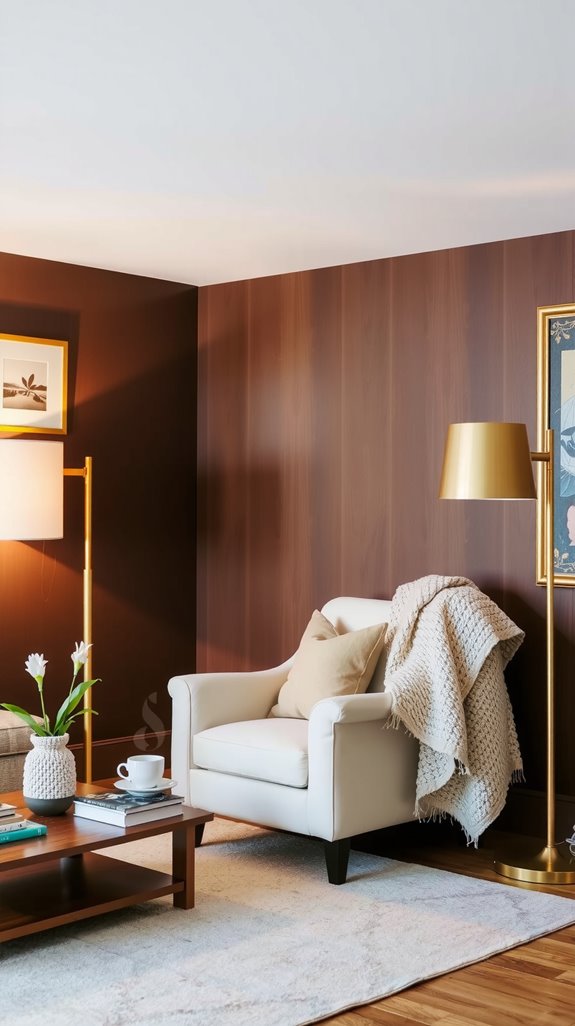
Chocolate brown has made a serious comeback, and for good reason. Applied to a single wall in a reading nook, it creates intimacy without the heaviness you’d get from painting an entire room.
Balance the darkness by keeping adjacent walls in creamy whites or warm beiges, which provide necessary contrast and brightness. Layer in pale wood furniture and touches of brass or gold to lift the scheme and prevent the space from feeling like a cave.
Plum Accent Walls in Intimate Conversation Areas
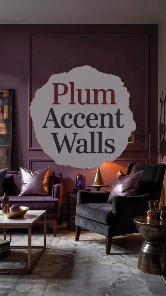
Plum takes more courage than chocolate brown, but the payoff is a room that feels genuinely distinctive. This deep purple works best in spaces dedicated to conversation and evening gatherings, where lower lighting enhances its moody sophistication.
Pair it with natural wood furniture to keep things grounded, and consider velvet upholstery that echoes the wall’s richness. Gold-framed mirrors and warm metallics play beautifully against plum’s cool undertones.
Earthy Olive Walls With Bouclé and Chenille Textures
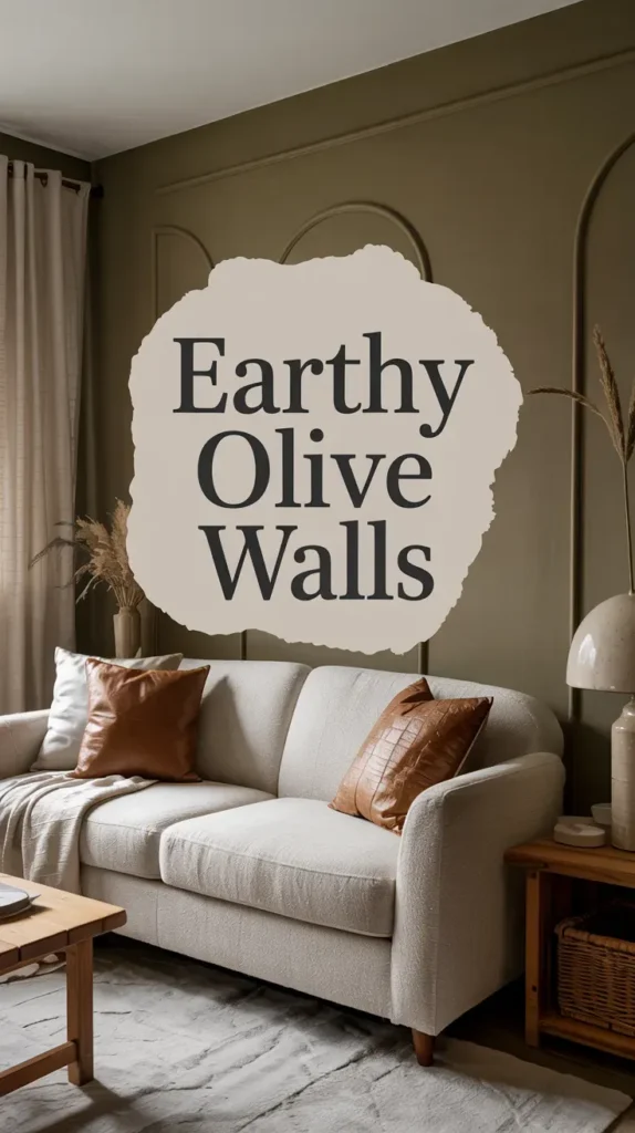
Olive delivers the same cocooning quality as darker shades but maintains a stronger connection to nature. The key is pairing these soft green walls with tactile fabrics that invite you to settle in and stay awhile.
Bouclé and chenille bring the right amount of visual softness while adding dimension that prevents the room from reading flat. Medium-tone wood floors and natural linen accents reinforce the organic sensibility without overdoing the earthy theme.
Intense Pink Feature Walls in Gallery-Style Rooms
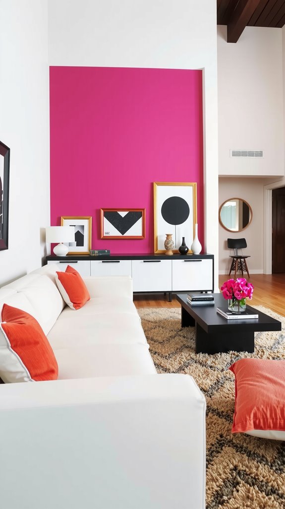
Pink can absolutely work in a living room if you commit to the right shade and treat it with confidence. Intense pinks create sophisticated backdrops for art collections when you avoid pastel territory and aim for something with real saturation.
Modular furniture helps balance the boldness in open layouts where the pink needs to coexist with other zones. Layer in rattan, linen, and other natural textures to keep the space from feeling too sweet or one-note.
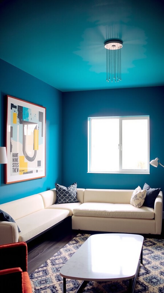
Deep Blue Accent Walls for Modular Seating Zones
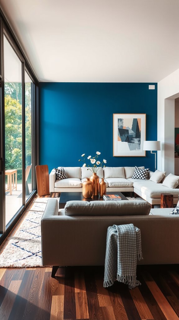
Deep blue naturally defines different areas within a living room while maintaining a calm, collected atmosphere. Nearly-black navy shades work particularly well behind modular seating arrangements, where they create intentional focal points without overwhelming the flexibility of the furniture layout.
Position these walls near windows or existing architectural features to enhance depth and dimension. Balance the darkness with neutral upholstery and strategic metallic accents that catch and reflect available light.
Rich Brown Walls Behind Croissant Sofas
The curved, pillowy shape of a croissant sofa looks exceptional against a rich brown wall. Deep chocolate or leather-toned paint creates contrast when paired with cream or beige upholstery, allowing each element to stand out without competing.
Matte finishes enhance the wall’s depth and prevent any unwanted shine that might cheapen the effect. Light wood accents in side tables or shelving keep the scheme from feeling too heavy or enclosed.
Color Capping Your Accent Wall Onto the Ceiling
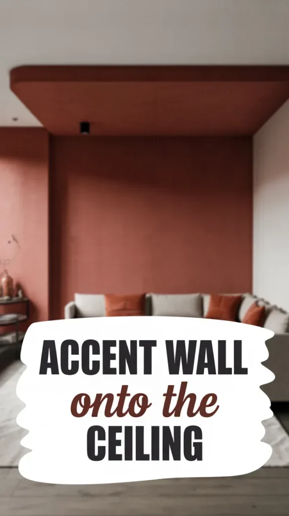
Extending your wall color about ten to twelve inches onto the ceiling creates an effect that’s gaining serious traction in residential design. This technique adds unexpected depth while drawing the eye upward and making the room feel more expansive.
The wrapped quality creates intimacy without sacrificing the sense of space, which makes it particularly effective in smaller living rooms. It’s a simple move that delivers outsized visual impact.
Tonal Gradients From Walls to Upholstery
Carrying your accent wall color into your upholstery creates a sophisticated, intentional continuity. Select fabrics one or two shades darker or lighter than your wall color to maintain unity while building depth.
This approach works especially well with muted tones like sage green or dusty lavender, where subtle variation reads as layered rather than matchy. The gradient effect adds complexity without requiring bold contrasts or jarring color jumps.
Tone-On-Tone Layering With Warm Neutrals
Layering different shades and textures within the same neutral family creates rooms with real staying power. Mix velvet, leather, and shearling in varying tones of your chosen hue to build dimension without introducing competing colors.
Incorporate multiple tints and shades across walls, furniture, and textiles so the space feels cohesive but never flat. Natural materials like rattan, jute, and wood add richness and prevent the monochromatic scheme from reading as boring.
Cream and Camel Accent Walls With Wood Tones
Cream and camel create warmth through subtle variation rather than dramatic contrast. Pair cream walls with camel-toned accents, then introduce walnut or oak furniture to add natural depth and visual interest.
Dark walnut particularly enhances camel’s richness when set against cream backgrounds. Brass floor lamps and copper accents provide just enough shine to complement the wood tones without stealing focus.
Grasscloth Accent Walls for Textural Depth
Grasscloth wallpaper brings an organic texture that paint simply cannot replicate. The natural weave adds warmth and dimension while maintaining an airy quality that works well in light-filled spaces.
Position grasscloth above fireplaces or behind gallery walls where its subtle pattern enhances rather than competes with other focal points. Professional installation is worth the investment, as grasscloth requires careful handling and performs best in dry living areas.
Microcement Feature Walls With Metal Accents
Microcement delivers an industrial aesthetic without the coldness that sometimes comes with concrete. This seamless coating creates continuous surfaces that pair beautifully with metallic shelving, pendant lights, and cabinet hardware.
The joint-free finish makes rooms feel larger while offering texture options from smooth and refined to rough and industrial. It provides the perfect neutral backdrop for bold metal elements without competing for attention.
Stone and Plaster Accent Walls in Defined Zones
Stone and plaster accent walls add architectural weight that paint alone cannot achieve. Precision-cut ledgestone around fireplaces creates natural focal points that feel permanent rather than decorative.
Stacked stone panels can conceal imperfect drywall while adding the kind of texture that makes a room memorable. Venetian plaster offers contemporary smoothness that contrasts beautifully with sleek modern furnishings while preventing the space from feeling cold or institutional.
Choosing Accent Wall Colors for Small Spaces
Color selection determines whether a small living room feels cramped or carefully curated. Light neutrals like white and soft beige maximize openness and work well when you want to preserve every inch of perceived space.
Deep blues or emerald greens create sophisticated focal points that surprisingly don’t overwhelm compact rooms when balanced with lighter surrounding walls. Dark colors like navy or deep forest green can actually make small spaces feel more intentional and cocooning rather than simply small.
Pairing Accent Walls With Antique Furnishings
Reclaimed wood accent walls create instant harmony with antique furniture by adding layers of history and patina. Position antique chests beneath contemporary artwork to bridge old and new, or place vintage marble-topped tables beside modern upholstered pieces for productive tension.
Repeat wood tones between your accent wall and antique furniture to create visual continuity that feels effortless. Weathered paneling complements heirloom cabinets naturally, letting the authentic character of aged materials speak for itself.