Choosing a paint color for your home is one of those decisions that feels bigger than it should. You’ll be looking at these walls every single day, watching how they shift with morning light and evening shadows, and either loving or quietly resenting your choice for the next few years.
The colors I’m recommending here aren’t the trendy shades that’ll make you cringe in two years when you’re flipping through old photos. These are the workhorses I’ve seen perform beautifully in dozens of homes, the ones that keep showing up in my notebook because they just work.
Contents
- 1 Pure White SW 7005: Crisp and Clean for Any Space
- 2 Alabaster SW 7008: Warm Comfort for Cozy Rooms
- 3 Evergreen Fog SW 9130: Sophisticated Green-Gray Tranquility
- 4 Naval SW 6244: Timeless Navy With Elegant Brass Accents
- 5 Cinnamon Slate 2113-40: The 2025 Color of the Year
- 6 Sea Salt SW 6204: Delicate Blue-Green Versatility
- 7 Accessible Beige: Modern Neutral Without the Noise
- 8 Redend Point: Muted Pinky Clay With Staying Power
- 9 Slate Tile SW 7624: Deep Cool Sophistication
- 10 Dover White SW 6385: Creamy Warmth With Yellow Undertones
- 11 Clary Sage SW 6178: Earthy Green Harmony
- 12 Briny SW 6775: Rich Coastal Blue-Green Saturation
- 13 French Canvas: Practical Elegance for Designer Homes
- 14 Shoji White SW 7042: Versatile Off-White With Gray Balance
Pure White SW 7005: Crisp and Clean for Any Space
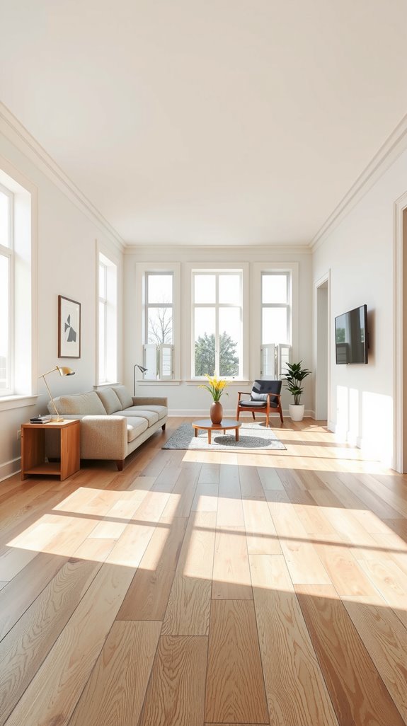
Pure White sits in that sweet spot where most whites struggle to land. It has an LRV of 84, which means it bounces plenty of light around without turning your room into an interrogation chamber.
The secret is in those barely-there yellow undertones that keep it from going cold and clinical. I’ve used this in north-facing rooms where other whites turn dingy, and it somehow manages to feel bright without that harsh, bluish cast that makes everyone look slightly ill.
Alabaster SW 7008: Warm Comfort for Cozy Rooms
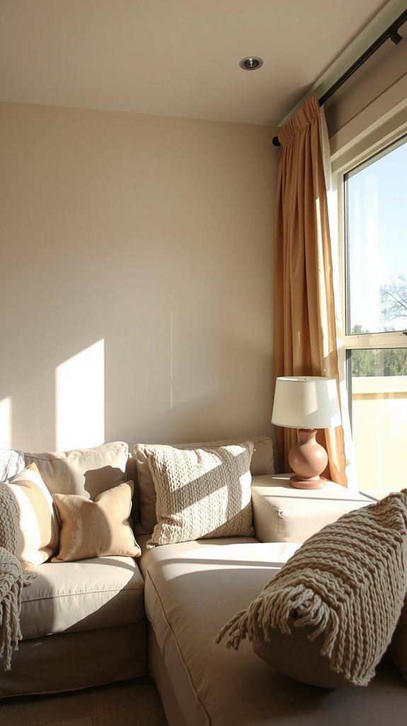
Most people reach for bright white and then wonder why their rooms feel sterile. Alabaster solves that problem by leaning into warmth without crossing over into yellowed-cream territory.
The LRV sits at 82, so you’re still getting plenty of light reflection, but there’s a softness here that makes spaces feel finished and intentional. What I love most is how it shifts through the day, looking crisp and clean in morning light, then settling into something cozier by evening when you actually want to relax.
Evergreen Fog SW 9130: Sophisticated Green-Gray Tranquility
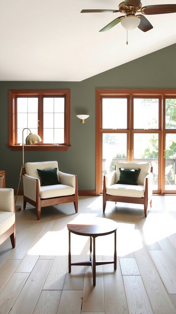
Sherwin-Williams picked this as their 2022 Color of the Year, and honestly, they nailed it. This muted green-gray reads completely different depending on your light source, swinging between mossy green and cool gray throughout the day.
With an LRV of 30, it’s definitely a commitment color, but that’s what makes it interesting in kitchens and bedrooms where you want something more complex than another beige. Pair it with Pure White trim and you’ve got contrast that feels natural rather than jarring.
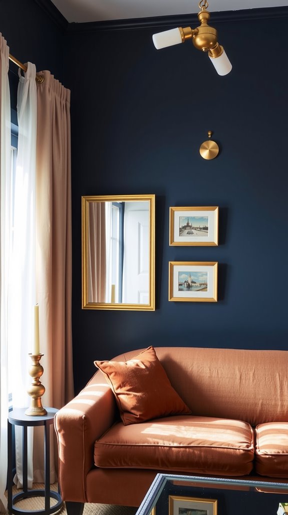
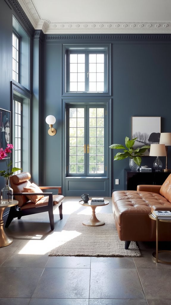
There’s a reason Naval won Color of the Year back in 2020. This navy has enough depth to read almost black in low light (LRV of 4), but those cool gray-green undertones keep it from feeling like a cave.
I’ve seen it work magic on kitchen cabinets, especially when you add brass hardware and keep the countertops white for contrast. The color has real staying power because it doesn’t try too hard to be anything other than a solid, sophisticated navy that makes everything around it look more expensive.
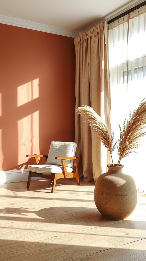
Cinnamon Slate 2113-40: The 2025 Color of the Year
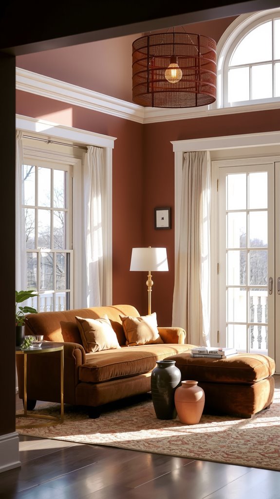
Benjamin Moore went bold with this purple-brown for 2025, and I respect the choice. At an LRV of 19.71, this isn’t background noise; it’s a color that asks you to commit to something moodier and more intimate.
The purple undertones come through strongest in natural light, while artificial lighting brings out the brown warmth. It works beautifully in living rooms and bedrooms where you want that cocooning feeling, and it plays surprisingly well with both neutrals and richer jewel tones.
Sea Salt SW 6204: Delicate Blue-Green Versatility
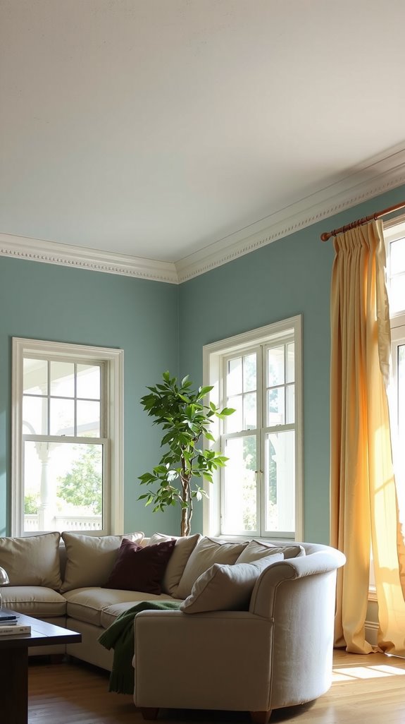
Sea Salt has become almost too popular, but there’s a good reason everyone keeps using it. The color hovers somewhere between blue, green, and gray, never quite committing to any single identity.
That LRV of 63 means it brightens spaces without being aggressive about it. The chameleon quality can be frustrating if you want consistency, but it’s perfect for homes where lighting varies wildly from room to room.
Accessible Beige: Modern Neutral Without the Noise
If you’re tired of cold grays but can’t stomach another builder-grade beige, Accessible Beige is your answer. This greige lives at LRV 58 with these interesting gray-green undertones that keep it from looking dated.
I’ve watched it coordinate with everything from honey oak floors to dark walnut cabinets, which is harder than it sounds. It’s one of those colors that works on walls, trim, and cabinets without creating a visual snoozefest.
Redend Point: Muted Pinky Clay With Staying Power
Redend Point walks a fine line that most dusty pinks can’t manage. The clay undertones ground it just enough to keep it from reading juvenile or overly sweet.
This works beautifully in bedrooms where you want something soft but not saccharine, and it pairs unexpectedly well with sage greens and warm grays. The powdery quality means it won’t scream at you from the walls, which is exactly what you want in a space meant for sleeping.
Slate Tile SW 7624: Deep Cool Sophistication
Slate Tile is for people who want drama but have enough restraint to skip pure black. This charcoal gray sits at LRV 15.47, making it dark enough to create real impact without swallowing all your light.
The blue undertones shift depending on what you’re lighting it with; natural light brings them forward while warm bulbs push it toward softer charcoal. I’ve used this in dining rooms and home offices where you want something more interesting than white but less aggressive than navy.
Dover White SW 6385: Creamy Warmth With Yellow Undertones
Dover White leans hard into those yellow undertones, which sounds risky but actually creates this warm, enveloping feeling that works in spaces where you gather. The LRV of 83 means you’re getting plenty of brightness, but it’s a soft, buttery light rather than harsh reflection.
This is what I reach for in living rooms and bedrooms, especially when I’m pairing it with soft blues or greens that need a warm neutral to keep them from going icy. Stay away from it if your trim is bright white, though, because the contrast will make it look dingy.
Clary Sage SW 6178: Earthy Green Harmony
Clary Sage captures that perfect muted sage that doesn’t look like hospital scrubs. The LRV of 40.96 puts it squarely in medium territory, which gives you options for both walls and cabinets.
What makes it work is how the gray undertones keep the green from going too cheerful or spring-like. In bright light, it definitely reads as sage, but move into dimmer spaces, and it settles into something more gray-green and sophisticated.
Briny SW 6775: Rich Coastal Blue-Green Saturation
Briny is what happens when you want coastal vibes without resorting to another pale aqua. This medium-dark teal has enough saturation to feel intentional, but those gray undertones keep it from screaming “beach house” at you.
I’ve seen it transform home offices and bedrooms into spaces that actually feel calming rather than just decorated. Pair it with Pure White or Repose Gray to keep it from overwhelming your space, and avoid it in rooms with orange-toned wood because the clash will make your eyes hurt.
French Canvas: Practical Elegance for Designer Homes
French Canvas has these greenish-gray undertones that make it more interesting than your standard greige. The LRV of 74.05 keeps spaces bright enough for daily living while adding subtle complexity that reads as expensive.
I’ve watched this color adapt to everything from coastal cottages to historic homes, which tells you something about its versatility. It’s cooler than most beiges without going full gray, landing in that narrow sweet spot that works with both warm and cool accent colors.
Shoji White SW 7042: Versatile Off-White With Gray Balance
Shoji White manages to be an off-white that doesn’t look dingy next to true white trim. Those cream-yellow undertones are balanced by enough gray to keep it from reading too warm, landing at an LRV of 74 that’s practical for almost any room.
I’ve used it on exteriors, cabinets, and walls with equal success, which is rare for an off-white. It plays particularly well with medium greens and white trim, creating contrast without the harsh jump that some color combinations give you.