You’ve stood there holding paint swatches, trying to imagine how a 2-inch square translates to four full walls. It never quite works that way in your head, and that’s exactly how people end up repainting rooms twice.
Color choices carry more weight in a living room than anywhere else in the house. They set the mood before anyone sits down, and they’ll either fight your furniture or make it sing.
This guide helps you get the foundation right, and everything else falls into place.
Best Color Combination for Living Room
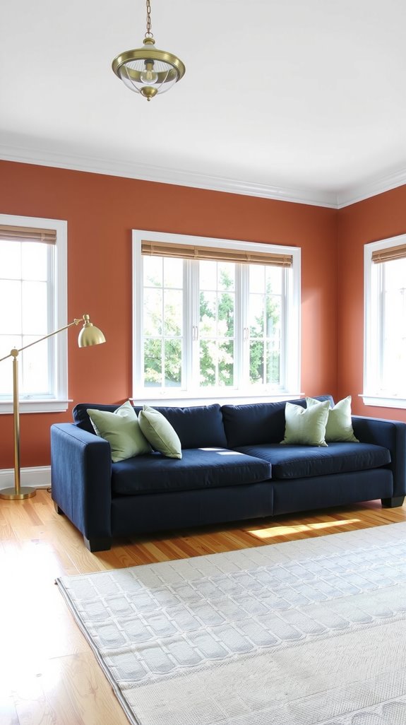
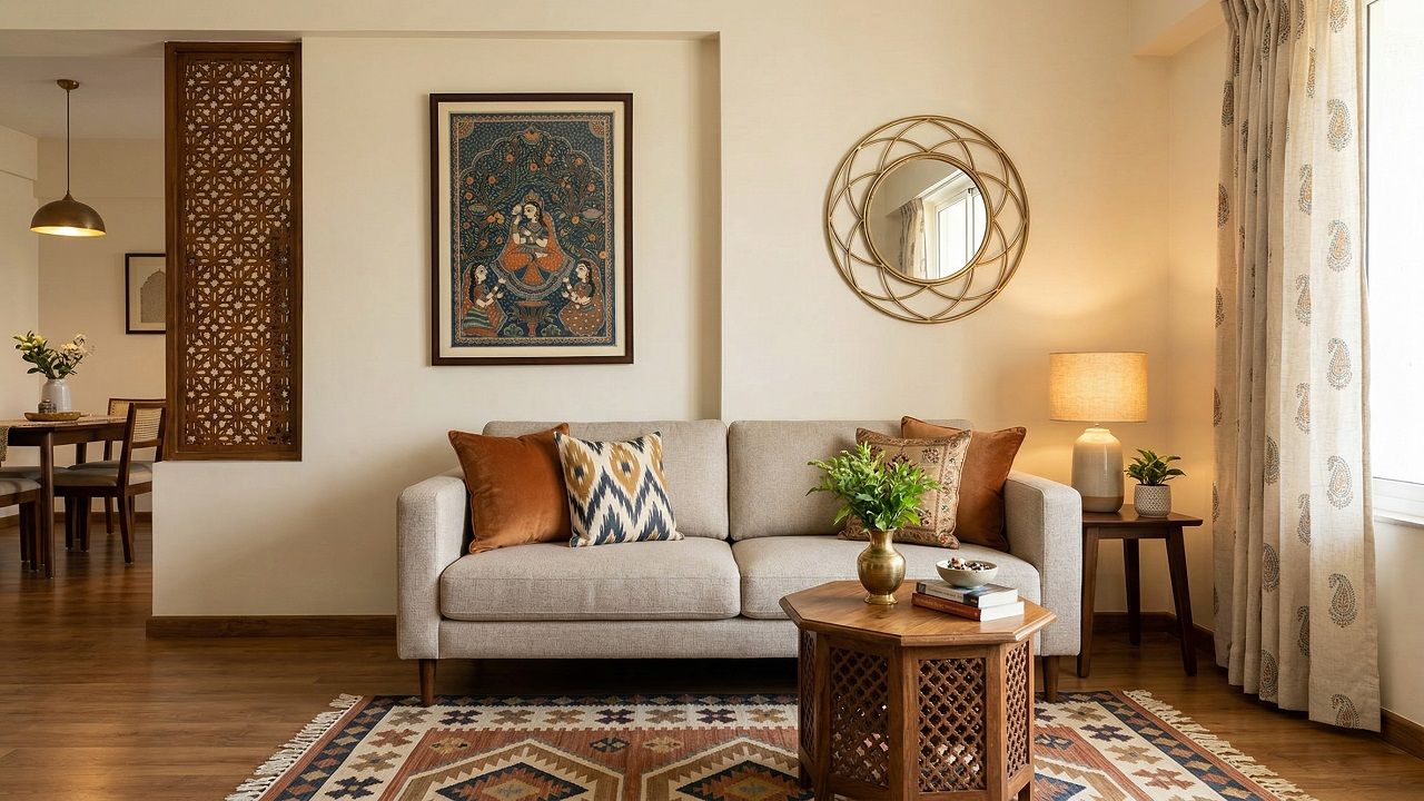
Navy and white has earned its reputation through decades of proven results in rooms of every size and style. Warm neutrals paired with terracotta accents create something that feels genuinely inviting rather than staged.
Gray and yellow is the contemporary answer to that same instinct, bright enough to feel fresh, grounded enough to live with for years. Whatever direction you go, the combination needs to work with what’s already in the room, not fight it.
| READ FULL GUIDE: Color Combination for Living Room: Stylish Ideas That Always Work |
Color Combination for Living Room Walls
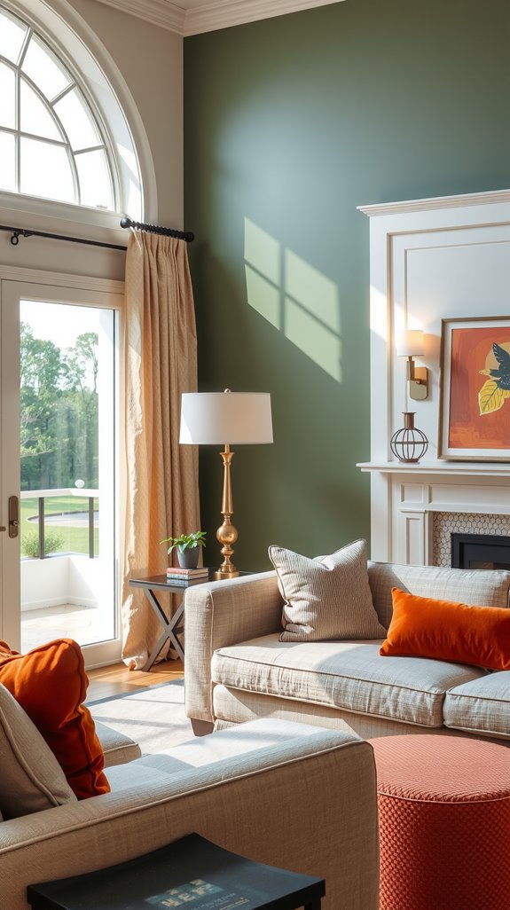
Your living room walls are where most people freeze up, and honestly, that hesitation makes sense. You’re committing to something you’ll look at every single day.
Soft neutrals like warm beige, greyed cream, or a true off-white give you room to breathe and change your mind on everything else without starting over.
If you want drama, deeper tones like navy, forest green, or charcoal can work beautifully, but only if your room gets enough natural light to keep things from feeling like a cave.
| READ FULL GUIDE: Color Combination for Living Room Walls (That Actually Works) |
Two Color Combination for Living Room
There’s a reason designers keep coming back to two-color schemes. They’re controlled, they’re intentional, and they almost always look better than throwing a third color into the mix.
Gray and white reads as effortlessly clean, navy and gold tips into something richer, and cream paired with muted sage green brings the outside in without trying too hard.
Pick one to dominate the room and let the second show up in textiles, trim, or a few well-chosen pieces.
| READ FULL GUIDE: Two Color Combination for Living Room (Easy Pairings That Always Work) |
Light Color Combination for Living Room
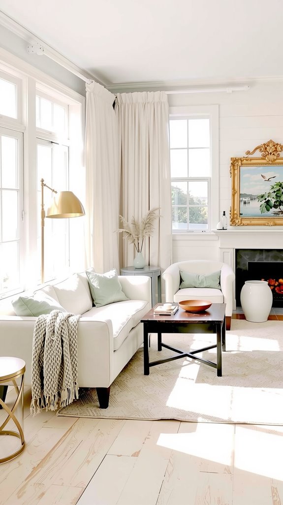
Pale palettes do something that darker ones simply can’t: they make a room feel larger than its measurements suggest. Soft white paired with light gray is the most reliable version of this, clean, airy, and genuinely easy to furnish around.
Cream with pale blue adds a layer of calm that works particularly well in rooms that get strong afternoon sun. These combinations reflect light rather than absorbing it, which changes how a space feels at every hour of the day.
| READ FULL GUIDE: Light Color Combination for Living Room (Bright, Airy & Timeless) |
Color Combination for Small Living Room
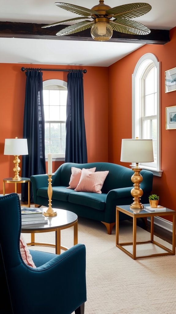
Small living rooms punish bad color decisions faster than any other space. Light neutrals, soft whites, warm beiges, and pale grays keep walls from closing in, and a monochromatic approach where your accents stay within the same tonal family adds dimension without visual noise.
Vertical stripes or color blocking on one wall can draw the eye upward, which tricks the brain into reading a room as taller than it is. What kills small rooms isn’t dark color exactly, it’s contrast overload, too many competing tones fighting for attention in too little space.
| READ FULL GUIDE: Color Combination for Small Living Room (That Makes Space Feel Bigger) |
Modern Color Combination for Living Room
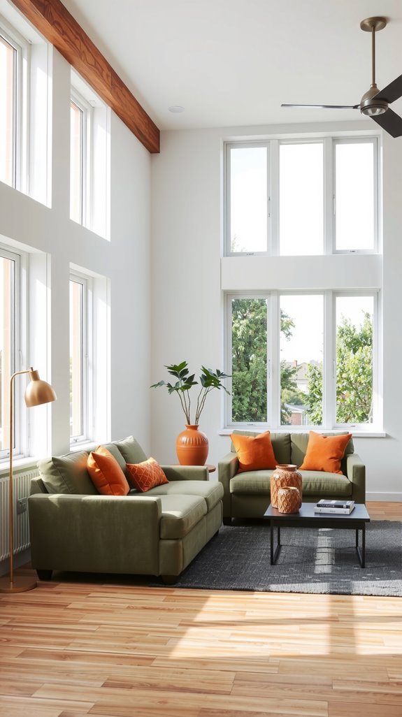
Contemporary rooms tend to live or die by restraint. Charcoal paired with crisp white is the classic move for good reason: the contrast is sharp, the look is clean, and it ages well. Navy with brass accents brings a layer of warmth that keeps things from feeling sterile.
If you want to go fully minimalist, a single color in three or four tonal variations, say a warm gray from whisper light to nearly charcoal, creates sophistication without relying on contrast at all.
| READ FULL GUIDE: Modern Color Combination for Living Room (Clean, Stylish & Timeless) |
Simple Color Combination for Living Room
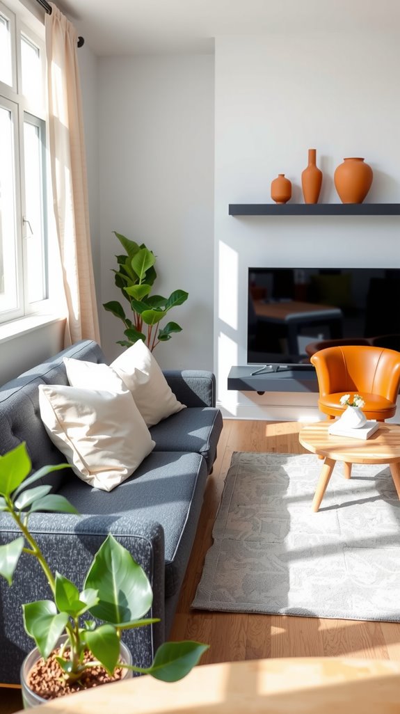
Simple combinations get underestimated because they look easy, but executing them well takes more discipline than people expect. White and navy is the classic entry point, clean and timeless without feeling lazy.
Beige and sage green offers something warmer and more organic, the kind of palette that feels like it grew from the room rather than being imposed on it. Gray and soft yellow splits the difference, cheerful enough to feel alive, restrained enough to stay out of its own way.
| READ FULL GUIDE: Simple Color Combination for Living Room (Easy, Calm & Livable) |
Neutral Color Combination for Living Room
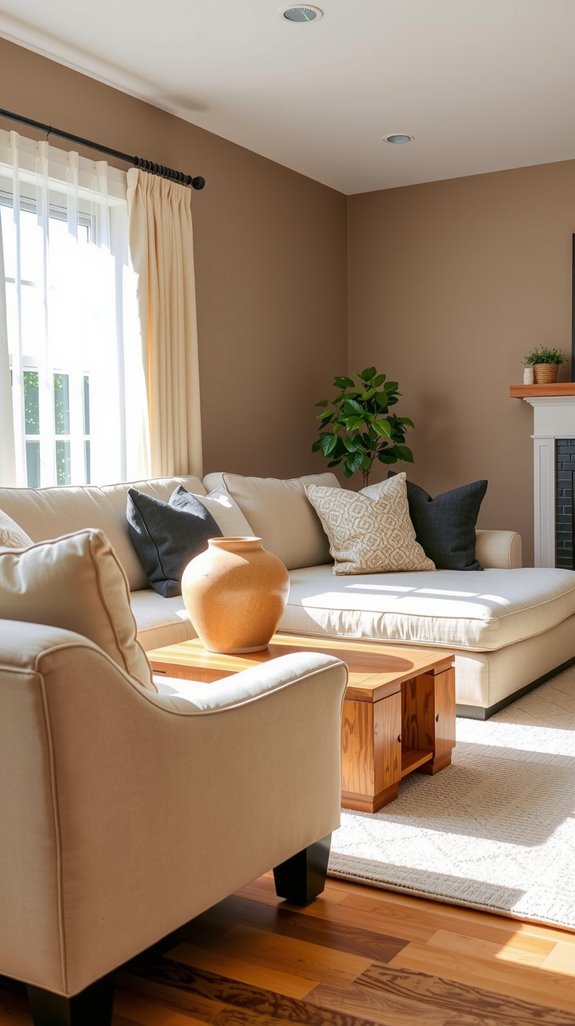
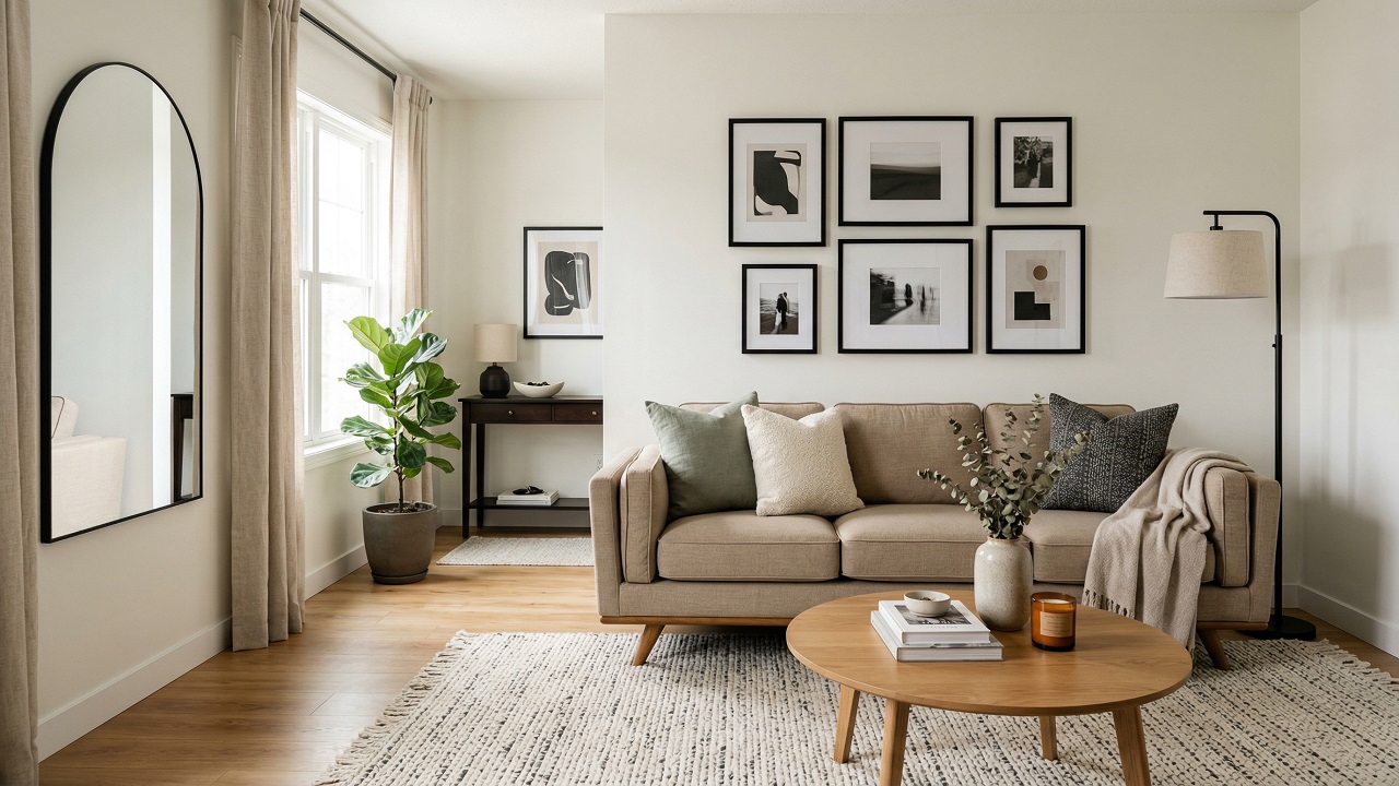
Neutral palettes have a staying power that bolder choices rarely match. Beige, cream, and soft gray create a backdrop that adapts as your furniture and tastes evolve, which matters more than most people realize when they’re buying a couch they’ll own for fifteen years.
These tones maximize natural light in a way saturated colors simply don’t, which makes rooms feel larger and more open without any structural changes. The real advantage of going neutral is that your accent colors, throws, cushions, art, can shift seasonally without the walls ever feeling wrong.
| READ FULL GUIDE: Neutral Color Combination for Living Room (Warm, Calm & Flexible) |
Warm Color Combination for Living Room
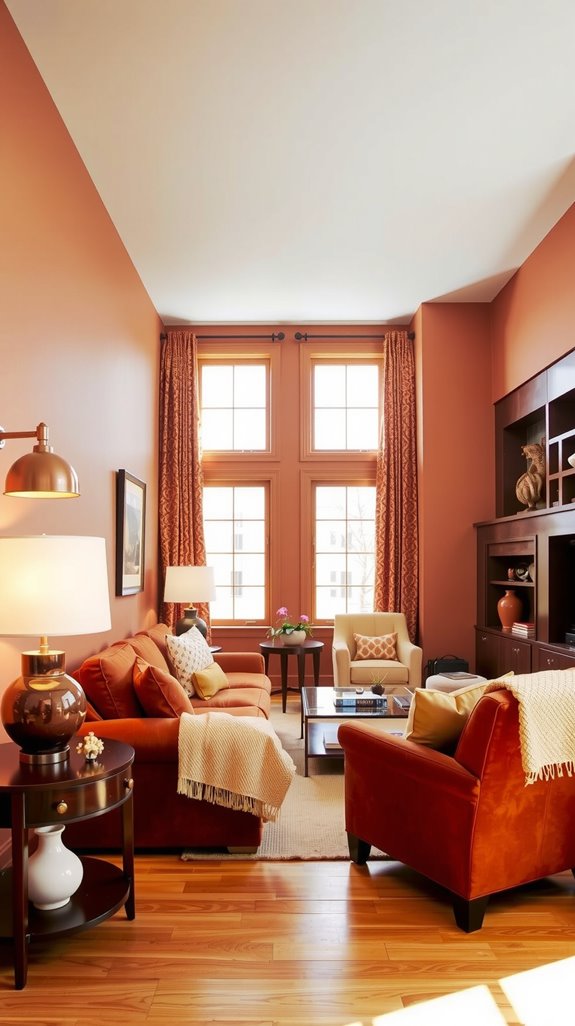
Warm palettes are where a room stops looking designed and starts feeling inhabited. Terracotta with cream is the combination I keep coming back to: it’s earthy without being muddy, and it photographs beautifully in afternoon light.
Rust orange and golden yellow sounds risky but reads as inviting when the tones are muted enough. Deep reds and warm browns are the old-school version of this idea, and they still work in rooms with heavy wood furniture and low lighting.
| READ FULL GUIDE: Warm Color Combination for Living Room (Cozy Without Feeling Heavy) |
Cool Color Combination for Living Room
Cool palettes have a reputation for feeling cold, and that’s entirely an execution problem. Navy paired with sage green sidesteps the chill because one tone pulls warm and one pulls cool, creating natural balance.
Light blue and white is a classic for a reason, especially in rooms that get strong morning sun where the light will warm everything up anyway. Teal is the underused option here, used as an accent against charcoal gray, it adds a richness that neither color achieves on its own.
Dark Color Combination for Living Room
Dark rooms feel like a gamble until you’ve actually spent time in one that’s done well. Charcoal gray with deep navy creates a layered depth that’s genuinely hard to achieve any other way.
Midnight blue and burgundy sounds heavy, but in a room with the right lighting, it feels more like a private club than a poorly lit box. The non-negotiables are adequate lamps and metallic finishes: brass, bronze, and polished nickel catch light in ways that keep dark rooms from feeling flat.
Bright Color Combination for Living Room
Saturated colors work when you treat them as the guest rather than the host. Sunny yellow against crisp white is cheerful without being juvenile, especially when the yellow leans toward gold rather than crayon.
Coral and turquoise sounds coastal, and it is, but in a room with natural wood and linen textures it settles into something less theme-y and more livable. The mistake most people make with bright palettes is going bright everywhere, one strong wall or a collection of saturated textiles is usually all a room needs.
Elegant Color Combination for Living Room
Sophistication in color isn’t about price, it’s about restraint and the right materials working together. Navy with gold accents is the most reliable version of this: classic enough to feel intentional, specific enough to feel considered.
Charcoal gray with cream operates on similar logic, strong contrast, quiet execution. These palettes earn their reputation through texture as much as color, velvet, linen, and polished metal respond to light differently, and that interplay is what separates a room that looks elegant from one that merely looks expensive.
Luxury Color Combination for Living Room
Deep, saturated hues layered with metallic accents are where luxury palettes separate themselves from simply rich-looking ones. Emerald green with brass details brings a jewel-toned depth that’s hard to fake with lighter colors.
Burgundy with champagne tones is the warmer version of that same instinct, opulent without feeling heavy. The key is balancing bold statement walls against neutral furnishings so the metallic elements, fixtures, frames, hardware, have room to catch the light and do their work.
Latest Living Room Color Combination
The palettes getting the most attention lately pull from the same broad direction: muted, nature-referencing, and warm without being heavy. Terracotta and sage green is everywhere, and for good reason.
Warm taupe with dusty blue has a subtlety that holds up better than trendier combinations, and clay rose alongside natural cream reads as quiet and grounded, the kind of room that feels restful after a long day. These combinations travel well across design styles, whether you’re leaning minimalist, maximalist, or somewhere sensibly in between.
Popular Living Room Color Combination Ideas
Certain combinations stay popular not because they’re trendy but because they genuinely work across a wide range of rooms, furniture styles, and lighting conditions. Navy and white delivers that timeless crispness that photographs well and lives even better.
Gray and yellow strikes a balance between grounded and cheerful that few other pairings manage as naturally. Charcoal with blush pink is the contemporary entry on this list, softer than it sounds and far more versatile than most people expect when they first see it on a swatch.
