What this is: A guide to modern and minimalist fall porch decor — the aesthetics, the specific moves, and the plant-and-prop combinations that look deliberately quiet instead of accidentally empty.
Who it’s for: Anyone whose aesthetic runs clean, neutral, and intentional, and who wants a fall entrance that reads as “autumn” without committing to a pumpkin explosion.
Why read it: You’ll learn why restraint is actually harder to pull off than maximalism — and the exact choices that make a minimal fall porch look curated rather than unfinished.
Every September, the seasonal aisle of every home store fills up with the same arsenal: orange and black everything, plastic gourds by the bag, a harvest-festival’s worth of plaids and burlap, and enough cornstalks to feed a county fair.
It’s cheerful. It’s warm.
And if your entire design sensibility runs toward clean lines, quiet palettes, and negative space, it looks like someone else’s house got on your porch while you weren’t looking.
Modern fall porch decor is a real thing, and it’s not just farmhouse-with-the-frills-removed.
It has its own aesthetics, its own prop vocabulary, and its own logic — and it’s actually trickier to pull off than the maximalist version, because there’s nowhere to hide a weak choice.
Here’s how to do it well.
Restraint Is a Design Decision, Not an Absence of One
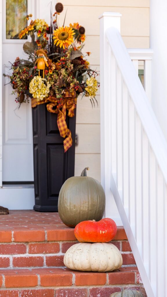
The mistake most people make with a minimalist fall porch is treating it as a regular fall porch with some things taken out. You strip away the scarecrows and the plastic pumpkins and the hay bale, and what’s left is three items on a bare concrete slab that looks less like a curated entrance and more like moving day.
Restraint works when every piece that stays is doing real work. One tall leaner in deep charcoal script against a light door — that’s a decision.
A single large planter of ornamental grasses with two cream pumpkins at the base — that’s a decision.
The principle isn’t fewer things for the sake of fewer things; it’s every object earning its presence, which is a much higher bar than just buying less. Your brain reads a composed minimal space as confident and intentional, the same way a single great piece of furniture reads as richer than a room full of filler.
The Modern Fall Color Palette Lives in the Neutrals

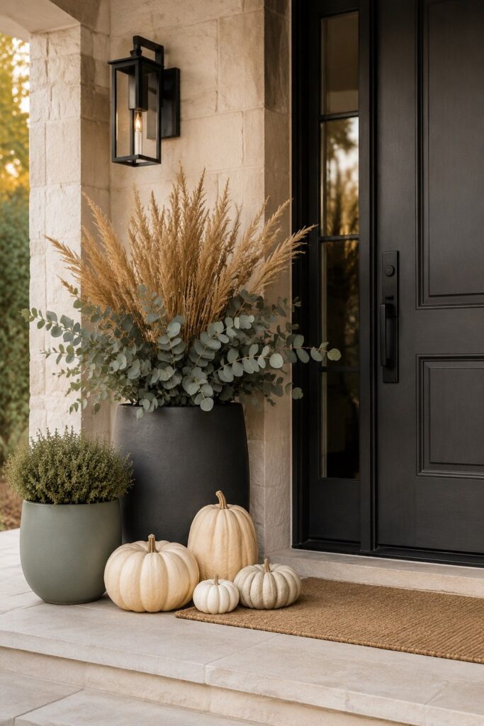
The quickest way to make a fall porch look modern is to leave orange out of it entirely — or at least relegate it to a minor supporting role.
Modern and minimalist fall porch decor works in a palette of warm whites, cream, sage, slate, charcoal, and the deeper naturals: dried wheat, muted terracotta, faded ochre, the gray-green of eucalyptus.
These colors read as autumn without screaming it. The trick is to anchor the palette in one dominant neutral and layer one or two accent tones on top. Cream as the base, sage and dried wheat as accents — that’s a complete and coherent palette.
Charcoal as the base, white pumpkins and black iron hardware as accents — clean, modern, done.
What breaks the look is mixing warm and cool neutrals without intention: cream pumpkins next to a cool gray planter next to a warm-toned doormat is three palettes pretending to be one.
Commit to warm or cool, and everything you put on the porch will quietly agree with everything else.
White and Cream Pumpkin Arrangements That Actually Look Editorial
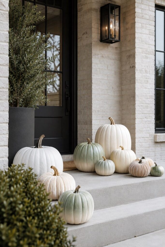
White, cream, and sage pumpkins are the single most effective swap you can make for a modern fall porch. They carry all the seasonal visual weight of standard orange…
… the shape, the scale, the harvest reference. Without the color that reads as traditional rather than contemporary.
Grouped in three sizes and placed deliberately, they look like something you’d see in an architecture magazine rather than a neighborhood front step.
The editorial move is to paint a set yourself: ombré and gradient finishes in tones that shift from cream at the base to warm sage at the stem read as genuinely designed rather than store-bought.
Velvet-finish faux pumpkins in ivory or dusty rose are another strong option — the texture is luxurious up close and photographs beautifully.
Group odd numbers, keep sizes varied, and resist the urge to add a bow or a sign. The arrangement is enough when it’s right.
The Black-and-White Modern Farmhouse Porch
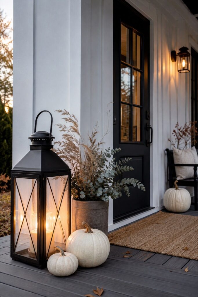
Black and white is the most effective high-contrast palette in exterior design, and it translates directly to fall porch decor.
A crisp white backdrop against bold black accents — black iron lanterns, a matte-black leaner, black-framed door hardware — gives a porch the kind of graphic clarity that reads from the street before anyone gets close enough to see the details.
For fall, the key is warm the palette just slightly so it doesn’t read as stark: cream rather than pure white pumpkins, natural dried grasses or eucalyptus that bring an earthy tone into the black-and-white framework.
A single large black iron lantern casting amber light after dark does more for a modern fall entrance than a dozen smaller decorative items. The lantern stays all season; you change what’s around it. That’s the whole update strategy in one piece.
One Statement Piece: The Single-Leaner Modern Porch
Here’s the format I keep coming back to for a modern or minimalist fall porch, especially on a smaller entrance: one tall leaner, one planter, one layered mat, and nothing else.
The leaner provides height and language — a single word or phrase in a clean font, dark on light or light on dark. The planter provides scale and nature. The mat grounds the threshold. Three things, all pulling in the same aesthetic direction, and the porch is done.
The reason this works is that the brain’s eye needs a point of arrival — somewhere to land when it hits the entrance — and a tall leaner gives it exactly that. Everything else exists to support the leaner, not compete with it.
I first tried this format on a narrow row-house stoop where space was limited and anything fussy looked immediately cramped. Leaner, planter, mat. The stoop looked more intentional than it ever had with twice as much stuff on it. For small space fall decor, this is genuinely the only format worth considering.
Scandi and Japandi Takes on a Fall Entrance
Scandinavian and Japandi aesthetics translate to fall porches better than most people realize, because both are built around the things autumn already offers: natural materials, quiet warmth, and the beauty of things that age well.
Japandi design combines Japanese minimalism with Scandinavian functionality, favoring raw wood, stone, linen, and muted earthy tones — essentially a shopping list for a fall porch that doesn’t try too hard.
For a Japandi fall entrance: raw wood risers beside the door with pumpkins and gourds arranged asymmetrically, one ceramic planter in a matte glaze, dried pampas or feather grass in a stone-colored pot, and no signage at all.
The absence of text is intentional — it’s the Japanese concept of ma, or negative space, in practice. The entrance communicates season and welcome through material and restraint rather than words. That reads immediately, from the street.
Monochrome White: The Hardest Look to Pull Off and the Best When You Do
A fully monochrome white fall porch — white pumpkins, white planters, bleached dried grasses, a pale natural wood leaner — is the most editorial interpretation of modern fall decor and the one that earns the most questions from the street.
The difficulty is that white reads as empty unless the textures are genuinely varied. A smooth ceramic planter next to a rough-weave doormat next to a matte-painted pumpkin next to feathery dried grass creates a monochrome palette that still has visual depth.
Flat white on flat white disappears. Texture is doing the job that color usually does. A layered doormat in natural coir under a cream woven mat anchors the whole composition and adds the tactile contrast that keeps the palette readable.
I learned this the hard way — beautiful in my head, invisible from fifteen feet. Add texture before you add anything else.
The Porch That Transitions Cleanly to Christmas
One of the real advantages of a modern fall porch decor approach is how easily it transitions. A farmhouse-harvest porch has to be completely dismantled in November because the hay bale and the scarecrow have exactly one season of relevance.
A modern neutral porch — charcoal leaner, white pumpkins, dried grasses, a black lantern — can move to Christmas by swapping the pumpkins for white sphere ornaments and adding a single evergreen wreath. The structural pieces stay; only the seasonal accents change.
This is the same fall-to-winter transition logic that makes elegant Christmas porch decorations effortless when the fall base is already in a neutral, timeless palette.
Build the fall porch with the next season in mind and you’ll spend twenty minutes on the December update rather than a whole Saturday.
The cozy fall living room benefits from the same approach indoors — coherent palettes that carry forward rather than expire. Neutral done right isn’t boring. It’s perpetually useful.
Less Is Measurably More — When Every Piece Is Right
The case for modern and minimalist fall porch decor isn’t aesthetic snobbery; it’s a practical argument about maintenance and longevity. Fewer pieces that are all genuinely right outlast a full seasonal spread that includes several things you settled for.
They’re easier to store, easier to reset for the next season, and easier to look at for three straight months without getting tired of them.
Pick the palette. Choose the one statement piece. Edit everything else until only what earns its spot remains. A quiet fall evening hits different when you walk up to a porch that looks like it means it.